Monday, February 19, 2018

Munsell - the Father of Color Science? (part 3)

This series of blogs was foretold in a prophecy of April of 2013:

Someday I will write a blog post about how this guy Munsell laid the foundation for the ever-popular color space CIELAB, and came to be known as the Father of Color Science. He was also the father of A. E. O. Munsell, who carried on his work. I don't intend to write a blog post about how Albert became the father of A. E. O.

What I did not foretell in that blog post is that ISCC will be sponsoring the Munsell Centennial Symposium,  June 10 - 15, 2018 in Boston. Or that I would be keynoting this event.

After two previous attempts (Munsell as an educator, Munsell and 3D color space), I am finally have made my way to looking at the most significant work of Munsell. The Munsell Color Space was a model for CIELAB.

First cursory pass

Exhibit A. Richard Hunter's book The Measurement of Appearance, on page 136.

Photo taken at the Color Difference family picnic

This is a family tree of proposed models for determining color difference. Note that the Munsell Color system is in the upper right hand corner, and all arrows come from that box. The only little boxes that are still active today are the two boxes labeled CIE 1976. A similar diagram is on page 107 of that same book, which shows a family tree of color scales. (I have an image of that in a previous blog posts about color difference.) Again, this shows a straight lineage from Munsell Color Scpce to CIELAB.

Is this reliable testimony? Richard Hunter was a fairly knowledgeable guy when it comes to color. I mean, he has his own entry in Wikipedia for goodness sake. CIELAB is (perhaps) the most widely used tool in the color industry. Since Hunter traces the lineage of CIELAB back to Munsell, then I feel pretty confident about putting Munsell on the shortlist of highly influential figures in the history of color science, at the very least.

But, that hides a lot of the fun stuff that happened between the creation of the Munsell color space and the ratification of CIELAB as a standard for color measurement.

What Munsell did

    Munsell Color Space

Munsell's color space is based on some simple principles.

1. Hue, Value, and Chroma

There are three attributes to color in Munsell's color system. While these are implicit in many of the previous color systems (enumerated in a previous blog post), Munsell was intent on tying these to our intuitive understanding of color. (After studying on this for 25 years, I have come to realize that they are indeed intuitive). 

2. A physical standard produced with simple tools, simple math, and a defined procedure

Munsell described the procedure by which his color system could be developed from any reasonable set of pigments. The procedure included a way to assign unique identifiers to each color.  As a result, all colors within the gamut of the chosen pigments could be unambiguously named.    

3. Perceptual linearity

One of Munsell's secondary aims was to create a color space where the steps in hue, value, and chroma were all perceptually linear. Did he meet his goal? Stay tuned.


This color system was used to create the Atlas of the Munsell Color System, which was a book containing painted samples with their corresponding designations of hue, value, and chroma. This book was to be used as an unambiguous way to identify colors, and thus, to provide a standrd way to communicate color.

     Munsell photometer and the gray scale

Munsell invented and patented a photometer which was capable of measuring the reflectance of a flat surface. Well, provided it was a neutral gray. The user would look into a box and see two things: the sample to be measured, and a standard white patch. The sample was illuminated with a constant illumination, and the white standard was illuminated with light through an adjustable aperture. To make a measurements, the size of the aperture was adjusted so as to match the intensity of the dimmed white standard and that of the sample. The width of the aperture, scaled from 1 to 10, was the Munsell Value for the gray sample.

A shoebox with some holes and stuff

Munsell used his photometer to mix black and white paints in steps from V = 1 to V = 10.

     Maxwell disks and the rest of the colors

James Clerk Maxwell invented a creature called the Maxwell disk around 1855. I spent the better part of a day building my own set of Maxwell disks from colored construction paper as shown below. The cool part is the slit. You can slide two or more disks together, and rotate them so as to get any proportion of the colors to show. In the inset, I show the device that I adapted to rotate the disks. Again, the better part of a day was spent assembling a bolt, a couple of washers, and a nut. I first tried a cordless drill, and found it didn't spin fast enough to merge the colors. I had to use my old drill that plugs into the wall.

The Maxwell disks were the inspiration for PacMan

The picture below shows the results of day 3 of my dramatic reenactment of Munsell's landmark experiment. I selected red, green, and blue construction paper, and adjusted the size of the segments in order to get a facsimile of gray. When I saw that gray, I realized that this was four days well spent.

Me, geeking out on the creation of gray from Red, green, and blue

If I were to be doing this on a government grant, I would have spent another day or two actually measuring the sizes of the red, green, and blue areas. For the purposes of this blog, I will be content with just saying that red and blue are each one-quarter, and green is one-half. In other words, this green is half as strong as the others. Thus, Munsell would conclude that the chromas of this red and blue were twice that of this green. Munsell would also have measured this gray with his photometer. Another opportunity for me to get a little more grant money.

In this way, Munsell was able to assign values to the colors.

     Perceptual linearity?

Linear in Value?

Since Munsell's original Value was measured as the width of an aperture, the amount of light let through is proportional to the square of the Value. Conversely, Value is proportional to the square root of the light intensity. The plot below compares this scale against today's best guess at perceptual linearity, CIEDE2000.

Munsell's original Value was kinda sorta close to perceptually linear

Note: The DE2000 scale in the plot above is based on Seymour's formula (L00 = 24.7 Log e (20 Y +1), where 0< Y < 1), which was first presented at TAGA 2015, Working Toward A Color Space Built On CIEDE2000. The height of the curve at the end shows that there are 76 shades of gray, based on DE2000. The Munsell Value has been scaled to that.

Is this perceptually linear? That depends on how gracious you want to be. On the one hand, the linearity is not lousy. Given the tools at hand, Munsell did a fairly decent job of making kinda linear.

On the ungracious side, Munsell merely took what he had handy (the size of the opening of his aperture) and used that. Lazy bum! Surely he would have known about the work of Ernst Weber (1834) and Gustav Fechner (1860) which postulated that all our perception is logartihmically based! 

Really pedantic note: There is some confusion about how the gray scale was set up. My description is based on Munsell's description [1905], as well as comments by Tyler and Hardy [1940], Bond and Nickerson [1940], and Gibson and Nickerson [1940], all of which were based on Munsell's words and measured samples. But in a paper from 1912, Munsell described his assignment of Value as being logarithmic, following the Weber-Fechner law.

Linear in hue?

Munsell started this exercise by selecting five paints with vibrant colors: red (Venetian red), Yellow (raw sienna), green (emerald green), blue (cobalt), and purple (madder and cobalt). He then created paints that were opposite hues for each of these. The opposite hues were adjusted so that the balanced out to gray on the Maxwell disks. Thus, he had a set of ten colors with Value of 5 and Chroma of 5.

What's to say that these paints are equally spaced in hue? I am sure that Munsell selected them with that in the back of his mind, but four of the five are just commonly available, single pigment paints.
From the literature that I reviewed in the bibliography below, I could find no evidence that he put much time into psychophysical testing.

I'm gonna say that the hue spacing in the original Munsell color system is only somewhat perceptually linear.

Linear in Chroma?

Munsell's assignment of Chroma values is all based on simple ratios of areas on the Maxwell disks. Thus, in his original system, chroma is linear with reflectance. I did a bit of testing, comparing Munsell's proposition against DE2000. I will smugly state that our perception is not linear with reflectance.

But Munsell begs to differ with me. He performed some tests of this, and summarized his results in 1909:

These experiments show clearly that chroma sensation and chroma intensity (physical saturation) vary not according to the law of Weber and Fechner, but nearly or quite proportionately, and in accordance with the system employed in my color notation.

This paper seems to have been largely ignored by other color researchers. Deane Judd looked at the question of equal steps in chroma in 1932. His bibliography included Munsell's 1909 paper, but he made no mention of it in the text. The same with several of the papers from 1940 listed below.
My brief test suggests this is not true, and the people who were genuinely interested in the question who were aware of Munsell's suggestion ignored it. The graphs from the 1943 paper (Newhall, et al.) are decidedly non-linear in steps of chroma. Barring further evidence, I would say that the original Munsell Color System was not perceptually linear in chroma.

All in all, I'm gonna rate the claim that the original Munsell system was perceptually linear as "Mostly False".

What happened after Albert Munsell

Albert Munsell passed on in 1918, but a lot of work was done on the Munsell Color System by others after his death.

In 1919 and again in 1926, Munsell's son, A. E. O. Munsell submitted samples to the National Bureau of Standards. These were measured spectrophotometrically. The 1919 data was analyzed by Priest et al., and came along with some suggestions for improvement. They suggested that the Value scale be changed. 

This challenge was taken up by Albert's his own son. In 1933, A. E. O. published a paper describing a modification of the function from which Value was computed. This brought value much closer into line with the predictions of CIEDE2000.

The Munsell Color System was largely ignored in the literature until 1940. At that time, seemingly everyone jumped on the bandwagon. A subcommittee of the Optical Society of America was formed, and the December 1940 issue of the Journal of the Optical Society in America published five papers on the Munsell Color System.

Why the sudden effort? Spectrophotometers were expensive and cumbersome, but were becoming available. The 1931 tristimulus curves were available to turn spectral data into human units. Several of the papers noted a desire to create a system which translated physical measurements into something that made intuitive sense.

The Munsell Color System seemed to be best template to shoot for, since it was "[l]ong recognized as the outstanding practical device for color specification by pigmented surface standards."  (Newhall, 1940)

The efforts of the OSA subcommittee culminated in what has become known as the Munsell Renotation Data, introduced in the 1943 paper by Newhall et al. Inconsistencies of the original data were smoothed out, a new Value scaled was introduced, and a huge experiment (3 million observations) was done to nudge the colors into a system that looked perceptually linear.  The final result is a color system that can indeed be said to be perceptually linear.

Oh what a tangled web we weave, from Newhall (1943)

I'm not gonna take up the rest of the story, from the Renotation Data to CIELAB. That's another long and interesting story, I'm sure. But I am running out of gas!

Conclusion

Here is the firmest entirely factual statement that I can make about this paternity suit involving Albert Munsell and the child named Color Science.

Munsell had a passion for teaching color, especially to children. He sought to bring order and remove ambiguity from communication of color. This passion brought him to create the Munsell Color System. This was not the first three-dimensional arrangement of color, nor was it all that close to being perceptually linear. But it had two great features going for it: It was built on the intuitive concepts of hue, chroma, and lightness, and it came with a recipe for building a physical rendition of the color space. As a result, the Munsell Color Space is both a concept for understanding color, and a physical standard to be used in practical communication of color.

The Munsell Color System saw a number of improvements after his death, resulting in the Munsell Renotation Data. This later became the framework for future development of a magic formula to go from measured specrta to three numbers that define a color. The CIELAB formula is the one that stuck.

I realize that my work over the past 25 years has given me a bias toward the importance of measurement of surface colors, and hence a bias toward thinking that CIELAB is important. The next statement is subjective, and based on my admitted biases.

I think that Albert Munsell deserves to be called The Father of Color Science.

Albert Munsell proudly showing off his very attractive John the Math Guy Award

On the other hand...

I would be remiss if I failed to mention a few other individuals, who might reasonably be on the podium with Munsell.

Isaac Newton - He invented the rainbow, right? Well, actually, he did some experiments with light and came up with the theory of the spectrum. Spectrophotmeters are designed to measure this.

Thomas Young - He first proposed the theory that the eye has three different sensors (red, green, and blue) in 1802. Hermann von Helmholtz built on this in 1894.

Ewald Hering - He proposed the color opponent theory in 1878. Light cannot be both red and green; nor can it be both blue and yellow. His three photoreceptors were white versus black, red vs green, and yellow vs blue. This is explicitly built into CIELAB.

It turns out that all of these are correct, but they are looking at different stages in our perception. Newton's spectrum is a real physical thing. The retina does have three Young-Helmholtz sensors. The cones are not exactly RGB, but kinda. And the neural stuff after the cones in the retina creates signals that follow Hering's theory.

So, maybe one of these gents should get the crown? I dunno... maybe I'll make a few more John the Math Guy awards?

Bibliography

Munsell's papers

Munsell, Albert H., A Color Notation, Munsell Color Company, 5th Edition, 1905, Chap V

Munsell, Albert H., On the Relation of the Intensity of Chromatic Stimulus (Physical Saturation) to Chromatic Sensation, Psychological Bulletin, 6(7), 238-239 (1909)

Munsell, Albert H, A Pigment Color System and Notation, Amer. Journal of Psych, Vol 23, no. 2, (April 1912)

Post Munsell, pre-1940

Priest, Irwin, K. S. Gibson, and H. J. McNicholas, An examination of the Munsell color system. I. Spectral and total reflection and the Munsell scale of value, Tech. Papers of the Bureau of Standards, No. 167 (September 1920)

Judd, Deane, Chromatic Sensibility to Stimulus Differences, JOSA 22 (February 1932)

Munsell, A. E. O., L. L. Sloan, and I. H. Godlove, Neutral Sclaes. I. Munsell Neutral Value Scale, JOSA (November, 1933)

Glenn, J. J. and J. T. Killian, Trichromatic analysis of the Munsell Book of Color, MIT Thesis (1935), also in JOSA (December 1940)

The 1940's flurry

Gibson, Kasson S and Dorothy Nickerson, An Analysis of the Munsell Color System Based on Measurements Made in 1919 and 1926, JOSA, December 1940

Newhall, Sidney, Preliminary Report on the O.S.A. Subcommittee on the Spacing of the Munsell Colors, JOSA, December 1940

Tyler, John E. and Arthur C. Hardy, An Analysis of the Original Munsell Color System, JOSA December 1940

Nickerson, Dorothy, History of the Munsell Color System, Company, and Foundation. II. Its Scientific Application, JOSA, December 1940

Bond, Milton E., and Nickerson, Dorothy, Color-Order Systems, Munsell and Ostwald, JOSA, 1942

Newhall, Sidney M., Dorothy Nickerson, and Deane B. Judd, Final Report of the O.S.A. Subcommittee on the Spacing of the Munsell Colors, JOSA July 1943

More recent

Hunter, Richard S., The Measurement of Appearance, John Wiley, 1975, pps. 106 - 119

Wednesday, February 14, 2018

Is my color process going awry?

This blog is a first in a series of blog posts giving some concrete examples of how the newly-invented technique of ColorSPC and ellipsification can be used to answer real-world questions being asked by real-world people about real-world problems for color manufacturers.

So, picture this scenario. I am running a machine that puts color onto (or into) a product. Maybe it's some kind of printing press; maybe it mixes pigment into plastic; maybe this is about dyeing textiles or maybe it's about painting cars. The same principles apply.

John the Math Guy really Lays color SPC on the line

Today's question: I got this fancy-pants spectrophotometer that spits out color measurements of my product. How can I use it to alert me when the color is starting to wander outside of its normal operating zone?

An important distinction

There are two main reasons to measure parts coming off an assembly line:

     1. Is the product meeting customer tolerances?

     2. Is my machine behaving normally?

Conformance and SPC (statistical process control). These are intertwined. Generally, one implies the other. But consider two scenarios where the two answers are different. 

It could be that the product is meeting tolerances, but the machine is a bit wonky. Not wonky enough to be spitting out red parts instead of green, but there is definitely something different than yesterday. Should we do anything about this? Maybe, maybe not. It's certainly not a reason to run out of the building with our hair on fire. But it could be your machine's way of asking for a little TLC in the form of preventative maintenance.

Or it could be that your machine is operating within its normal range, and is producing product that is outside the customer tolerances. This the case you need to worry about. Futzing with the usual control knobs ain't gonna bring things in line. You need to change something about your process.

Use of DE for SPC

The color difference formulas, such as DE00, were designed specifically to be industrial tolerances for color. While DE00 may well be the second ugliest formula ever developed by a sentient being in this universe, it does a fair job of correlating with our own perception of whether two colors are an acceptable match. 

But is it a good way to assess whether the machine is operating in a stable manner? I mean, you just track DE over time, and if it blips, you know something is going on. Right? Let's try it out on a set of real data.

The plot below is a runtime chart of just over 1,000 measurements of pink spot color that I received from Company B. These are all measurements from a single run. I don't know for sure what the customer tolerance was, but I took a guess at 3.0 DE00, and added that as an orange dashed line.

It sure looks like a lot of measurements were out of tolerance!

Uh-oh. It looks like we got a problem. There are a whole lot of measurements that are well above that tolerance... maybe one out of three are out of tolerance?

But maybe it's not as bad as it looks. The determination lies in how one interprets tolerance. Here is one interpretation from a technical report from the Committee for Graphic Arts Technologies Standards (CGATS TR 016, Graphic technology — Printing Tolerance and Conformity Assessment):

"The printing run should be sampled randomly over the length of the run and a minimum of 20 samples collected. The metric for production variation is the 70th percentile of the distribution of the color difference between production samples and the substrate-corrected process control aims."

TR 016 defines a number of conformance levels. (For a description of what those values mean, check out my blog on How Big is a DE00) It says that 3.0 DE00  is "Level II conformance", so the orange dashed line is a quite reasonable acceptance criteria for a press run. But a runtime chart is not at all useful for identifying those "Danger Will Robinson" moments. I mean, how do you decide if a single measurement is outside of a tolerance that requires 20 measurements? 

If we want to do SPC, then we must set the upper control limit differently.

Use of DE for SPC, take 2

The basic approach from statistical process control -- the whole six sigma shtick -- is to set the upper control limit based on what the data tells us about the process, and not based on customer tolerances. It is traditional to use the average plus three times the standard deviation as the upper limit. For our test data set, this works out to 5.28 DE00.

The process looks in control now!

This new chart looks a lot more like a chart that we can use to identify goobers. In fact, I did just that with the two red arrows. Gosh darn it, everything looks pretty good.

But I think we need a bit closer look at what the upper limit DE means. The following pair of plots give us a perspective of this data in CIELAB. The plot on the left is looking down from the top at the a*b* values. The plot on the right is looking at the data points from the side with chroma on the horizontal axis and L* on the vertical.

The green dots are each of the measurements. The red diamond is the target color, and the ovoids are the upper limit tolerances of 5.28 DE00. (Note: in DE00, the tolerance regions are not truly ellipses, but are properly called ovoids. One should ovoid calling them ellipses, and also ovoid making really bad puns.)

Those are some big eggs!

The next image is  closeup of the C*L* plot, showing (with red arrows) the small set of wonky points that were identified with the DE runtime chart. I would say that these are pretty likely to be outliers. But look at the smattering of points that are well outside the cluster of data points, but are still within the ovoid that serves as the upper limit for DE. These should have stuck out in the runtime chart, if it were doing its job), but are deemed OK.

Wonkyville

Now, listen carefully... If you are using a runtime plot of "DE00 from the target color", you are in effect saying that everything within the ovoids represents normal behavior for your process. So long as measurements are within those ovoids, you will conclude that nothing has changed in your process. That's just silly talk!

Here is my summary of DE runtime charts: JUST SAY NO! Well... unless your are looking at conformance, and your customer tolerance is an absolute, as in, "don't you never go above 4 DE00!"

Use of Zc for a SPC

I know this was a long time ago, but remember the Z statistic from Stats 101? You compute the average and standard deviation of your data, and then normalize your data points to give you a parameter called Z. If a data point had a Z value that was much smaller than -3, or much larger than +3, then it was suspicious. This is mathematically equivalent to what's going on with the upper limit in a runtime chart.

I have extended this idea to three-dimensional data (such as color data). I call the statistic Zc. This is the keystone of ColorSPC.

Now, remember back when I showed the CIELAB plots of the data along with a DE00 ovoid? Didn't you just want to grab a red pencil and draw in some ellipses that represented the data better? That's what I did, only I used my slide rule instead of a pencil. There is a mathematical algorithm that I call ellipsification that adjusts the axes lengths and orientation of a three-dimensional ellipsoid to "fit" the data. Ellipsification is the keystone of ColorSPC.

Ellipsification charts in CIELAB

The concentric ellipses in the drawings above are the points where Zc = 1, 2, 3, and 4. That is to say, all points on the innermost ellipse have Zc of 1. All points between the innermost and the next ellipse have Zc between 1 and 2.

Zc is a much better way to do SPC on color data. Here is a runtime plot of Zc for this production run. The red dashed line is set to 3.75. That number is the 3D equivalent of the Z = 3 upper limit used in traditional SPC.

Finally, a runtime chart we can believe!

As can easily be seen (if you click on the image, and then get out a magnifying glass) this view of the data provides us with a much better indication of data points which are outside of the typical variation of the process. Nine outliers are identified, and many of them stick out like sore thumbs. Kinda what we would expect from the CIELAB plots.

But wait!

In the previous DE analysis, we computed DE from the target value. In a paper by Brian Gamm (The Analysis Of Inline Color Measurements For Package And Labels Printing Using Statistical Process Monitoring Techniques, TAGA 2017), he pointed out this problem with DE runtinme charts, and advocated the use of the DE, but with DE measured from the average L*a*b* value, rather than the target. The graphs below show the result of this analysis on our favorite data set.

DE00 ovoids based on computing color difference from average

Addendum Feb 22, 2018: 

I would like to update the previous paragraph based on conversations with Brian.

First, he wanted to reiterate something that I have said before, and which bears re-reiterating. Looking at a runtime chart of DE is the correct thing to do when you are doing QA -- if your question is "did my product meet the conformance criteria from my customer?" But his paper (and this blog post) show that DE is not the proper tool for finding aberrant data. Both are necessary and useful.

Second, he advocated something a bit different than what I said. Subtle, but important difference. I said "... but with DE measured from the average L*a*b* value". Brian advocated "... but with DE measured from the initial L*a*b* value". Brian is looking at the drift during a production run. The assumption is made that color was dialed in pretty decent at the start, but may be gradually changing over time.

Thanks, Brian!

It is interesting to note that the DE00 ovoid in a*b* (on the left) is similar to the to the ovoid produced by ellipsifcation. Larger, and not quite as eccentric, but similar in orientation. This is a good thing, and will often be the case. This will not be the case for any pigments that have a hook, which is to say, those that change in hue as strength is changed. This includes cyan and magenta printing inks.

However, it can be seen that the orientation of the DE00 ovoid in C*L* (on the right) does not orient with the data in orientation. This is soooo typical of C*L* ovoids!

So, DE00  from the average is a much better metric than DE00 from target color. If you have nothing else to use, this is preferred. If you are reading this shortly after this blog was posted, and you aren't using my computer, then you don't have nothing else to use, since these wonderful algorithms have not migrated beyond my computer as I write this. I hope to change that soon.

Conclusion

For the purpose of conformance testing, there is no question that DE is the choice. DE00 is preferred to ΔEab(or even DECMC  or DE94  or DIN 99).

For the purpose of SPC -- characterizing your color process to outliers -- the Dfrom target metric is lousy. The use of DE from average is preferable, but the best metric is Zc, which is based on Color SPC and fitting ellipses to your data.

Monday, February 12, 2018

Munsell - the Father of Color Science? (part 2)

Albert Munsell has been called the Father of Color Science. In the previous blog post, I looked at whether he earned that accolade through his crusade to put the Science into Color Science Education. I concluded that he would probably have to share this with Milton Bradley -- the board game magnate. I dunno, though. Saying that Munsell and Bradley are both of the Fathers of Color Science might get a bit weird for some.

Before I continue, Munsell is held in esteem by real color scientists, not just color science wannabes who write corny blogs on color in hopes of being invited to the real people parties. One of those cool people parties is the Munsell Centennial Color Symposium, June 10-15, 2018, MassArt, Boston, MA.

So far, I have only gotten as far as being invited to give a webinar for cool people, which is based on this series of posts.  If you are reading this before Feb 21, 2018, then there is still time to sign up. As further.

Today, I try another possible explanation for why Munsell might be due the honor. Albert Munsell developed the Munsell Color System. Unlike previous two-dimensional color systems, the Munsell Color Space is three-dimensional! That made it way cooler. All of the avid readers of my blog even know why color is three-dimensional.

World famous Color Science Model admires the Munsell Color System

But was he the first to bring 3D to color?

Munsell invented the idea of a three-dimensional color space?

Here is a quote from the Introduction of Munsell's book A Color Notation System (1919). (The Introduction was written by H. E. Clifford. Evidently Clifford was his publicist. The world famous Color Science Model shown above is my publicist.)

"The attempt to express color relations by using merely two dimensions, or two definite characteristics, can never lead to a successful system. For this reason alone the system proposed by Mr. Munsell, with its three dimensions of hue, value, and chroma, is a decided step in advance over any previous proposition."

Huevalue, and chroma

That kinda sounds like three dimensional color was Munsell's idea?

Here is another piece of evidence suggesting that Munsell may have been the guy that brought 3D color to a cinema near you. US Patent #824,374 for a Color Chart or Scale was issued to Munsell in 1906. His disclosure states: "It may assist in understanding the order of arrangement of my charts to know that the idea was suggested by the form of a spherical solid subdivided through the equator and in parallel planes thereto, ..."

Doncha just love drawings from old patents?

Fig. 2 above shows a page where the hues of the rainbow are arranged around the perimeter, with them all fading to gray at the center. This is but one page of color. Previous pages would have a brighter version of this, and subsequent pages would be darker. Fig. 1 shows a cut-away version of these pages assembled into a book.

So, he got the patent! Case closed. Munsell deserves to be the Father of Color Science.

Or did he patent the color space?

But... hold on a sec. Another part of the disclosure in the patent refers to "the three well-known constants or qualities of color -- namely, hue, value or luminosity, and purity of chroma..." In the patent biz, we would refer to that hyphenated word well-known as a pretty clear admission of prior art!

Clearly Munsell did not invent the idea of using three coordinates to identify unique colors. This is why I keep telling my dogs that you have to read patents very carefully to understand what is being patented. My cute little puppies are always ready to get out the pitchforks and torches after doing a quick read of a patent.

In Munsell's paper A Pigment Color System and Notation (The Journal of Psychology, 1912), he refers to a number of previous color ordering schemes by "Lambert, Runge, Chevreul, Benson, and others".

A slice of Munsell

So, I did a little investigation. Munsell also mentioned Ogden Rood as an experimenter in color. I dug out a book named Modern Chromatics, by Ogden Rood. I should point out that using the word modern in the title of a book may not be such a good idea if you want the book to be around for a while. This book was published a while ago, like thoroughly before Modern Millie, like in 1879.

The diagrams below are from Rood's book. They look kinda like representations of three-dimensional things to me!

Cross section of Rood's color cylinder and color cone

Not only does Rood's book predate the Munsell patent by about 30 years, but on page 215, he pushed the discovery of three dimensional color back by a full century: "This colour-cone is analogous to the color pyramid described by Lambert in 1772." That was soooo rood of him!

(That was probably the worst pun of my life. I apologize to the anyone whose sense of humor was offended.)

How about these other color systems?

I stumbled on a website called colorsystem.com which chronicles more color systems that you can shake a crayon at. Here is their list of the three-dimensional color systems which predate Munsell. Are you ready?


I just love the name of his color space. In addition to being a world famous Color Scientist Model, my wife makes a pretty decent savory kugel.


Benson touts this as both an additive color space and a subtractive one. Orient it one way and you get RGB axes. Orient it another, and you get (what I would call) CMY. He called them yellow, sea-green, and pink. I have used this trick in classes for years. I had no idea that it was invented so long ago.


So, including Rood's, we have eight different suggestions for a three-dimensional color space, all of which came before Munsell. Oh... wait, I almost forget the earliest one.

Robert Grosseteste, 1230

This gentleman deserves a bit of comment. The colorsystem entry on Grosseteste is a bit sparse, if you ask me. First, Grosseteste has to share a webpage with Leon Battista Alberti and Leonardo da Vinci. I would be honored to share a webpage with da Vinci, but colorsystem didn't mention that Grosseteste's color system was likely the first three-dimensional color system ever conceived.

I do not mean to malign the good folks at colorsystem (although that would be pretty much in line with my reaction to anyone who knows more than I do). I love their website. I think the whole cover-up of Grosseteste's three-dimensional color system was part of a bigger conspiracy to deprive him of his rightful place in the History of Science. In the words of David Knowles (in The Evolution of Medieval Thought, p. 281, "[Grosseteste] is now only a name ... because his chief work was done in fields where he could light a torch and hand it on, but could not himself be a burning flame for ever."

Roger Bacon, who was one of the thinkers that led our way into the renaissance, would become one of the burning flames kindled by Grosseteste. Thus, we see that Robert Grosseteste had two degrees of separation from Kevin Bacon, who was in the movie Apollo 13, which kinda had something to with with science.

Here is a quote from an in-depth study by some people who sound gosh-darn scholarly. The quote is pertinent to the debate over the first three-dimensional color space: "De colore [the paper from Grosseteste] dates from the early thirteenth century and contains a convincing argument for a three-dimensional colour space that does not follow the linear arguments that Grosseteste had inherited from previous philosophers..." 

Back to the Munsell Color Space

It would appear that my original premise was far from being correct. Munsell did not create the first three-dimensional color space.

BUT!!!! The astute picture looker will notice something critical. Rood gave us color spaces that were a cylinder and a cone. Bezold also gave us a cone, and Grosseteste gave us a double cone. Lambert's was a pyramid. Mayer's was a triangular prism. Runge, Chevreul, and Wundt all provided spheres. The Benson color space is a cube.

Please do me the favor of scrolling up to the diagram entitled "A slice of Munsell". Please do me the favor of identifying the shape of that slice. This reminds me of the time when my shrink gave me a Rorschach test. Him: "What does this ink blot look like?" Me: "An ink blot." I failed the test.

Most of the drawings in Munsell's A Color Notation System depict his color space as being a sphere, but there are a few drawings like Fig, 20 (above) that show that his color space is irregular. In his own words, "Fig. 20 is a horizontal chart of all the colors which present middle value (5), and describes by an uneven contour the chroma of every hue at this level."

The last pages of this book are color plates that are slices from his Color Atlas. Note the distinct non-standard-shapedness of this.


Why was Munsell's color space groundbreaking?

We finally come to the unique and revolutionary feature: The Munsell Color Space is not a standard geometric shape. As shown below, the high chroma red hues stick out a lot further than the blue ones. It's hard to see this, but the yellow hues with the highest chroma are near the top, whereas the richest purples are nearer the bottom.

The Munsell color solid

Munsell took the non-intuitive road not taken, and that has made all the difference. That will be taken up in the next exciting installment of this series

Wednesday, February 7, 2018

Munsell - the Father of Color Science? (part 1)

Albert Munsell. <pause for dramatic effect> Should he be credited with being the Father of Color Science? <another pause> That's my topic for today's blog post.

The question should come as no big surprise to anyone who has been following my blog. So far, his name has shown up in 20 of my blog posts. My wife is even starting to get a bit suspicious. This coming June, he will have been gone for 100 years, but jealousy can make folks a little crazy.

By the way... The 100th anniversary of the founding of the Munsell company will be celebrated this summer. Munsell Centennial Symposium will be held June 10 - 15, 2018 in his old stomping grounds, Boston. Your's truly will be keynoting, and (bonus points) I will be giving a tutorial on color measurement devices.

Let's look at some of Munsell's legacy to decide whether he deserves the honor. Today we look at Munsell's contribution to color science education.

Munsell was an enthusiastic teacher of color

Munsell's first claim on the coveted title of Father of Color Science was that he had a passion for teaching about color. Let me give some supporting evidence.

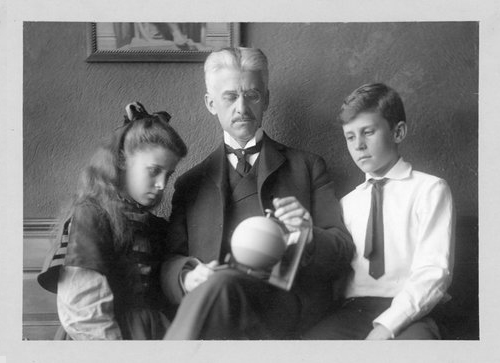
Albert Munsell, the Father of the Color Science Kids, Margaret and A.E.O.

He filed for a patent in 1899 (US Patent 640,972, A Color Sphere and Mount) for a color sphere, which was a globe, with the rainbow colors painted around the equator, with gradations of those colors mixed with white heading up to the North Pole, and with similar gradations mixed with black in the Southern Hemisphere. Quoting from his patent: "The object of my invention is to provide a spherical color chart for educational purposes." In addition, Munsell filed for a patent for a Spinning Top in 1902. One could affix colored cards to the spinning surface of the top "for the purpose of producing novel color effects". It sure sounds like Munsell was in the business of color edu-tainment to me!

Munsell's Color Sphere (left) and top (right)

He worked toward standardizing the teaching of color. In 1904, Munsell started working with teachers in Boston on a primer for teaching color in grades 4 through 9. Munsell developed a set of 22 crayons in 1906. This line was eventually added to the set of Crayola crayons sold by Binney and Smith. In 1917, the Munsell Color Company was formed to sell art supplies to schools.

Who doesn't remember the smell of a fresh box of these crayons at the start of the school year?

Incidentally, the word crayon dates back to the mid 1600's. It was Alice Binney, the wife of founder Edwin Binney who coined the word crayola, a conjunction of the prefix cray- from crayon and -ola, which means oleaginous (oily). This suffix was popular for products in the day: Mazola, granola, Victrola, and of course, Shinola. Now that you read that, don't let anyone tell you that you don't know cray from crayola!  

So, does this qualify Albert Munsell for the title of Father of Color Science? While his work was impressive, sadly, I don't think he deserves the title for these efforts.

Not to malign the guy, but Albert was not the only evangelist for proper color education at the turn of the last century. A gentleman by the name of Milton Bradley was another early chromo-vangelist. Yes. That Milton Bradley. The guy who invented the Game of Life, Operation, Battleship, and  of course Candyland. Ohhh... the late night Candyland parties we used to have when I was in college!

Bradley's colored paper samples

In Bradley's book Elementary Color he describes the Bradley System of Color Instruction, which aims "to offer a definite scheme and suitable material for a logical presentation of the truths regarding color in nature and art to the children of primary schools." The third edition of this book was published in 1895, a few years prior to the start of Munsell's colorful evangelical career. 

By the way, I should mention that Milton Bradley filed for an patent for a Color Disk Rotating Mechanism in 1893, and for a Color Mixing Top seven years before Munsell's filing for a color mixing top. To add insult to injury, Bradley developed a line of crayons in 1895, and had a business relationship with Binney and Smith for a few years, starting in 1905.


My ruling so far is that Albert Munsell is, at best, one of two Godfathers of Color Science Education. Stay tuned for the next blog post, where I investigate whether Munsell invented the three-dimensional color space!

Would you like to hear me rehash this topic in the same dreary and boring manner, but with the benefit of my dull and boring voice? Live? With the opportunity to heckle me with questions??? Sign up for the ISCC webinar.

Tuesday, January 16, 2018

Statistical process control of color, a method that works

I have preached quite a bit about the shortcomings of many methods for statistical process control of color data. I reference all the previous blogs at the end of this blog post, just in case you missed them. My take on the topic can be summarized by an anecdote about President Coolidge. After attending a church service, he was asked about the topic of the sermon. "Sin." The followup question was to ask what the minister had to say about sin. "He was against it."

It's time to unveil my technique.

Looking at magenta

Magenta is an interesting ink. It is well known that as you increase the ink film thickness (or pigment concentration), it will change in hue toward red. I know for a fact that this is well-known, since I blogged about the hue shift of inks before. After all, anyone who is anyone reads my blog. 

(Magenta is not such an odd duck, when it comes to colorants. Cyan ink is another printing ink that has this hook. I know from the physics of color that there are a lot of colorants in other industries that will do this same thing.)


The red ellipse in the diagram shows the area of the magenta ink trajectory where magenta is normally run. There are two aspects of this plot that might be disconcerting.

First, the ink trajectory is curved. One might therefor expect that the normal variation in color might wind up being shaped like a kidney bean, rather than a nice ellipsoidal jelly bean. Or maybe... I shudder to think of it... like a cashew! 

Why is this a concern? The idea of SPC is based on being able to tell the difference between typical  and atypical behavior. Ellipsoids are kinda easy to describe mathematically, so it is kinda easy to tell what is inside the ellipsoid and what is outside. I searched through my copy of the NIST Handbook of Mathematical Functions. The word cashew does not appear.

Second, it is clear that, even if the scatter of points for magenta in L*a*b* can be suitably approximated by an ellipsoid, the ellipsoid is not tilted toward the origin, as was the example of yellow in from the previous blog post on this topic.

Whether or not the first issue is a true matter of concern depends upon the amount of curvature present over the range of typical variation, and also the magnitude of other contributors to the variation. I will provide one example of the variation of magenta ink where the hook is not a problem. We shall see in this analysis that the odd direction of the tilt of magenta doesn't make a bit of a difference.

Magenta variation in newspaper data

I spoke before about a data set of test targets printed by 102 newspaper printers. One hundred printers, each printing 928 patches, with (in particular) two magenta solid patches on each one. The image below shows the variation in a*b* of all the solid magentas. 

You will note that it is kinda elliptical, with a decided tilt that is not toward neutral gray. Kinda what we would expect. Just visually, I can't see any sign of kidney-beaning. This, despite the fact that the variation is quite large, something like 10 ΔE from the two extremes. Then again, the other variations may just be doing a great job of hiding any curvature that is present. At any rate, I am going to make the bold assertion that we are not going to be making any beans and rice with this data set.


Below is 3D view of that same data. The height axis of the plot is L*, from 40 to 70. The (mostly) right to left axis is a*, from 30 to 60. The front to back axis is b* from -15 to 15. 


Note that the ellipsoid is not only tilted kinda away from neutral gray, but it is also tilted downward, which makes sense, I guess. As you make the ink richer in color (more pigment) you also make it darker.

A note about the image above. You should see an animation, with the set of points rotating around. If the animation isn't working, try a different browser, or try downloading the image and displaying it with some other app.  I found that Microsoft Office Manager and Paint did not display the animation. Microsoft Photos, Internet Explorer, and Windows Media Player do.

Once again, I don't have much of a problem saying that this data resembles an ellipsoid. At any rate, it looks a lot more like an ellipsoid than a box, which is the assumption that is made if we separately analyze ΔL*, Δa*, and  Δb*.

Previous blog posts

Here is the first post in a series of four blog posts about the futility of using ΔE for statistical process control. The first post ends with a link to the second in the series, and so on. 

I wrote a more recent blog post that looked at a common process management tool, the cumulative relative frequency plot (CRF) with ΔE data. Again, I gave some warnings about trying to make much out of the shape of the curve.

Then I wrote a post about the practice of applying SPC on ΔL*, Δa*, and  Δb*. My conclusion is that this is better in some cases, but there are some very reasonable distributions of color data where the method falls apart.