Showing posts with label deltaE. Show all posts

Tuesday, July 11, 2017

Munsell and the deltaE

I want to correct a common misconception. Well, by "common", I mean that I once had this misconception, and was embarrassingly corrected for being so foolhardy. I may even have blogged on this silly notion. People say that 1.0 DE is a just noticeable difference. That's not exactly the intent. 

There are three concepts that are very closely related to the DE color difference:

    1. The smallest change in color that we are able to perceive.

    2. The acceptable difference in color in manufacturing.

    3. The even spacing of colors intermediate between two other colors.

In this (soon to be) highly acclaimed series of blog posts, I will look at how each of these concepts intertwine when we talk about the difference between two colors. I will start with the third concept.

These two colors are just under two inches apart

What is a DE?

The term DE is a strange lexicographic combination. It started with the Greek letter, D (pronounced delta). This has been used by math and engineering folks to stand for difference, usually for a small difference. The second letter is the first letter of the German word Empfindung, which means sensation. So, this lexical chimera literally means difference in sensation. It is defined as a unit of measure of the difference between two colors.

The idea of DE as a measure of color difference dates back to the introduction of the CIELAB color space in 1976. But I get ahead of myself.

Munsell and perceptual uniformity

It really started with Albert Munsell and the Munsell Color System, which was developed in the early 1900's. Munsell provided a color atlas, which was a book with a zillion colors in it. By comparing your color swatch against those in the book, you could give a unique and unambiguous identifier to any color. This was a big leap past "I want my walls to be a lighter shade of apricot, but so so beigey". As you will recall from Munsellology 101, Munsell defined the lightness scale to have ten evenly-spaced steps.

I wrote another whole blog post on the idea that our perception of color is non-linear, and the need and difficulty of finding a way to measure how close one colors is to another. These blog posts just go on and on!

Munsell put a great deal of time and energy into making his color space uniform. Each step in color was the same size. Or put another way, for every set of three adjacent colors, the one in between is halfway between the two outer colors.

The image below is a dramatic reenactment of Albert Munsell putting together a uniform set of colors between gray and burnt orange. In the first step, he created one color between gray and burnt orange. Maybe he started with a 50-50 mixture of the gray and burnt orange pigments and then tweaked from there? When he got a color that he felt was halfway between, he probably jotted down the recipe for this midpoint color; how much of each of the pigments was required to make that color. Then, he stepped back and looked at it. He decided the steps were too big.


Next he tried putting two colors in between the gray and the burnt orange. The result is shown in the second row of the image below, with a ramp of four colors. He use the recipes for gray, burnt orange, and for the previous midpoint as a starting point. Maybe he used some math to interpolate the recipes? He certainly had to do some iterating, since not only does color 2 have to look like it's halfway between colors 1 and 3, but color 3 has to look halfway between colors 2 and 4.

Again he stepped back, and said "the steps are still too big".

I have taken this process to five and to six gradations from gray to burnt orange. Munsell won this contest. He got 12.

This work culminated in the publishing in 1913 of the Atlas of the Munsell Color System, which was a big book with a zillion color patches. If a designer on the West Coast and a printer on the coast of Lake Michigan both bought a color atlas, they could accurately communicate color over the phone by referencing the book.

The Munsell Color Atlas is still available today, albeit under a different name

Now for the boring history lesson

I put this section in to convince skeptics that I really and truly did my homework when I say that the size of a DE, be it the 1976 formula, or a newer formula, is based on the work of Albert Munsell.

In 1933, Munsell, Sloan, and Godlove published a formula that approximated a conversion from tristimulus Y values to Munsell neutral value scale. The Munsell in this trio was Alexander Munsell, not to be confused with bis father, Albert Munsell. I might add, the acronym of this formula is not to be confused with a flavor enhancer that has erroneously been blamed for the hypothetical Chinese restaurant syndrome.

The MSG formula and the MSG formula

The 1933 effort gave the waiting world a formula for the lightness axis, but not for the chroma and hue axes of the Munsell Color System. That work was left to Eliot Adams in 1943. He applied the Munsell-Sloan-Godlove formula to all axes.

In that same year (1943), Newhall, Nickerson, and Judd put a great deal of effort into cleaning up the Munsell system, introducing what amounted to a look up table to convert from Munsell units to tristimulus values. The table is called the Munsell Renotation Data. Their paper included an equation to compute the Y tristimulus value from the lightness component of the Munsell system, which is called value. This equation was a fifth order polynomial. Note that the input to the equation is the Munsell value, and the output is the tristimulus Y value.


Dorothy Nickerson later (1950) merged her own work (the fifth order polynomial) with the work of Adams (a color space) to form a color space which became known as the Adams-Nickerson color space, also known as ANLAB. Very popular at the time. MGM produced one of their big theatrical movies about it, but unfortunately, the era of big production musicals was rapidly waning before the movie took off.

Busby Berkeley's rendition of the ANLAB color space
failed because it was in black and white

The use of a fifth order polynomial allowed for a close fitting of the data, but it caused some problems if you tried to go the other way, that is, from tristimulus to Munsell. (Us math guys call this a trap door problem.) The problem was dealt with by an approximation to the polynomial given in a 1958 paper with the catchy title Cube-Root Color Coordinate System from Glasser, McKinney, Reilly, and Schnelle,  This paper proposed a set of formulas where cube roots are taken of the XYZ values. The cube root function is readily invertible. Coincidentally, I was born in that same year. I am also invertible.

Glasser's cube root formula

The cube-root color coordinate system was modified a bit by the CIE (Commission Internationale L'Eclairage in French, or International Commission on Illumination) when they met in London in 1975. The modification (due to Pauli) replaced the cube root with a straight line below about 1% reflectance. This became CIELAB, also known as L*a*b*. To finish connecting the dots between Munsell and color difference, the official definition of DE is based on CIELAB.

CIELAB L* formula

The original Munsell color space had only ten levels of lightness. CIELAB L* goes from 0 to 100. Somewhere along the way, someone decided that it would be more convenient for there to be 100 shades of gray.

Thus, we see a straight line connecting the Munsell equally spaced color space with the CIELAB color space. Perhaps not all that straight; the path goes directly through at least five papers with a total of eleven authors. I have not counted the number of slightly less direct authors and papers that contributed along the way.

But, the preferred color difference formula today isn't the original DEab (the more precise name for DE). As of 2010, the recommended formula is DE00. Let me provide a little known fact: The DE00 color difference in the L* and in the b* directions at the very center of color space is the same in DEab and DE00. Big shocker: DE00 was scaled so as to agree with DEab at the point {50, 0, 0}. Even DE00 traces back to Munsell.

Just in case you missed it, I blogged about the various color difference formulas before (including DE00). And in case you missed a more recent blog post, in a future blog post I will answer a reader's question about how big of a color difference might be allowable for printing.

For values of L* other than L*=50, the conversion to DE00 is not one-to-one. As a result, there somewhat less than 100 levels of lightness. I count 76 shades of gray.


So, long story short, the size of a DE color difference is based on the Munsell Color System, which is all about uniform spacing of colors. 1.0 DE00 is one of 76 perceptually equal steps between pure black and pure white. That's my story, and I'm gonna stick to it. At least until my next blog post on the subject.

Wednesday, November 20, 2013

What difference does it make? (part 2)

Let's see... where did I leave off in part 1?  Our hero, Albert Munsell left us with a posthumous challenge. He developed this wonderful color space -- a way of organizing crayons [1] -- which has for some strange reason become known as the Munsell Color System. This is one of the oddest things I have ever seen in science history, by the way. One of the basic rules in the history of science is that you never name something after the person who invented it!


The wonderful Munsell Color Space had this wonderful trait that it is "perceptually linear". Well at least mostly. The thing is, there was a lot of effort put into making sure that pairs of colors that are adjacent kinda felt like they were the same distance apart as any other pair of adjacent colors.

But, the Munsell color space is not measurable, that is, I can't just put a color meter on an object and have it tell me the position of that color in Munsell units. So, they invented CIELAB -- but it did not quite have that perceptual linearity that Munsell had bragging rights to. If you took a one unit step in any direction from a given point in CIELAB space (that is, from one color), it probably wouldn't look to be the same size as a one unit step away from some other color. Also, a step in one direction (like in the direction of higher chroma) may not look to be the same size as a step in another direction (like in the direction of a slightly different hue).

So, what's a color scientists to do!?!?!

Taming of the ΔE

As I write this, I am sitting in a hotel in Hong Kong, sipping on a Coke that I bought for the alarming sum of 32 dollars (Hong Kong dollars, mind you). My wife is currently back home. For the sake of the discussion, let's say that she is in a bar in Wisconsin, listening to reggae music [2]. Also for the sake of the discussion, let's say she is also drinking a Coke, for which she paid four dollars. And let's say that my buddy Dave, who lives in Sweden, is drinking a Coke that he paid three euros for. And let's say that my buddy, Steve, in England is also drinking a Coke that he got for 2.50 pounds. While the absolute numbers are different, for each of us, the perceived cost is about the same. All of us are getting equally ripped off for drinking carbonated sugar water. 

Such it is with the adjustment that has been done to color differences. I don't mean that we are getting ripped off when we order a color difference margarita, but that there is a local exchange rate that is used to convert between actual numbers and perceived cost.

Let me 'splain a bit more about the details of that local exchange rate.

Enter CMC

CIELAB came along with a method for determining the distance between two colors. It is called ΔE. Technically I should say that it was called ΔE. Now, it's called ΔEab to distinguish it from its antecessors, which we will enumerate shorthly. ΔEab is computed in the normal Pythagorean way with all those hypotenuses and square roots and all that. It's just the distance that you would measure with a tape measure, as if the colors were all laid out in a physical model of color space. Don't let anyone tell you it's more complicated than that. A ΔEab is defined as one step in any direction, and was originally intended to refer to one "just noticeable difference".

The error in ΔEab assessment of color difference can be generally characterized by saying that higher the chroma (richer color) the larger the overestimation of a color difference. R. McDonald noticed this in 1974, and proposed a fairly simple method to correct ΔE values. I don't know this for sure, but I believe McDonald worked for J P Coates Thread Company [3]. This work all lead to ΔEJCP79.

In Old McDonald's formula, the differences in L*, a*, and b* are first converted into ΔL, ΔC, and ΔH. These represent the difference in lightness, in chroma, and in hue. I show below ΔC in green, and ΔH in red.


This is where my Hong Kong dollar analogy comes in. These three differences are then scaled, each according to the position of the colors in CIELAB space. The scaling is shown below. I didn't bother to show how to compute SL, SC, and SH, mainly because I'm lazy. 

The ΔEJCP79 Color Difference Formula

This formula was from 1979. But that gosh darn McDonald kept working on this formula. He, along with Clarke and Rigg, published a modification in 1984. This modified version was standardized in 1986 by the Colour Measurement Committee of the Society of Dyers and Colourists. They named it after their own group: ΔECMC.

The formula embodied a few general ideas that are summarized in the artist's conception shown below. First, the collection of all colors that are viewed as being "too close to tell the difference between" are described by an ellipsoid in CIELAB. Second, those ellipsoids get more elongated as you move away from a neutral gray color. Third, all the ellipses are tilted about the neutral axis, that is, they point to a* = b* = 0.

Artists conception of CMC just noticeably difference ellipses

This color difference formula has been successful. According to a recent poll by IDEAlliance, ΔECMC is currently the most commonly used color difference formula in the print industry, with 45% of the respondents saying this was the formula they used to specify color tolerances.

The menu gets longer

The CMC formula was updated in 1987 by Luo and Rigg and called the BFD color difference formula. Don't ask what me what BFD stands for, cuz I don't know. But it's probably not what you are thinking. For some reason, BFD never took off. Maybe because people thought it was not a Big Friggen Deal?


Then came ΔE94, which was accepted as a trial standard by CIE in 1994. This color difference formula is a simpler version of the CMC formula with similar performance. The CIE, by the way, is a standards organization which fits under the ISO standards umbrella. The name stands for International Commission on Illumination. For those of you who noticed that "Illumination" does not start with the letter "E", note that the committee goes under the French name Commission Internationale de l'Eclairage.

Dong-Ho Kim wrote his PhD dissertation in 1997 on yet another color difference formula. Excuse me... I meant colour difference formula, since his work was done at the University of Leeds in England. The formula was known as LCD for Leeds Colour Difference.

Like BFD, Dr. Kim's formula never got taken to the prom. Perhaps he didn't have a good publicist? Or perhaps his work was overshadowed by the work of the ISO committee TC 1-47, which published CIE 142-2001. This document introduced ΔE00 which is also known by the euphonious name "CIEDE2000".

The CIE was a bit circumspect about this formula. The document describes a recommendation, and not a standard. "A period of use, testing, and reporting by the user community will precede a determination on whether to make the new method a standard."

Now, I don't want to say the formula for ΔE00 is ugly, but let's face it. When it was born, the doctor slapped it's mother. This formula gives Stephen King nightmares. Seriously, the formula is complicated enough that I have had two different people send me spreadsheets to debug. There is an oft referenced paper that provides a data set for testing implementations of the formula.

From the standpoint of an applied mathematician, I honestly worry about all the fitted parameters. To understand why this is a concern, have a look at my blog post on when regression goes bad. Still, the standards group in the printing industry, TC 130 (which I happen to be a member of) recently ratified this as the color difference formula of choice.

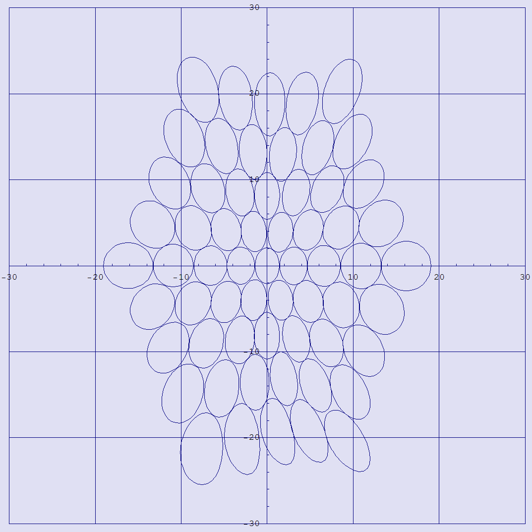
Remember how ΔECMC gave us ellipses for just noticeable difference, and that the ellipses all pointed toward the neutral point? CIEDE2000 gives us quasi-ellipses which sometimes don't quite point to neutral.

Quasi ellipses, shown in a*b*, all of which have radius of 2 ΔE00

To recap, we have ΔEabΔEJCP79ΔECMC, ΔEBFDΔE94, LCD, and ΔE00. Seven color difference formulas, arranged in chronological order, with every other one catching some users along the way. (I am guessing that the next ΔE formula won't be shopping for a prom dress any time soon!) Which one is best? Generally speaking, the last formula, despite it's distinct lack of pulchritude and parsimony, agrees better with psycho-physical testing. The CIE has gone from it's original stance of "suggested formula" to "standard formula".

What about a uniform color space?

Remember my analogy about Hong Kong dollars? Wouldn't it be nice if we had once single currency that applied to colors everywhere in color space? If we could somehow warp color space so as to match human perception, life would be so much easier. Or so I think.

One problem that would go away is the so called "which color do I use to define my ellipse" problem. I glossed over this problem when I introduced ΔECMC, but consider this: with ΔECMC, the color difference between color one and color two is generally not the same as the color difference between color two and color one. In this formula, the first color is always used to "calibrate the ruler" for measuring color difference. ΔE00 solved this problem by defining an imaginary color midway between the two colors you are comparing.

Another fall of the "which color do I use to define my ellipse" problem is that ΔE00 has a warranty of 5. It is not recommended for color differences greater than that.

Really, what we want is not a way to distort ΔL*, Δa*, and Δb* values for any particular color, but rather a way to distort the whole color space so that the whole Pythagorean thing works. Apparently, I am not the only person who had that thought. Here are some folks who have entered the sweepstakes for the best uniform color space:

Labmg (Colli, Gremmo, and Moniga, 1989)
ATD (Guth, 1994)
DCI-95 (Rohner and Rich, 1995)
LLAB (Luo, Lo, and Kuo, 1995)
??? (Tremeau and Laget, 1995)
CIECAM97 (CIE standard, 1997)
RLAB (Fairchild, 1998)
IPT (Ebner and Fairchild, 1998)
L*’a*’b*’ (Thomsen, 1999)
DIN99 (DIN standard 6176, 2000)
CIECAM02 (CIE standard, 2002)
QTD (Granger, 2008)
LEaEb(Berns, 2008)
LAB2000 (Lissner and Urban, 2010)

Wow. I think this just goes to show ya. People want this uniform color space, but it's not a simple task to come up with one. One can only hope that some dashing young math guy will one day come up with a simple equation that gives us a uniform color space. Just think of the fame and fortune that this guy will receive!

---------------------------
[1] Interesting point of history here: Munsell developed a set of crayons. The rights to these crayons were purchased by Binney and Smith in 1926 to augment their Crayola line of crayons. I assume that most of my readers have heard of these.

[2] For those who are not familiar with Wisconsin, this is one of the few states where there are more bars than churches. The majority of these bars will be featuring a reggae band. I may not have this exactly correct, but someone once told me that their brother heard that Wisconsin is known as the reggae capitol of the Midwest.

[3] A thread company? Really? It may seem odd that this guy is doing color science, but consider the importance of color when looking at thread, especially when it comes to accepting a batch of thread as being the correct color. This work all lead to JCP79.

Wednesday, November 6, 2013

What difference does it make? (part 1)

I want to talk about the difference between two colors, but I need to lay some background first. This background is useful for understanding how we got ourselves into such a nice mess.

Albert Munsell, jealously guarding this cool little color toy
from two envious kids [1]

For the purposes of this blog post, I am going to say that Color Science (with capital letters) began with the work of Albert Munsell just after the turn of the last century. I call him the Father of Color Science, and I think I can get away with affixing that moniker to him because:

1. If he were alive today, he would be 155 years old, and there is still a book of his available: The Munsell Book of Color. The 2010 edition is available for the low, low cost of $994.75.

2. The Rochester Institute of Technology has a building named after him, "The Munsell Color Science Laboratory".

3. He has his own friggen' website: http://munsell.com/. At 155 years old? Complete with a blog! Although I suspect that some of his more recent blog posts were by ghost writers.

I have blogged about the Munsell color space before, in a marvelous post entitled Organizing Your Crayons. That incredible blog post gave a superficial understanding of value, hue, and chroma. That task of organizing crayons was already a pretty cool thing to be known for. But I neglected one of the really big things that he did: perceptual linearity. The colors in Munsell space are organized so as to be equally spaced according to the eye. 

The world's most attractive color space supermodel,
clearly enjoying her experience with the Munsell Color Space

This was a monumental undertaking, and the undertaker was none other than Albert Munsell. Painstakingly, he mixed colors in all combinations, at each step trying to find mixtures exactly half way between two colors. His ultimate goal was to organize colors in a way that is visually uniform. The result was the best-selling book "Atlas of the Munsell Color System", first published in 1915.

Four pages from the Color Atlas

Our messed up perception

I'm gonna ponder a bit about our perception of difference. Imagine getting a raise from $10 per hour to $10.50 per hour. Not a bad raise, right? 5%? Compare that to getting "that same raise" -- of $0.50 per hour -- if you are making $50 per hour. That's only a 1% raise. The skinflints! This example shows that our perception of salary and money is not linear. We think in terms of percentage of change. A mathematician (or an engineer who remembered her math) would say that our perception of the size of a raise is logarithmic. 

Our perception of loudness is also logarithmic, so we measure sound pressure in a nonlinear scale, decibels. Each step of ten in decibels represents a factor of ten in energy. Each step of one decibel is about a 26% increase. Our perception of musical pitch is also logarithmic, so we "measure" pitch in a logarithmic scale that we call musical notation. Each key on the piano is roughly 5.9% higher in pitch than the one just to the left of it. (Want some more math about the frequency of notes on a piano?)

The brightness of stars and the intensity of earthquakes are also measured on a logarithmic scale. The general rule that all of our perceptions are logarithmic is known as the Weber-Fechner law. The law is named after Weber and Fechner, by the way.

The same law applies more or less to our perception of color. Let's say that we give someone a pile of little tiles with different shades of gray, and ask them to find the gray tile that is half way between pure black (0% reflectance) and pure white (100% reflectance). What would the reflectance of the mid-gray be? You would think that it might be pretty close to 50%, but not so. The preferred choice is somewhere around 20%.

Nonlinearity in the chromaticity diagram

Now I'm going to take back what I said about Munsell being the father of science. Lord Kelvin (AKA James Thompson) said this about science: "When you can measure what you are speaking about, and express it in numbers, you know something about it, when you cannot express it in numbers, your knowledge is of a meager and unsatisfactory kind; it may be the beginning of knowledge, but you have scarcely in your thoughts advanced to the stage of science."

Munsell provided us with a fancy book with lots of pretty colors. He gave us a three dimensional ordering system that allowed us to uniquely specify every color in the world. I guess you could say that his three attributes are the expression in numbers of color, but I could argue either way about whether he truly provided us with a way to measure color. 

The genesis of the color measurement work came in the late 1920's and early 1930's. W. D. Wright and J. Guild (whose first names are doomed to be lost in the annals of history) performed experiments to measure the spectral response of the human eye. The culmination of that work resulted in "the standard observer" functions that were standardized in 1931. Applying this standard to spectrometer data, we arrive at the beloved X, Y, and Z tristimulus values that define the color that the human eye sees.

This was all well and good, and everyone was justifiably excited. But when the champagne had gone flat and the helium balloons lost their buoyancy, they realized that the tristimulus values were just not intuitive. The numbers did not readily relate to our intuitive understanding of hue, value, and chroma. 

The diagram below shows one early attempt at relating these numbers to something intuitive. The x axis is the x tristimulus value, and the y axis is the y tristimulus value. The brightly colored overlay shows a rough mapping of these numbers into our perception of colors.

The chromaticity diagram, showing the MacAdam ellipses

Another deficiency of the chromaticity diagram is illustrated by the "MacAdam" ellipses on the chart in the above diagram. These ellipses represent the range of tristimulus values that we would perceive as being the same color [3]. Anything within those ellipses looks the same.

Munsell provided us with a color space that had this wonderful property of perceptual linearity. Beyond just being cool, this property is of practical importance. While it is important that we can say "if two objects have the same XYZ values, then they are the same color", it is even more important to be able to specify how close to the same XYZ values that they need to be in order for us to perceive them to be the same color. And even more important still is the idea of being able to quantify when a measured color is acceptably close to a target color.

Attempts to rectify the situation

The challenge was taken up by many researchers. The goal was basically this: to find a mathematical transform to convert XYZ tristimulus values into a color space that looked like the Munsell color space. Richard Hunter, in his book The Measurement of Appearance provides a handy summary of the work that went into this effort between 1931 and 1976. I recommend printing this image off and tacking it to the wall in your office. I am sure that you will find yourself frequently referring to it.

A family tree of color spaces
(Stolen with neither malice or remorse from Hunter's book)

As you will see, the culmination of this work came in 1976, with the standardization of the color space called L*a*b*. This is a natural point for Hunter to end his color tree, since this book was published in 1975. How he came to know that L*a*b* would become a standard the year after his book was published is a mystery to me. He must have had some inside information.

L*a*b*, AKA CIELAB [4], did a good job of capturing the essence of the layout of the Munsell color space. The L* value correlates moderately well with Munsell's "value" axis. The a* and b* values can be translated quite easily into analogs of Munsell's hue and chroma. A mathematician (or an engineer who remembered her math) would be immediately reminded here of the arctangent function. 

L*a*b* also came along with a reasonably simple way to express the difference between two colors. If you lay out two colors on a three dimensional grid, you can use a tape measure to determine the distance between two colors. A mathematician (or an engineer who remembered her math) would recognize the Pythagorean theorem in this. 

The L*a*b* values are scaled so that one step in any direction corresponds to a "just noticeable difference" in color. This step is referred to as a ΔE (read as delta E). Unfortunately, a ΔE does not do a great job at predicting color difference. For example, a step of 5.0 ΔE in the direction of making yellow a more saturated color is just barely noticeable. A step of 0.5 ΔE in any direction around a neutral gray is noticeable.

As another example of the disparity between ΔE and our actual perception of color difference, one brilliant researcher devoted an entire blog post to counting the number of discernible colors. An entire blog post! Can you imagine that?!?!? When counted in L*a*b* space, there were something over 2 million. But the real number is somewhere closer to only 346 thousand.

What was needed is a more accurate way of expressing color difference. That's the topic of the next part in this series.

-----------------------------------------
[1] I need to be fair here. Albert Munsell was a brilliant man who devoted his life to understanding color, and to teaching kids about color. 

[2] At least that's the way they look on my monitor. Like most computer monitors, mine is not calibrated, so I can't really be sure what the ramps will look like on your monitor!

[3] Technically, the ellipses are drawn at ten times that threshold of just noticeable difference.

[4] These are the only correct names for this color space. They are routinely called Lab or CIELab or even LAB. These are all incorrect and naughty. Note that Hunter invented Lab, so it is just plain wrong to call CIELAB by this name. Wrong.