The Gedanken
I have found that using German words is an effective way to demonstrate my superiority in any scientific endeavor. Hence, I like to say gedanken a lot. It means thoughts, so a gendanken experiment is one that your just think the experiment through without having to waste all that time and expense doing any real experiment.
I picked two crayons at random from my crayon box. As it would happen, one was orange and the other was blue. What color is halfway between the two? That's the gedanken experiment. Admittedly, the question is a tad silly, but I am going somewhere with this.

I have a bunch of answers for you!
Crayola-speriments
The first, and obvious answer comes from using crayons as they are intended to be used. Note that we have extended beyond the gendanken experiment into the verum mundi experiment. (That's Latin for either real world or John the Math Guy is uber-cool.)
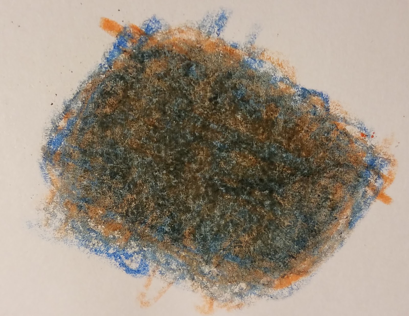
Orange and blue crayons, colored overneath each other
I dunno what color that is, but I am gonna call it muddy green. My wife, who is the reigning Queen of Chromolinguistics in our house, calls it orangeish tourquoise tealish gray. The color is hard to parse because we can see many colors. In some places, we can see the orange peaking through. In others, the blue, and we even see a few tiny spot of white. And of course we have a lot of places where the two colors are atop one another. They are mixing together in much the same way that halftones of printing inks mix. I wrote a four part trilogy of blog posts about the math behind that!
Not content with an experiment that could be performed by a kindergartner, I took it to the next step. I melted the two crayons in a beaker, and poured the mixture into a blob on a piece of paper. The image below documents my experiment. The resulting blob is black. The Queen of Chromolinguistics concurs.

Orange plus blue is the new black.
Let me pause for a moment. Why did they make black?
Both of the crayons were rich colors, at least until they were united in crayholy matrimony. The orange crayon is rich orange because it absorbs most of the light in the blue and green parts of the spectrum, and reflects practically all of the light in the red and yellow portions of the spectrum. The blue crayon is rich blue because it absorbs most of the light from green to yellow to orange to red. Between the two crayons, they gobble up the whole rainbow. We call this a subtractive mixture of the colors.
So far, I have two answers to the question of what color is halfway between orange and blue: 1) orangeish tourquoise tealish gray (AKA muddy green), and 2) black.
Before I forget, I used a cup warmer to melt the crayons in the beaker. Here is a picture of the box that the cup warmer came in. Note how my previous use of the German word gedanken works along with the German text on the box to subliminally suggest the hyper-intellectual image that I am desperately trying to project of myself. I mean, we all know that Germans are way smarter than us Americans.

Monitorology
The next most obvious way to find the halfway point between orange and blue is on a computer monitor. I created three squares. The rightmost square is the closest approximation to the orange crayon that I could get on my computer monitor. The RGB values are 254, 97, 0. Admittedly, the match was not all that good. Rather than immediately jumping to a conclusion about my computer skills or lack thereof, let me say this: You cannot create all colors with a computer monitor which mixes red, green, and blue light. Orange is one of those colors which is outside the gamut of most computer monitors. Not my fault.
The square at the right is a rich blue that is a fair approximation to the blue crayon, with RGB values of 0, 32, 96.
The square in the middle is the average of the RGB values: 126, 64, 48. I would call this color chocolate milk. The Queen of Chromoliguistics calls this cocoa, and there is harmony in our household.
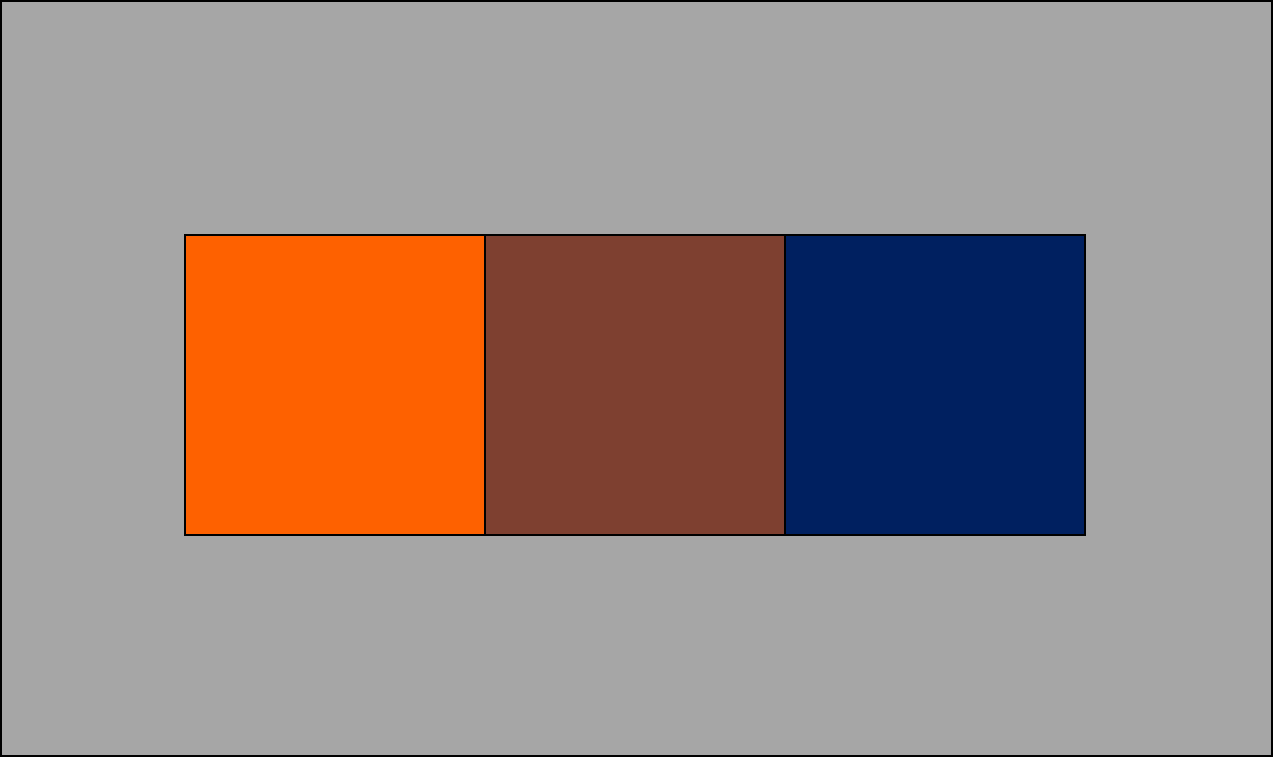
I guess maybe I could talk myself into believing that this shade of brown is the halfway point. Maybe? I dunno. Whatever... this is an additive mixture of orange and blue. The light from the monitor is adding together.
I will take one more shot. I averaged the RGB values to get chocolate milk. There is another color system in my computer which is called HSL. This stands for hue, saturation, lightness. HSL is a bit more akin to our perception of color than RGB. The middle square in the image below has the HSL average of orange and blue. I think this is a shade of green. The Queen of Chromolinguists calls it "between army green and forest green". Harmony.

Why green??? Think about the rainbow: ROYGBIV: red, orange, yellow, green, blue, indigo, violet. The colors yellow and green come between orange and blue. Yellow is such a tiny slice of the rainbow that I could rationalize that the halfway point could be green. So, green is a reasonable halfway point in terms of hue.
In terms of saturation... well, orange and blue are both pretty darn saturated, so I would want an equally saturated color as the halfway point.
Finally in terms of lightness... orange is a bright color and blue is a dark color. If I had my druthers, I would rather have a halfway color that is a bit lighter.
But, all in all, I think the dark green is not a bad representation of the color that is halfway between orange and blue. Well, if I tilt my head on its side and squint. While chewing on a lemon. This is a perceptual mixture of two colors.
CIELAB
But, I am not done yet. The circle below is based on CIELAB, voted the most popular color space of 2013 by a group of retired fourth grade schoolteachers. If we just draw a line from orange to blue, and bisect it, we get the color in the small circle, which is kind of a mauven color, ideal for any color mavens.

I used color space kinda stuff to give two different answers. This answer differs computationally from the green answer in that the first was determined by finding the midpoint in hue angle. The approach in this answer don't know nuthin' about no hue. To the math geek, the previous answer was computed from color space with cylindrical polar coordinates, and the second is computed from Cartesian coordinates.
CIELAB 2, going 'round t'other way
It's interesting that I got two answers that are diametrically opposed to one another. The drawing below illustrates why this happened. The halfway point between orange and blue can be determined either by going clockwise from orange to get something in the purple family, or by going counter-clockwise to get something in the green family.

Silly answer
How about one more? Here is a culinary mixture of orange and blue.

The definitive mixture of orange and blue
Recap
I asked a deceptively simple question: what color is halfway between two others? And when I say deceptively simple, I mean really hard. When I am finally granted a professorship at the John the Math Guy University of Color and Karaoke Sciences JMUCKS, I will use this question on a final exam. It's a great exam question, since I could arbitrarily pick one of the six reasonable answers as the correct one, and then mark everyone else's answer wrong.

Will the real halfway point between orange and blue please stand up?
From the standpoint of color science, the army-forest green or mauve answers are the most defensible. Color is not a physical entity. It really only happens in the brain. By use of the word color, I have limited the scope to answers that relate to our perception of color.
Munsell
It is hard for me to write a blog about color without mentioning Albert Munsell. When I die, I want to come back as Albert Munsell.
Munsell did the experiment that I just described. He spent years doing various sets of colors. I don't know for sure which pairs of colors he chose to work with -- I was out getting my nails done every time he brought out the paints. But, I presume he didn't choose the intuitively different colors orange and blue. More likely, he found the halfway point between things like shades of orange, mixed with either white, black, or gray. I show below one of the tests that he may have made.

Which color is halfway between burnt orange and gray?
He didn't just mix one part burnt orange with one part gray and call that the halfway point. He selected the halfway point by eye. In the end, Munsell had plates like the one below, only with heaps and gobs more colors.

His color space has uniform perceptual spacing. I may need to expound on that in another blog post.
Can you average the wavelengths of the two colours? Oh right, some colours don't have wavelengths. Colour is weird.
ReplyDeleteAl had me at uniform perceptual spacing.
ReplyDeleteStephen, Each color does have an officially defined "dominant wavelength", which is determined through the chromaticity diagram. So average wavelength is a precisely defined thing, and a meaningful answer to the question.
ReplyDeleteWell... a partial answer, anyway. You need three attributes to define a color. The other two might be (for example) the richness of the color and the lightness.
How do you define the wavelength of colours like magenta (the non spectral ones)?
DeleteA picture would be a good way to explain that. Since I can't upload a picture to the comments, I will write a short blog to answer the question!
DeleteFuncolors,
ReplyDeleteYeah... I know that you and Al go way back! Romance in the Land of Colors is sweet.
Actually, there is a real-world solution to this question. Ever watched a cloudless sunset that is definitely orange on the horizon and definitely blue in the sky above? The best word I can use to describe the colour in-between is beige, which is a very light brown. So it goes from orange to beigey orange to beige to light dull blue ("beigy-blue") to blue.
ReplyDeleteWhen someone sees a thing of beauty and they start to think of the science behind it, rather than just take in the splendor -- that person is a geek! I have often pondered the same thing when beholding that gradient between sunset orange and sky blue. :)
DeleteHere is an example of a orange to blue gradient sunset: https://c2.staticflickr.com/8/7063/6779012556_13de274551_b.jpg
ReplyDelete