Tuesday, July 25, 2017

Is 1.0 delta E a "just noticeable difference"?

My favorite scene from Fiddler on the Roof has a group of men talking politics in the town square. One of the men says that the czar is a really great guy who is bringing prosperity to the little town of Anatevka. To this, Tevya (the main character in the play) replies "Yes... You're right." I wish I could do accents in this typed blog. Imagine a rich, deep, heavily accented Russian-Jewish voice.

Another man disagrees, saying that the czar is destroying tradition in the village. Tevye again nods his head and says "Ahhh... You're right."

Yet another man looks at Tevye and says, "Tevye, how can they both be right??!?" Tevye slowly shakes his head in agreement, "You know, you are also right."


This is the third blog post in this series about the measurement of color difference. To recap, here are the two previous, contradictory explanations about the unit of measure of color difference.

   1. The size of a DE color difference is based on the Munsell Color System, which is all about uniform spacing of colors. 1.0 DE00 is one of 76 perceptually equal steps between pure black and pure white. Color differences throughout color space are scaled to this.

    2. The size of a DE color difference is all about tolerances in the industry. For print work, 2.0 DE00 is considered pretty darn good, and 6.0 DE00 is merely "pleasing".

Naturally, I will tie this up by providing a third contradictory explanation.

What is a JND?

The year 1931 was a banner year for color science. This year saw the publication of a set of tables that directly related to the color response of the human eye. Color could now be measured. Because of this work, you can measure the spectrum of a sample with a spectrophotometer, and then use the tables to convert to a real color.

The four little bumps that all color scientists know and love

I need to explain what I meant by real color. The measurement and subsequent computation would give you a set of three numbers, X, Y, and Z, which are called the tristimulus values. The numbers came with a guarantee: If two color samples measured exactly the same tristimulus values, then they would be perceived as the same color.

But, tristimulus values have two drawbacks. First, the values are non-intuitive. It was not a simple mental task to convert back and forth between tristimulus values and our common concept of color. More importantly, there was not an answer to a very basic and important question in the color industry: How close do two XYZ values need to be in order for them to be a good match?

David MacAdam sought to answer this question in his 1942 paper, entitled "Visual Sensitivities to Color Differences in Daylight". He performed a series of experiments where the test subject adjusted knobs to make one color match another color. Naturally, even if the same test subject repeatedly performs this task, the numbers won't always come out the same. He coined the phrase just noticeable difference to describe this variability.

MacAdams's gizmo for testing color discrimination
not to be confused with gizmos for discrimination against color

MacAdam created what have become known as the MacAdam ellipses, as shown in the image below. The image below is called a chromaticity diagram, and is based on the XYZ values. The ellipses  in the plot represent regions of ambiguity, magnified by a factor of ten. According to his tests, all colors within the various regions are indistinguishable.


These ellipses are ten standard deviation units across. (He chose ten in order to make the ellipses visible.) By my calculation, roughly 39% of all observations would be within ellipses of one standard deviation unit, and about 87% should be within ellipses that are twice the size.

This was a landmark paper. There have been something over 1,100 citations to it. The basic concept in MacAdam's paper was an enormously important realization for everyone who needed to put conformance ranges around color values. If you were to use XYZ as a target value for a color, then you have to allow different acceptance windows for every color and for every direction of color change. Yuck! 

Here is an interesting factoid: the MacAdam ellipses are a counterexample to Stigler's Law of Eponomy. Unlike virtually every other scientific discovery, history has correctly named these ellipses after the person who first described them. Then again, if Stigler's law is infallible, then Science has lost the name of the person who originally proposed the MacAdam ellipses.

A moment of candor with John the Math Guy

I Googled some names, and could not find anyone by the name of Avard Håkansson. Since the name of the original inventor of the MacAdam ellipses is lost, and the name Avard Håkansson is lost, it logically follows that the ellipses should be named the Håkansson ellipses. I am circulating a petition to update the 1,100 or so papers, and the 40K+ websites that refer to the MacAdam ellipses.

MacAdam's paper spurred interest in finding some transform to apply to tristimulus values that would lead to a color space that is uniform. Many attempts have been made at this. I have previously blogged on that subject (boy, that's a surprise), and in my normal obsessive compulsive way, I identified 14 different attempts between 1989 and 2010 alone.

Here's a bigger surprise. I am aware of only a handful of color spaces that were directly based on the MacAdams ellipses. Two were developed by a trio consisting of Friele, MacAdam, and Chickering, and are eponymously called FMC-1 and FMC-2.

The set of equations for FMC-2 are described in the 2002 release of the standard ASTM D2244:02. This document describes the equations in an annex with the title "Color Spaces and Color Difference Metrics No Longer Recommended But Still in Use". The 2004 version of this standard omitted this annex. It is my understanding that the last person who was using FMC-2 retired in 2003.

Here is an interesting factoid: Evidently, just like Fleetwood Mac, Simon and Garfunkel, and the Beetles, there was a falling out between these three gents, and Friele went on to develop the FCM color space by himself in 1978. The new acronym stands for Fine Color Metric. Just imagine the outrage when MacAdam and Chickering found that the acronym did not include their own names!

So, long story short, a just noticeable difference is based on the work of MacAdam on the smallest differences in color that a person is able to discern. To the best of my knowledge, there are no color spaces developed directly on this work that are currently commercially available.

Are they the same? 

I have heard it said that 1.0 DE is 1.0 JND. Is this true?

It is worth noting that CIE 142-2001, which defines DE00, does not include the name "MacAdam" as a reference, or include the phrase "just noticeable difference". So clearly the answer to that rhetorical question is no. Further, a JND and a DE are based on different data sets, so they will differ numerically.

There is a somewhat more philosophical answer, however. One of these measures of color difference is based on perceptibility, and the other on uniformity. Are these ultimately related? I propose a gedanken experiment.

Supposed that I create the gray-to-burnt-orange ramps (described in a previous blog post) in a slightly different way. Instead of basing the ramps of finer and finer subdivision of the range from gray to burnt orange, what if we arranged the spacing of the colors by taking very tiny steps from gray to burnt orange. Each tiny step would be a just noticeable difference.

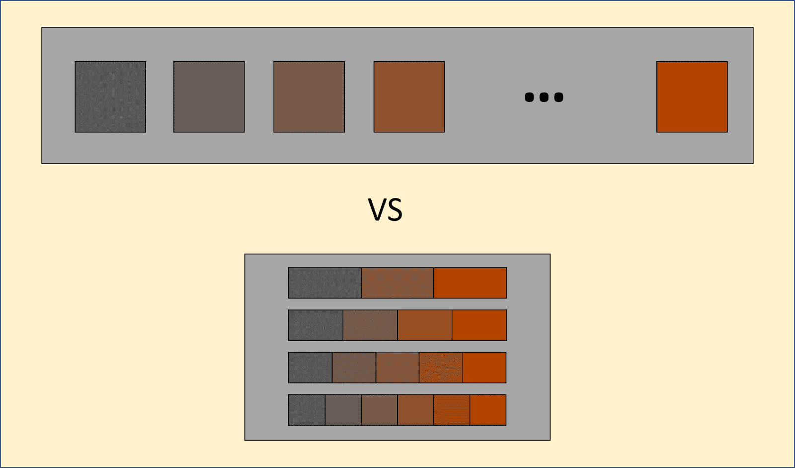
The development of a JND scale (top) versus
the development of a perceptually linear scale (bottom)

Would the spacing on the two ramps be kinda the same? Another way of asking that question: When my brain makes a judgment call about midway-ness between two colors, does it count JND steps to reach that conclusion?

I don't know. I suspect that there is not a "color midway-ness determination area of the brain". I don't think it is a fundamental concept, and as such, there is a lot of variability in what people might call midway between two colors that are a modest distance apart. I have a set of special brain probes on order through Amazon. When they arrive, I will get right on that question about what's going on in my brain. My wife has been wondering about that for years.

A crinkly wrinkle

I have spent the better part of two blog posts trying to make it clear that the DE color difference and the just noticeable difference do not have the same lineage, so they must be different. Imagine how cruel you will think I am when this whole world comes crashing down. If truth be told, the two are very intimately related.


The formula for DE00 is universally regarded as being the second ugliest set of equations in the known universe. You may reckon differently, but I count a total of 26 free parameters that were available to tweak the equations, including the handful of parameters that were inherited from the formula for L*a*b*. The equations mix Fourier series, Pade formula, square roots, cube roots and seventh powers. There was a lot of knob-twiddling of the free parameters in order to get the equation just right.

Egad. John the Math Guys really don't like this: When regression goes bad. Finding the right model. Mathematical models.

What did the authors use to assess their tweaking? A bunch of large data sets that came from just noticeable difference experiments. While the lineage of DE00 is based on Munsell's perceptually linear color space, there was significant cross-breeding from the JND folks.

Final answer, what is a DE00?

DE00 is a unit of color difference, which has proven itself in practice as a way to assess conformance of manufactured color. It is loosely based on the equal gradations of color in the Munsell space. The magnitude (scaling) of DE00 is based on the size of a color step at the middle of CIELAB space, which was in turn based on 100 levels of gray. The size of a DE00 in other parts of color space was scaled so that the color difference is that same number of just noticeable difference units throughout color space.

Thursday, July 20, 2017

Inspirational memes

Who said that John the Math Guy can't be a sappy, Hallmark card kinda guy? Just in case it was you, get a load of these sickeningly sentimental memes that I created.

Inspiration


Love


Being cool


Ok, so I couldn't write a whole blog post without be silly...

Tuesday, July 18, 2017

How big is a deltaE?

Every once in a while, someone in the audience calls on me to ask a question that I know the answer to. That just happened to me, and I am soooo happy!


This is the second blog post in a series about the actual meaning of color differences. I blogged previously about the origin of the DE, in particular, the DE00. I came to the preposterous notion that "the size of a DE color difference is based on the Munsell Color System, which is all about uniform spacing of colors. 1.0 DE00 is one of 76 perceptually equal steps between pure black and pure white."

Today, I want to correct that silly idea. Contrary to what certain bloggers have said previously, the color difference DE00  is a unit of measure which is used for industrial color-difference evaluation. This color difference equation is officially defined in the document Improvement to Industrial Colour Difference Evaluation (CIE 142-2001). The summary of this document starts out with  the sentence "Recommended practice for industrial colour-difference evaluation is presented." (The italics are mine, added strictly to heighten the excitement.)

The question that sparked this series of blog posts

Here is the question that I got from my good buddy, Larry Goldberg. As you will see from his question, he is eloquent, piquant, and just a tad irreverent; three qualities I appreciate in a friend. He works for a little company called Beta Industries, where you can get microscopes and print measurement devices and a variety of other devices for the print industry.

Here is his question:

I'm looking for The Idiot's Guide to delta E, converting scientifically rigorous results to Foolproof Rule o'Thumbs.  Or the more linguistically acceptable Rules of Thumb. Or until the new, improved Fool is released.

Something in simple tabular form such as;

delta E 2000  |  Rule O'Thumb
======================
0                         Deadnuts!
1                         Just Noticeable Difference, depending on who's asking and how much they drank for lunch
2                         Winner Winner Chicken Dinner!
3                         Good commercial color match, Kwitcher belly-achin', looks good to me!
4                         It'll be perfect when you add a little more snap to the magenta.
5                         Whaddya expect on this crappy paper?
6                       TWICE as good as commercial color match, no?  No. The buyer needs another dinner and round of drinks.
7 - 10                Roses are red, violets are blue, the grass is green the sky is blue.  Run it, they'll be wrapping the fish in it tomorrow.
>10                     This is a lot better than when they printed black and white...

If you have a dissertation, or a link, or a suggestion, it would be greatly appreciated.

Boy, have I got a technical paper for you!

The Committee for Graphic Arts Technologies Standards (CGATS) has been feverishly working on a standard that ties numerical color difference to lexical color difference. The title of the standard is "Graphic technology — Printing Tolerance and Conformity Assessment". Those of us in the biz affectionately know it as TR 016. The technical report is free, by the way. Just click on the link in the sentence before the sentence before this one.


This technical report is all about making that critical decision about whether a printed product has conformed to tolerances for color. Yes, this is the stuff of which contracts are made. Come to think of it, citing this document in a contract could simplify an agreement between print buyer and printer. I wonder if the folks on the CGATS committee ever thought about that? I'll hafta mention it during the next meeting I attend.

TR 016 defines four levels of acceptance, with explanations for when these levels are appropriate. Each of the levels has an associated tolerance for color difference (in DE00), and states that 95% of the production samples must have a color difference less than the number. In other words, most of the measurements must be within this tolerance.

Here are the levels:

    Level 1 - "the most color critical applications, e.g., proofing" - 2.0 DE00
    Level 2 - "color critical applications, e.g., commercial printing" - 3.0 DE00
    Level 3 - "utility process color printing" - 4.5 DE00
    Level 4 - "pleasing color" - 6.0 DE00

So, there you have it. The size of a DE color difference is all about tolerances in the industry. For print work, 2.0 DE00 is considered pretty darn good, and 6.0 DE00 is merely "pleasing". Within printing, it is expected that the ink will be kept to a higher tolerance than the print using that ink, and the printing of a proof must also be tighter than the printing of the final product. Kinda makes sense. The variation in the color of the stuff coming out of the print shop can't be any better than the variation of what goes in.

Other industries may have tighter or looser tolerances for color. Please add to the comments below if you know about color tolerances in other industries!

Pondering

Consider this: The tolerances for color are based on a scheme for equal steps of color, which is where the DE came from. Somehow it seems a bit odd to put those two together. But one big benefit of this scheme is that it is based on our perception of color. That's a good thing, since our perception is certainly not linear with reflectance. Another big benefit is that our perception of the size of a DE00 is largely independent of the color that you are looking at. That is, we don't need different tolerances for different colors or directions of color change.

On the other hand, I would argue that our acceptance of a difference in color between two samples is not necessarily the same as our perception of the gradations of color, especially when those two samples are not side-by-side. We are much more discriminating when we see two bags of potato chips sitting next to each other on the shelf.

A color that is slightly off will sit on the shelf until expiration date

And when the colors are not side-by-side? I would argue (without much data to support this) that our brain is much more forgiving of color changes that are strictly changes in lightness or chroma than they our of changes in hue. I would also argue (again without a grain of evidence) that we tolerate differences much better if the whole image has that same sort of shift. And once again without anything to support this, I claim that the brain is much more forgiving of colors in busy images with lots of fine detail.

Comparison of a health food drink ad in a glossy magazine and on newsprint
(Images courtesy of JMG Design Services)

There is a committee in the CIE (TC8-16) that is currently working on trying to quantify Consistent Colour Appearance -- what is it that makes our brain accept the two images above as being "kinda the same", versus if those two images were shifted in hue? There are some bright and knowledgeable minds working on this committee. And then there is one dim-witted slacker who just sits around and writes self-important blog posts all day.

But on the third hand, industrial tolerances with DE00 are amenable to measurement with existing technology. What good is a unit of measure if you can't find a ruler?


That's all for part 2 of this trilogy of blog posts. Stay tuned for part 3, where I revisit the phrase just noticeable difference, and admit that the first two parts of this series were nothing but lies!

Thursday, July 13, 2017

Of colorimeters and spectrophotometers

Today’s secret word? Spectrophotometer.

Pronounce it with me: SPECK-troe-fuh-TAH-muh-terr. The three parts of the word are 1) spectro-, which comes from the fact that they take slices from the rainbow, 2) -photo-, meaning light, and 3) -meter, which comes from the fact that they measure the light in each of those slices of the rainbow.

The part in the middle, -photo-, may sound redundant since we are already talking about rainbows. But this middle part helps distinguish a spectrophotometer from a spectrometer. (Note that the latter omits that middle part. The photo in spectrophotometer designates that this sort of device comes with its own flashlight. It shines that flashlight on your sample and measures the reflected light.

A spectrometer (note the omission of the -photo- part) does not have such a flashlight, so it is used to measure emitted light from things like computer monitors, LEDs, and members of the family of insects lampyridea. These cute little buggers put flashlights on their tushies to make themselves sexier. It didn’t do much for me, but it seems to help them at pickup joints on a Saturday night.


Here is some news on the spectrophotometer front. DataColor, manufacturer of handheld and benchtop spectrophotometers, has come out with a small, inexpensive color measurement device, the ColorReaderPro. It talks to your smart phone via Bluetooth.

The ColorReaderPro in action

This is already a crowded field, with a lot of recent hoopla coming from the folks at Color Muse and Nix. My good friends at Color Technology Consultancy recently blogged on a variety of inexpensive color measurement devices.

Handheld colorimeters on the market

Here is a little tidbit just for my loyal newsletter readers: While the Color Muse, Nix, and ColorReaderPro measure color, and SPECK-troe-fuh-TAH-muh-terrs also measure color, these small and inexpensive devices are properly called colorimeters (KUH-luh-rim-uh-terrs).

Colorimeters measure color by mimicking the human eye in how they respond to light. This mimicry is done with colored filters that approximate the color response of the cones in the eye. Spectrophotometers apply those filters with math, after capturing all those slices of the rainbow.

Colorimeters are in general much less expensive than spectrophotometers. I don’t have a price on the ColorReaderPro, but the Color Muse is $59, and the Nix goes for $349. Spectrophotometers are generally multiple thousands of dollars.

So, why would someone want to spend a whole bunch of money to buy a spectrophotometer? It comes down to accuracy. If you want to pick out a paint color to match your drapes, then a colorimeter is a good thing to put in your purse or murse. If you are contemplating using it as part of your color quality assurance project, I would recommend investing in a good set of dice. Your results will be just as good, and you will be able to play craps at lunchtime.

Which of the three different measurement devices is appropriate for your process control?

Are colorimeters appropriate for process control?

We gosh-darn sure would like to use this inexpensive and convenient new crop of colorimeters for all of our color measurement needs, including process control. We would like to reach into our purse or murse or pocket and pull out this cute little gadget to check to see if production is acceptable. We would like to deploy these little puppies all through our supply chain so that the designer and the janitor and the guy who drives the fork truck in the factory can check the tolerances of color throughout the process.

But

There is a rule of thumb for statistical process control. It's called the 30% rule, mainly because it includes the percentage 30. Here it is: If your measurement device eats up more than 30% of your tolerance window, then the measurement device will help you out by increasing your variation. You will be potentially chasing bad color that wasn't really bad, and neglecting bad color that you thought was good.

So, if your customer has allotted you a tolerance of 4 DEab, then your measurement device must be accurate to within 1.2 DEab.

I have done some extensive testing of the Nix and the Color Muse on a simple set of samples, all of them white. black, or gray. I have seen typical disagreement of a several DEab, with some up to 6 DEab


So, I'm gonna just go ahead and add that one to the list that your mom started, and Jim Croce added to later on. Don't run with scissors. Don't pull the tail of the neighbor's bulldog. Don't add water to acid. Don't spit into the wind. Don't pull the mask of the old Lone Ranger. And don't use a colorimeter for process control.

Unabashed promotion of some related blog posts

Just in case you missed a series of my blogs on spectrophotometers…

I started off my highly-acclaimed series with three blog posts that are prerequisites to talking about different devices to measure color: What color is water? and When light reflects from stuff. There is also a slightly more technical blog post called An illustrated compendium of the indicatrix throughout history. These posts all talk about how light interacts with matter.

The four colors of water

I followed up with no less than six blog posts about the different devices used to measure color.
If you are into color and are in the graphic arts, then I recommend reading What to use in the graphic arts. There are some notable special cases of inks that require special attention: Measuring metallic inks, and Measuring wet ink. These lead to Variants on the graphic arts spectrophotometers

If you are Measuring cloth or paint, or maybe soda cans, then you might want a different type of device.

Even when you are using the same sort of device to measure color, there are still choices for how the color is computed: The wonderful thing about standards is that there are so many to choose from.


Tuesday, July 11, 2017

Munsell and the deltaE

I want to correct a common misconception. Well, by "common", I mean that I once had this misconception, and was embarrassingly corrected for being so foolhardy. I may even have blogged on this silly notion. People say that 1.0 DE is a just noticeable difference. That's not exactly the intent. 

There are three concepts that are very closely related to the DE color difference:

    1. The smallest change in color that we are able to perceive.

    2. The acceptable difference in color in manufacturing.

    3. The even spacing of colors intermediate between two other colors.

In this (soon to be) highly acclaimed series of blog posts, I will look at how each of these concepts intertwine when we talk about the difference between two colors. I will start with the third concept.

These two colors are just under two inches apart

What is a DE?

The term DE is a strange lexicographic combination. It started with the Greek letter, D (pronounced delta). This has been used by math and engineering folks to stand for difference, usually for a small difference. The second letter is the first letter of the German word Empfindung, which means sensation. So, this lexical chimera literally means difference in sensation. It is defined as a unit of measure of the difference between two colors.

The idea of DE as a measure of color difference dates back to the introduction of the CIELAB color space in 1976. But I get ahead of myself.

Munsell and perceptual uniformity

It really started with Albert Munsell and the Munsell Color System, which was developed in the early 1900's. Munsell provided a color atlas, which was a book with a zillion colors in it. By comparing your color swatch against those in the book, you could give a unique and unambiguous identifier to any color. This was a big leap past "I want my walls to be a lighter shade of apricot, but so so beigey". As you will recall from Munsellology 101, Munsell defined the lightness scale to have ten evenly-spaced steps.

I wrote another whole blog post on the idea that our perception of color is non-linear, and the need and difficulty of finding a way to measure how close one colors is to another. These blog posts just go on and on!

Munsell put a great deal of time and energy into making his color space uniform. Each step in color was the same size. Or put another way, for every set of three adjacent colors, the one in between is halfway between the two outer colors.

The image below is a dramatic reenactment of Albert Munsell putting together a uniform set of colors between gray and burnt orange. In the first step, he created one color between gray and burnt orange. Maybe he started with a 50-50 mixture of the gray and burnt orange pigments and then tweaked from there? When he got a color that he felt was halfway between, he probably jotted down the recipe for this midpoint color; how much of each of the pigments was required to make that color. Then, he stepped back and looked at it. He decided the steps were too big.


Next he tried putting two colors in between the gray and the burnt orange. The result is shown in the second row of the image below, with a ramp of four colors. He use the recipes for gray, burnt orange, and for the previous midpoint as a starting point. Maybe he used some math to interpolate the recipes? He certainly had to do some iterating, since not only does color 2 have to look like it's halfway between colors 1 and 3, but color 3 has to look halfway between colors 2 and 4.

Again he stepped back, and said "the steps are still too big".

I have taken this process to five and to six gradations from gray to burnt orange. Munsell won this contest. He got 12.

This work culminated in the publishing in 1913 of the Atlas of the Munsell Color System, which was a big book with a zillion color patches. If a designer on the West Coast and a printer on the coast of Lake Michigan both bought a color atlas, they could accurately communicate color over the phone by referencing the book.

The Munsell Color Atlas is still available today, albeit under a different name

Now for the boring history lesson

I put this section in to convince skeptics that I really and truly did my homework when I say that the size of a DE, be it the 1976 formula, or a newer formula, is based on the work of Albert Munsell.

In 1933, Munsell, Sloan, and Godlove published a formula that approximated a conversion from tristimulus Y values to Munsell neutral value scale. The Munsell in this trio was Alexander Munsell, not to be confused with bis father, Albert Munsell. I might add, the acronym of this formula is not to be confused with a flavor enhancer that has erroneously been blamed for the hypothetical Chinese restaurant syndrome.

The MSG formula and the MSG formula

The 1933 effort gave the waiting world a formula for the lightness axis, but not for the chroma and hue axes of the Munsell Color System. That work was left to Eliot Adams in 1943. He applied the Munsell-Sloan-Godlove formula to all axes.

In that same year (1943), Newhall, Nickerson, and Judd put a great deal of effort into cleaning up the Munsell system, introducing what amounted to a look up table to convert from Munsell units to tristimulus values. The table is called the Munsell Renotation Data. Their paper included an equation to compute the Y tristimulus value from the lightness component of the Munsell system, which is called value. This equation was a fifth order polynomial. Note that the input to the equation is the Munsell value, and the output is the tristimulus Y value.


Dorothy Nickerson later (1950) merged her own work (the fifth order polynomial) with the work of Adams (a color space) to form a color space which became known as the Adams-Nickerson color space, also known as ANLAB. Very popular at the time. MGM produced one of their big theatrical movies about it, but unfortunately, the era of big production musicals was rapidly waning before the movie took off.

Busby Berkeley's rendition of the ANLAB color space
failed because it was in black and white

The use of a fifth order polynomial allowed for a close fitting of the data, but it caused some problems if you tried to go the other way, that is, from tristimulus to Munsell. (Us math guys call this a trap door problem.) The problem was dealt with by an approximation to the polynomial given in a 1958 paper with the catchy title Cube-Root Color Coordinate System from Glasser, McKinney, Reilly, and Schnelle,  This paper proposed a set of formulas where cube roots are taken of the XYZ values. The cube root function is readily invertible. Coincidentally, I was born in that same year. I am also invertible.

Glasser's cube root formula

The cube-root color coordinate system was modified a bit by the CIE (Commission Internationale L'Eclairage in French, or International Commission on Illumination) when they met in London in 1975. The modification (due to Pauli) replaced the cube root with a straight line below about 1% reflectance. This became CIELAB, also known as L*a*b*. To finish connecting the dots between Munsell and color difference, the official definition of DE is based on CIELAB.

CIELAB L* formula

The original Munsell color space had only ten levels of lightness. CIELAB L* goes from 0 to 100. Somewhere along the way, someone decided that it would be more convenient for there to be 100 shades of gray.

Thus, we see a straight line connecting the Munsell equally spaced color space with the CIELAB color space. Perhaps not all that straight; the path goes directly through at least five papers with a total of eleven authors. I have not counted the number of slightly less direct authors and papers that contributed along the way.

But, the preferred color difference formula today isn't the original DEab (the more precise name for DE). As of 2010, the recommended formula is DE00. Let me provide a little known fact: The DE00 color difference in the L* and in the b* directions at the very center of color space is the same in DEab and DE00. Big shocker: DE00 was scaled so as to agree with DEab at the point {50, 0, 0}. Even DE00 traces back to Munsell.

Just in case you missed it, I blogged about the various color difference formulas before (including DE00). And in case you missed a more recent blog post, in a future blog post I will answer a reader's question about how big of a color difference might be allowable for printing.

For values of L* other than L*=50, the conversion to DE00 is not one-to-one. As a result, there somewhat less than 100 levels of lightness. I count 76 shades of gray.


So, long story short, the size of a DE color difference is based on the Munsell Color System, which is all about uniform spacing of colors. 1.0 DE00 is one of 76 perceptually equal steps between pure black and pure white. That's my story, and I'm gonna stick to it. At least until my next blog post on the subject.

Wednesday, July 5, 2017

What is the color halfway between blue and orange?

The Gedanken

I have found that using German words is an effective way to demonstrate my superiority in any scientific endeavor. Hence, I like to say gedanken a lot. It means thoughts, so a gendanken experiment is one that your just think the experiment through without having to waste all that time and expense doing any real experiment.

I picked two crayons at random from my crayon box. As it would happen, one was orange and the other was blue. What color is halfway between the two? That's the gedanken experiment. Admittedly, the question is a tad silly, but I am going somewhere with this.


I have a bunch of answers for you!

Crayola-speriments

The first, and obvious answer comes from using crayons as they are intended to be used. Note that we have extended beyond the gendanken experiment into the verum mundi experiment. (That's Latin for either real world or John the Math Guy is uber-cool.)

Orange and blue crayons, colored overneath each other

I dunno what color that is, but I am gonna call it muddy green. My wife, who is the reigning Queen of Chromolinguistics in our house, calls it orangeish tourquoise tealish gray. The color is hard to parse because we can see many colors. In some places, we can see the orange peaking through. In others, the blue, and we even see a few tiny spot of white. And of course we have a lot of places where the two colors are atop one another. They are mixing together in much the same way that  halftones of printing inks mix. I wrote a four part trilogy of blog posts about the math behind that!

Not content with an experiment that could be performed by a kindergartner, I took it to the next step. I melted the two crayons in a beaker, and poured the mixture into a blob on a piece of paper. The image below documents my experiment. The resulting blob is black. The Queen of Chromolinguistics concurs.

Orange plus blue is the new black.

Let me pause for a moment. Why did they make black?

Both of the crayons were rich colors, at least until they were united in crayholy matrimony. The orange crayon is rich orange because it absorbs most of the light in the blue and green parts of the spectrum, and reflects practically all of the light in the red and yellow portions of the spectrum. The blue crayon is rich blue because it absorbs most of the light from green to yellow to orange to red. Between the two crayons, they gobble up the whole rainbow. We call this a subtractive mixture of the colors.

So far, I have two answers to the question of what color is halfway between orange and blue: 1) orangeish tourquoise tealish gray (AKA muddy green), and 2) black.

Before I forget, I used a cup warmer to melt the crayons in the beaker. Here is a picture of the box that the cup warmer came in. Note how my previous use of the German word gedanken works along with the German text on the box to subliminally suggest the hyper-intellectual image that I am desperately trying to project of myself. I mean, we all know that Germans are way smarter than us Americans.   


Monitorology

The next most obvious way to find the halfway point between orange and blue is on a computer monitor. I created three squares. The rightmost square is the closest approximation to the orange crayon that I could get on my computer monitor. The RGB values are 254, 97, 0. Admittedly, the match was not all that good. Rather than immediately jumping to a conclusion about my computer skills or lack thereof, let me say this: You cannot create all colors with a computer monitor which mixes red, green, and blue light. Orange is one of those colors which is outside the gamut of most computer monitors. Not my fault.

The square at the right is a rich blue that is a fair approximation to the blue crayon, with RGB values of 0, 32, 96.

The square in the middle is the average of the RGB values: 126, 64, 48. I would call this color chocolate milk. The Queen of Chromoliguistics calls this cocoa, and there is harmony in our household.


I guess maybe I could talk myself into believing that this shade of brown is the halfway point. Maybe? I dunno. Whatever... this is an additive mixture of orange and blue. The light from the monitor is adding together.

I will take one more shot. I averaged the RGB values to get chocolate milk. There is another color system in my computer which is called HSL. This stands for hue, saturation, lightness. HSL is a bit more akin to our perception of color than RGB. The middle square in the image below has the HSL average of orange and blue. I think this is a shade of green. The Queen of Chromolinguists calls it "between army green and forest green". Harmony.


Why green??? Think about the rainbow: ROYGBIV: red, orange, yellow, green, blue, indigo, violet. The colors yellow and green come between orange and blue. Yellow is such a tiny slice of the rainbow that I could rationalize that the halfway point could be green. So, green is a reasonable halfway point in terms of hue.

In terms of saturation... well, orange and blue are both pretty darn saturated, so I would want an equally saturated color as the halfway point. 

Finally in terms of lightness... orange is a bright color and blue is a dark color. If I had my druthers, I would rather have a halfway color that is a bit lighter.

But, all in all, I think the dark green is not a bad representation of the color that is halfway between orange and blue. Well, if I tilt my head on its side and squint. While chewing on a lemon. This is a perceptual mixture of two colors.

CIELAB

But, I am not done yet. The circle below is based on CIELAB, voted the most popular color space of 2013 by a group of retired fourth grade schoolteachers. If we just draw a line from orange to blue, and bisect it, we get the color in the small circle, which is kind of a mauven color, ideal for any color mavens.


I used color space kinda stuff to give two different answers. This answer differs computationally from the green answer in that the first was determined by finding the midpoint in hue angle. The approach in this answer don't know nuthin' about no hue. To the math geek, the previous answer was computed from color space with cylindrical polar coordinates, and the second is computed from Cartesian coordinates.

CIELAB 2, going 'round t'other way

It's interesting that I got two answers that are diametrically opposed to one another. The drawing below illustrates why this happened. The halfway point between orange and blue can be determined either by going clockwise from orange to get something in the purple family, or by going counter-clockwise to get something in the green family.


Silly answer

How about one more? Here is a culinary mixture of orange and blue.

The definitive mixture of orange and blue

Recap

I asked a deceptively simple question: what color is halfway between two others? And when I say deceptively simple, I mean really hard. When I am finally granted a professorship at the John the Math Guy University of  Color and Karaoke Sciences JMUCKS, I will use this question on a final exam. It's a great exam question, since I could arbitrarily pick one of the six reasonable answers as the correct one, and then mark everyone else's answer wrong.

Will the real halfway point between orange and blue please stand up?

From the standpoint of color science, the army-forest green or mauve answers are the most defensible. Color is not a physical entity. It really only happens in the brain. By use of the word color, I have limited the scope to answers that relate to our perception of color.

Munsell

It is hard for me to write a blog about color without mentioning Albert Munsell. When I die, I want to come back as Albert Munsell.

Munsell did the experiment that I just described. He spent years doing various sets of colors. I don't know for sure which pairs of colors he chose to work with -- I was out getting my nails done every time he brought out the paints. But, I presume he didn't choose the intuitively different colors orange and blue. More likely, he found the halfway point between things like shades of orange, mixed with either white, black, or gray. I show below one of the tests that he may have made.

Which color is halfway between burnt orange and gray?

He didn't just mix one part burnt orange with one part gray and call that the halfway point. He selected the halfway point by eye. In the end, Munsell had plates like the one below, only with heaps and gobs more colors.


His color space has uniform perceptual spacing. I may need to expound on that in another blog post.