Wednesday, August 27, 2014

An illustrated compendium of the indicatrix throughout history

For this week's blog post, I went in search of that frumious beast, the indicatrix. This indicatrix is the link between the previous blog post that describes the nature of reflected light, and the eventual blog post that will describe the various instruments designed to measure parts of the indicatrix. 

John the Math Guy slays the Manxome Indicatrix

What is an indicatrix?

First, let me clarify. I am not talking about "Indie cat tricks", which is to say, YouTube videos of felines doing awesome stuff. While this would be an absolutely fascinating blog topic, it is not what I am writing about. At least not today.

The indicatrix tells you absolutely everything you need to know about the reflectance of an object. It is the function that tells us the amount of light that is reflected at every possible combination of angles of incoming and outgoing light. (I would call these influx and efflux angles, but I don't want the bullies to take my lunch money again.)

Picture yourself someplace like, I dunno, Athens, Wisconsin. There is a spot just west of this town which is at 45N latitude, 90W longitude. Exciting. Big tourist trap. While you are trying out the local beers, you point a flashlight at the center of the Earth, where you have placed some sort of sample. Meanwhile, your buddy is sitting near Qitai, Xinjiang, China, which is at 45N 90E. You ask your buddy to measure the intensity of the light on your sample.
Measuring one point of the indicatrix

Now I realize that there are some minor technical problems with this scenario. The Earth will, of course, get in the way of you being able to shine your light on the sample. It is also quite possible that, even with the Earth out of the way, your flashlight may not have quite enough power to illuminate the sample. And (this is the big one) the location in China is about 2 km away from any road, so your poor buddy has some overland hiking to do.

Once your buddy has written down the intensity of light that he sees from there, you politely ask him to fly to Nova Scotia and row out in a boat to a spot about 800 km east of the island, which is at 45N 90W. Once again, he jots down the intensity of the light that he sees when he looks at your sample.

The two of you are well on your way to collecting the indicatrix of the sample that you placed during your journey to the center of the Earth. You will, of course, send your buddy to Honolulu, and Tokyo, Anchorage, Tuscany, Oslo, Las Vegas, and beautiful downtown Burbank. Eventually, he will stand at every conceivable location in the northern hemisphere to record the intensity of the reflection from your sample.

Your intrepid buddy will come back with more frequent flier miles than Phileas Fogg, and you will have the most lovely indicatrix in the world. But you will not have traveled at all. Does that seem right?  I think not! To collect the entire indicatrix, you must also putting on your globetrotter sneakers. 

To collect a complete indicatrix, you need to measure the reflectance at each and every influx angle (your lat/lon on the globe), and at each and every efflux angle (your buddy's lat/lon). The indicatrix thus has a reflectance value at every combination of lat/lon and lat/lon. So, the mystical indicatrix is a beast that lives in four dimensional space.  

Mythical creature?

I went looking for pictures if this beast, the indicatrix. I started my search in the venerable textbooks written by venerable people who wrote books about color stuff. I found various depictions among my library, as shown below. The images are all in polar coordinates, with the distance from the sample as an indication of the amount of reflected light. This is either a bit confusing, or completely obvious.

The drawings all show some amount of bulk reflection, along with a bump caused by the specular reflectance. They illustrate that the amount of gloss determines the shape of the indicatrix at the specular angle. The harder the surface, the bigger the total area of the bump. The smoother the surface the narrower and taller the bump.  

Color in Business, Science, and Industry, Judd and Wyszecki, 1975
Principles of Color Technology, Billmeyer and Saltzman, 1981

Goniophotometry of Printing Ink, Seymour, TAGA 1996
Handbook of Print Media, Kipphan, 2001

Improving Metallic Ink Printing through Polarized Densitometry, Mannig and Verdeber, 2002

BASF Handbook on Basics of Coating Technology, Goldschmidt and Steitbeger, 2003
Paper Products Physics and Technology, Ek, ‎Gellerstedt, ‎and Henriksson, 2009 

Industrial Color Physics, Klein, 2010

Notice anything odd? The first odd thing I see is that there ate eight depictions of the indicatrix that all show light coming in at one angle, that is, with me standing on Meridian Road, in Athens, WI. None of these drawings would suggest that a full indicatrix must have a measurement for every influx angle as well as for every efflux angle..

Notice anything else that's odd? How about this... Every single drawing shows Phileas Fogg traveling just along the semicircle from Santa Cruz Island to Athens, Wisconsin, to the North Pole to Qitai China to a spot in the Indian Ocean between Sri Lanka and Singapore. None of the drawings show Phileas catching some rays in Barbados, or Tiajuana, or anywhere else off that circle. 

So, the first two odd things are sort of the same, that the classical depictions of indicatrices are all one-dimensional, and as we know, the indicatrix lives in four dimensional space.

Notice anything else that's odd? You might not notice this right off - at least until I mention it - but these tdepictions of indicatrices are all drawings!  All we have are artist's conceptions of this fanciful beast. Is the indicatrix like a mermaid or a unicorn, or like Republican and Democrat senators who are friends? Has anyone ever actually seen these mythical creatures? 

Fabled Creatures Picnic, July 2007

Actual sightings

Although these key sources, don't show them, some actual sightings of the indicatrix have shown up in the literature. Of course, you have to wonder if you can trust these eye-witnesses accounts. I mean, I am one of those untrustworthy individuals who has claimed to have seen a real live indicatrix. The image below is from my TAGA 1996 paper.

In this plot, the light is coming in at 45 degrees, which is off to the right of the plot. There is a peak, as expected, near the specular angle of -45 degrees for all four samples. The y axis of the graph above is in density, and is flipped upside down. 

I draw your attention to the trace with the tiny dots, which is a sample of black ink on a glossy stock. At 0 degrees, it shows an ink with a density of about 1.6. As you move to the left, the peak is at a density of -0.7D. That means that the reflectance is about 700%, that's 700% as compared against the reflectance of "white" measured at 0 degrees. Interesting.

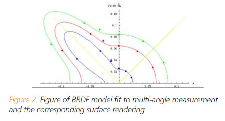
Here is another indicatrix sighting. A gent by the name of Artur Rosenberg showed up at TAGA five years after my paper to report about his indicatrix sighting. Artur made use of a much more sophisticated "camera". (Mine was a home-brew.) He also spent a bit more time collecting data. He obviously has a bit more patience than I do.

Below is one of his many indicatrices. Here he compares two different metallic inks at three different influx angles. Note that by playing with multiple angles, he has fleshed out the indicatrix to be a bit more two-dimensional.
Rosenberg, TAGA 2001

Here's another shot of the elusive indicatrix, taken from a booklet put out by XRite. This is actually a picture of indicatrices of three surfaces, one hiding behind the other.


This is not a complete set of indicatrix sightings. I am guessing that I missed a few in the literature. I know that I missed a lot because I did not search for the indicatrix under its other name, the BDRF. I am referring, of course, the the Bidirectional Reflectance Distribution Function, and not the Bowel Disease Research Foundation. The BDRF has been very popular with people who want to create realistic 3D images. Very interesting stuff, but I know nothing from this.

Conclusion

I have described the indicatrix. A number of authors have used this concept to help describe the nature of reflected light. But the fact is, the full indicatrix is just not used that often in process control The equipment to measure them is expensive and cumbersome. Furthermore, it's hard to deal with the large amount of data. Or at least it's hard to know quite what to do with all the data.

Clearly there is a need for some better pictures of indicatrices. Maybe I need to address that in my next blog? 

Wednesday, August 20, 2014

When light reflects from stuff

I responded to a recent discussion on LinkedIn, baring my soul about the measurement of the color of metallic stuff. I have never seen a standing ovation on a LinkedIn discussion thread, but... another person responded "Oh?  That's interesting." I will take that as the closest thing to a standing ovation that you can get on professional social media. Or maybe I should say that the mildly pleasant comment was the closest thing to a standing ovation that I can get!

But nevermind. I described some of the plethora of color appearance measurement devices, and Jonkai found it interesting. I decided to blog about this, to explain why we have 0/45 spectrophotometers that are sometimes polarized but sometimes they are 45/0, and we have 8/diffuse spectrophotometers that are SPIN or SPEX, (is your head spinning?), and we have really hoity-toity sounding instruments called goniospectrophotometers, but some of them are abridged. And then there are friendly sounding devices called glossmeters.
A simple goniophotometer, from US Patent 6,249,751

Wouldn't that be a great topic for a blog post?  Absolutely! Too bad that's not the topic of this blog. Before we get to that dessert topic, I need to prepare you, dear reader, with some fundamentals. How does light reflect from objects? Understanding the difference between specular and bulk reflection goes a long way to explain why we have so many different types of geometries for color appearance measurement devices.

Background

I have two articles online where you can go to read about the possible destinies of a photon (a tiny particle of light) encounters an object. In an article in Answers.com called Four Fates of a Photon, you can read the short answer: a photon may bounce off the surface, it may enter the object and get absorbed, it may transmit all the way through the object, or it may scatter within the object, eventually to be absorbed, transmitted, or scattered again. In another humorous and insightful blog post, I asked the "simple" question of What Color Is Water. The various answers to this question - the different colors of water under different conditions - gave a practical example of these four fates.

A fate worse than absorbance!


Reflective light = specular + bulk

It is normal to think that the colorfullness of an object is due to the light that bounces off the surface. An apple looks red because red light is reflected from the surface, right?  It's also normal for us to think that light doesn't go into solid objects, except for clear solids, like water. Oh, and lemonade or iced tea or Jello.

But that's not quite the case. Light that bounces from the surface of an object (the specular reflection) has basically the same color as the incident light. An apple looks red because a lot of the incident light goes into the skin of the apple and only the red light survives to tell about it. Light that is green or blue gets absorbed into the skin of the apple. This is called the bulk reflection.

Whenever we see an illuminated object, we are viewing a combination of specular and bulk reflection. Uusally, the bulk of the reflection is bulk reflection.

The nature of specular reflection

Specular reflection is also referred to as gloss, glint, glare, and mirror-like reflection. This is not to be confused with "spectral", which is a modifier that refers to a photons position in the rainbow. Or, "spectral" might also mean "having to do with stuff in the spiritual world". Oddly enough, another similar sounding word is "secular", which means "having to so with stuff not in the spiritual world".

Specular light is largely governed by Fresnel's equations and Billiard's law. Fresnel is best known for inventing the Fresnel lens that can be seen in every lighthouse and every geek's wallet. Bobbi Billiard is a busty swimsuit model and former pro wrestler who has nothing to do with Billiard's law.


The math in Fresnel's equations is ugly -- if math can ever really said to be ugly -- but the details are not important. The equations tell us how much light is reflected when it goes from one medium to another and how much enters the second medium. This could mean going from air to glass, or from water to air. Here are the three important consequences of the Fresnel equations:

   1. The "harder" the surface (from the perspective of a photon), the larger percentage of light that reflects specularly.

The first law explains mirrors. If I were a photon, I would believe that metal and mirrors and stuff like that is pretty darn hard. If I saw a piece of metal in my path, I would get out the old crash helmet, cuz I know that I would be changing direction in a few femto seconds. Glass? Not so hard. Maybe I have a 5% chance of going specular. Water, still less.

If I were to want to sound really smart, I would say that the relative hardness of a material from the perspective of a photon is called its index of refraction.

   2. The shallower the angle, the larger percentage of light that reflects specularly.

The second law is all about playing the angles. As I said in the previous paragraph, photons hitting glass straight on have a one in twenty chance of flying right back again. If photons approach the glass from the side (a shallow angle) then glass or even water might just as well be a mirror.

   3. The amount of specular reflection depends on polarization of the light.

Polarized sunglasses. Need I say more?

Well, maybe I do. When light reflects specularly at somewhere near 53 degrees, pretty much all of the light that was polarized in one direction goes into the material. This angle is called the Brewster angle. The 53 degree angle is for glass - the exact number depends on how optically hard the surface is. As a result, the specular light is pretty much all polarized in the other direction. Using the proper polarizing filters can eliminate the glare, at least when you are near the Brewster angle.

Using antispecular specs to hide my glaring personality

For completeness, I add Billiard's law:

   4. Specular light reflects like a billiard ball.

This one is near and dear to my heart, not because of any special attraction to Bobbi Billiard, but because it helps explain why magazines don't look like newspapers. As the diagram below shows that, if a surface is not flat, light will reflect in all different directions.

Red light rays, photographed bounding off a smooth pebble

What does that have to do with magazines and newspapers, you may ask? Both of them are flat. Ahhh! So it would appear, Dear Reader!  At the microscopic level,  Magazines are mostly. As a result, when directional light hits the surface, the specular reflection is also directional. Note that when we read a magazine, we subconsciously orient the magazine so that the gloss goes somewhere else, and we don't see it.

Newspapers are anything but flat, and as a result, the specular reflection is sent out in all directions. No matter how we orient a newspaper, we see the specular reflection, so we don't notice it. And it makes the newspaper inherently lighter in color. Our perception of "glossy" is just specular reflection that has been concentrated into one angle.

Note that our perception of glossy and matte paint works the same way.

The nature of bulk reflection

The last section was about one of the four fates of a photon when it encounters an object: specular reflection. Once a photon has decided to pay the cover charge to enter the medium, the other three fates come into play. A photon may be absorbed or it may be scattered. Failing to do either, the photon may emerge on the other side.

Ideal white paint


An ideal white paint - primer - should only scatter photons. They enter the paint layer, encounter a "particle of white opacity making stuff" (like titanium dioxide, barium sulfate, calcium carbonate, or the infamous lead sulfate), and change directions like pinballs. The photons would stay in play, bouncing around until they finally exit. All photons eventually find their way out, so the paint has 100% reflectance.

In a less-than-ideal white paint, there may not be enough "particles of white opacity making stuff" to block the photons from reaching the layer under the paint. If this happens, then some may be absorbed by the layer underneath, so that the reflectance is something less than 100%. In the worst case, the layer underneath is a rich color whose absorbance is spectrally selective, that is, it absorbs more of one part of the spectrum than another. In this way, it will impart a hue to the layer of paint that is overneath.

Note that the photons that eventually exit will have long since forgotten which direction they were going when they started out. In other words, when they exit, they could be headed in pretty much any direction.

Ideal ink

While an ideal white paint scatters photons without absorbing, an ideal ink is just the reverse. In an ideal ink, photons make their way through the ink to the paper (or other substrate), reflect from the substrate, and then make a second pass through the ink. All along the way, photons run the risk being absorbed, but the motto of the ideal ink is "non dispergam" (never scatter).

This bit about scattering is important. If I print yellow ink atop cyan ink, I want the result to be green, and not yellow. I don't want the yellow ink to hide the cyan ink below.

Oh, by the way... The cyan, magenta, and yellow inks are all spectrally selective. Cyan ink likes to eat photons at the red end of the spectrum. Yellow ink likes to eat photons at the blue end of the spectrum. Magenta ink is partial to photons near the middle, the green photons. How this gives us the gamut of colors that can be printed is a fabulously interesting topic. No doubt I will blog about it some day.

I should mention something about the direction that photons exit from a perfect ink. Such photons will travel through the ink without changing direction, so their angle of exit depends a lot on the characteristics of the substrate. Often this means that this sort of bulk reflection is equally likely to be pointed in any direction, but this may not always be the case.

I should also mention that photons in an ideal ink will follow Beer's law.

The real world

I have carefully avoided talking about paint that isn't white, and ink that isn't transparent. These are the interesting cases, since they involve both scattering and absorbing. These are also complicated cases. Beer's law just won't cut it. It's time to haul out the old Kubelka-Munk equation.

Summary

The light that reflects from an object is a combination of light that reflects directly from the surface and light that interacts with the object. The net effect is a combination of the Fresnel equation, the Billiard law, Beer's law, and the Kubelka-Munk equation. Between all these equations, we can characterize the amount of light that reflects from the object as a function of direction of incoming light, direction of exiting light, and wavelength.

A basic knowledge of these rudiments is helpful in understanding the next installment on color appearance measurement devices.

Wednesday, August 6, 2014

DIY with RYB - Printing with the artist's primaries

I'm going into the email bag once again for this week's blog post. 

Dear John The Math Guy,

Why is it that we print with cyan, magenta, and yellow?  I learned in grade school that red, yellow, and blue were the primaries.

Sincerely,
Licensed to be Artistic

PS - How did you get to be so darn good looking?

What I learned in Kindergarten

I learned in Kindergarten (Fingerpainting 101, an elective) that red, blue and yellow are the primary colors. If you mix them you get all the other colors. If you mix red and yellow you get orange. If you mix red and blue, you get purple. If you mix yellow and blue, you get green.

It would make sense that you could use these same three primaries (along with black) in your desk top printer and also in the behemoth printing presses that churn out shipping pallets full of catalogs with my wife's name and address on them. Every artist knows that these should be printed with red, blue and yellow inks.

One way to test this would be to refill cyan and magenta ink cartridges with blue and red ink. This might get just a tad messy, so I came up with an easier and cleaner way to test the RBY theory. All you need is a standard inkjet printer and the files that are at the end of this blog post. 

We can simulate RBY printing with two passes. The first time a sheet of paper goes through the printer, we can simulate the red and the blue inks by the appropriate mixing of CMY. Then this sheet of paper is fed back into the printer for a second pass. We do the same sort of simulation of red and blue, but mix the design up a bit so we can see the various overprints of red, blue and yellow. 

Explanation of the test images

The image below shows the layout of the first pass, the second pass, and an expected result. In the leftmost boxes, the simulated blue ink from the second pass is arranged to overprint the red ink from the first pass. The expected result, on the bottom, is various shades of purple. Similarly, the middle column of boxes show that yellow is arranged to overprint blue to arrive at the expected shades of green. And finally, in the rightmost column of boxes, we see that red is overprinting yellow to give us orange. 
Design of the test of using artist's primaries for printing
  
The expected result above is hypothetical. What is the actual result? I did this test with my desktop printer (an Epson Stylus NX515). The first time through my printer, the red, blue, and yellow boxes were printed. On the second pass, These boxes with printed with blue, yellow, and red overneath.

I then used the scanner on this printer to change the printed sheet back into an image that I can share in my blog. Scanning it and displaying it on your screen introduces color error, but regardless of this, it's rather obvious that our expectation was way off for both of the mixtures that included blue. Red and yellow wasn't so bad.

Scan of the actual overprint result of RBY printing with bad mixes highlighted

In the box to the left, we see that adding red to the solid blue just makes it head toward black. Maybe it's a purple-black, but it's really not a pleasing purple. Similarly, in the middle box, mixing yellow with blue just pushes the blue closer to black. Note something interesting... both of the halftone overprints are sorta gray.

If we do the same experiment with cyan, magenta, and yellow inks, the overprints look much better. Cyan printed over magenta gives a nice purple - maybe a bit dark, but still unmistakably purple. Magenta printed over yellow gives a pleasing orange-red. Yellow over cyan gives a slightly dissatisfying green. I would have liked to see overprints of blue, red, and green, but at least the overprints are fairly decent colors. 
Scan of the CMY overprint test

The test images

I have the two test images below. Unless I have messed something up, you should be able to double click on the images to get a full resolution version, and then save the files. If you can't get that to work cuz of some stupid mistake I made, drop me an email and I will send the images. (john@johnthemathguy.com)

Print one image (either one could go first). Then reload that page into your printer's paper tray. Take care to make sure the paper has the same orientation as it did the first time through. Getting the right orientation took me twelve tries, so you should be able to get it right after two or three. The sets of six boxes along the left side will all be filled in if you did this part correctly.

Since a full page was being printed anyway, I decided to test three sets of primaries. The top row of boxes is a test of the CMY primaries. The middle row tests the RGB primaries that are used in computer monitors and television sets. The bottom row is our now infamous test of the artist's primaries.

First pass

Second pass

Here is a scan of the full page that came out of my printer:
My results

So... why don't we print with red, blue, and yellow?  Because cyan, magenta, and yellow work better.

WTF?

If you had subscribed to the executive version of this blog, this would be where I make it all clear why there are different primaries for mixing light (as in a computer monitor or stage lighting), mixing ink or filters, and for mixing paint. But, alas, most of you will need to wait for another blog post to answer this question. Stay tuned for my expostulatings on RGB color theory!