Wednesday, July 30, 2014

That's a yellow of a different color!

I checked out the yellow pages to find a yellow cab to take me down the yellow brick road to the yellow submarine so I could get a can of mellow yellow. So many yellows!  Are they all the same?

I have used the word metamerism in three previous blogposts: RGB into Lab, Scribbling away that scratch on my car, and Is your green the same as my green. But, I really haven't explained why there is this thing called metamerism. Why is it that a pair of colors may match under one light, but not under another?

Example 1

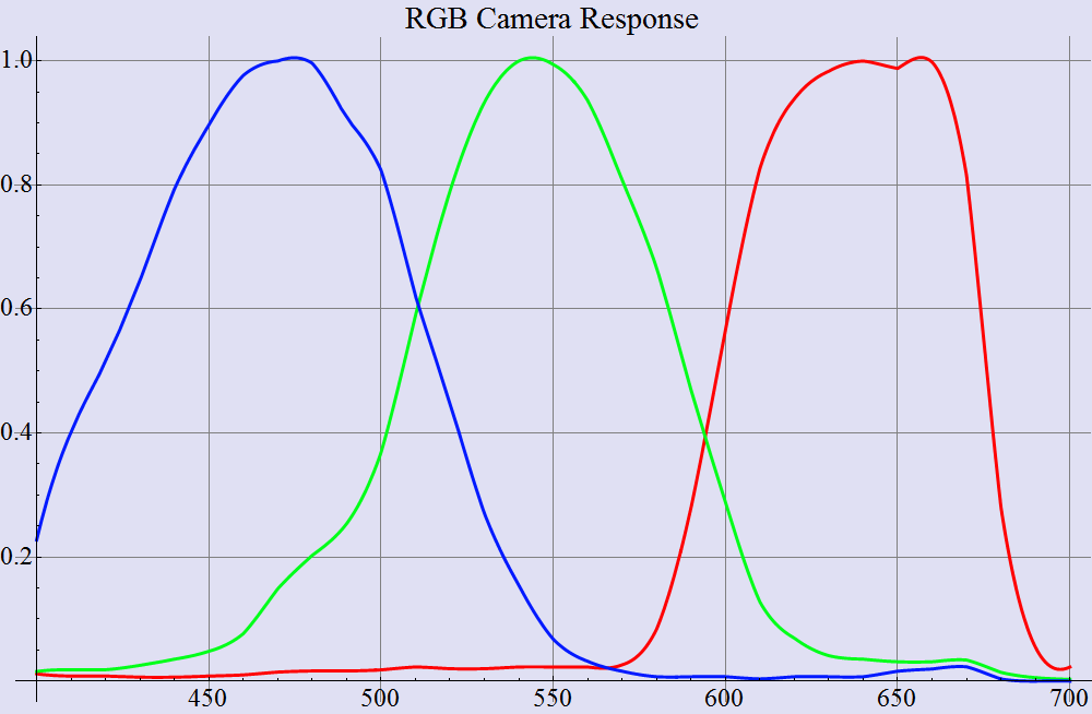
In the image below, I show the spectrum of one particular yellow printing ink. The image also shows the spectral response of the three cones in the human eye, with the L (long), M (medium), and S (short) wavelength cone responses in red, green, and blue, respectively.

The spectrum of yellow ink, along with the sensors in the eye

If I can be so presumptuous as to paraphrase what the yellow graph is saying, we see that above about 530 nm (in the green to red parts of the rainbow), the yellow ink has a pretty high reflectance, somewhere up around 90%. Below 470 nm (in the violet to blue part of the rainbow), the reflectance is pretty darn small.

To continue my presumption, consider what an S cone (the blue plot) is seeing when it is pointed at this ink. It sees light in the wavelength range from 400 nm to 500 nm. This channel is pretty quiet. There isn't just a whole lot of light reflecting from this region of the spectrum.

This darkness is all completely unbeknownst to the L and M cones. In their little view of the electromagnetic spectrum (above 470 nm), the yellow ink looks a whole lot like white. And note that the amount of light seen by the M cones is pretty much the same as the amount of light seen with the L cones

So, that, my friends, is what the spectrum of yellow looks like. By the way, the CIELAB (L*a*b*) value is 94.04, -6.07, 116.18.

Example 2

For my next encore, I show the spectrum of a hypothetical yellow LED. I say hypothetical because this isn't an actual measurement, or even a typical measurement provided by the manufacturer. I started with the spectrum of an amber LED, fit a Lorentzian function to it, and then adjusted the wavelength and width just a little to make it the same color as the yellow ink. The CIELAB value of the hypothetical yellow LED is 94.04, -5.99, 116.19. By fudging the LED a little, I got the color within a tenth of a deltaE. 

The spectrum of a yellow LED, along with the sensors in the eye

One thing I should mention about the graph. I scaled the plot of the LED by a factor of about four, just to make it fit with the rest of the plots. In terms of the real real world, I turned up the LED so that in one narrow range of the spectrum it was about four times as bright as the ink, but on the whole, the color -- what the human eye would see -- was nearly identical.

Once again, we see that the amount of light that is seen by the S cone is minimal. The light from the yellow LED is seen in the L and M cones, and in something like equal measure.

So, forget what you learned in that last section. This is the true spectrum of the color yellow. It is a slice out of the yellow part of the rainbow.

Example 3

For my second encore, I will perform the same act of creation of a color that looks indistinguishable from the yellow ink. This time, I will do it with not one, but with the heretofore unimaginable quantity of two LEDS!  From my bag of hypothetical LEDs, I draw a red and a green LED, and mix the light emitted from them. I used an ordinary whisk, but you could certainly use a Kitchen Aid. You can plainly see the peak emission of the LEDs at 555 nm and at 640 nm. 

The spectrum of a mix of red and green LEDs, along with the sensors in the eye

By a small act of hypotheticalry, I managed to adjust wavelength and peak width of these two LEDs so as to get these two LEDs to emit light with CIELAB value of 94.04, -6.05, 116.55. I will admit that I did not get quite as close to the original color of the yellow ink. I got tired of futzing with the hypothetical parameters of the hypothetical LEDs. But, the colors are still close enough to call a really darn good match. And it really could have been perfect if I wasn't so darn lazy.

Oh... remember that thing I said about scaling the plot in the previous one to protect the innocent? The same holds for this one.

At the risk of repeating myself, I will recount what the cones see when they gaze upon this pair of LEDs. It's the same as before. No S, and about an even amount of L and M. 

So, once again forget what you learned in the two previous sections. This bimodal spectrum with two humps is the only real and true spectrum of the color yellow. This Bactrian spectrum is the actual spectrum, and the Dromedary from the previous section is nothing more than a figmentary pigmentary unicorn. And that first spectrum that's as flat as my head? Fahgeddaboudit.

Will the real yellow please stand up?

I hope that I'm not the only one who is confused. I have given three different spectra. And I have claimed in each case that the spectra represents the "correct" version of the spectrum of yellow. 

The versions of yellow

My favorite scene from Fiddler on the Roof has Tevye talking in the courtyard with some of his friends. The first guy says that Obama has brought prosperity to the country. Tevye says "Yah, you're right." The second man in the square says that Obama has completely ruined the country. Tevye stroked his beard and once again says "Ahhh... you're right." The third gentleman questions Tevye, "How can they both be right?!?!" To this, Tevye strokes his beard and says "Ahh yes... you're right!"

How can all three of these spectra claim to be yellow? Which one is the true yellow, and which two are the impostors?  Fear not. None of them are impostors. They are all spectra of yellow. All three spectra would be perceived by the eye as being yellow, and (to a pretty darn close degree) all three are the same exact shade of yellow.

Consider the silhouette below. Is this woman holding a ball? Could be. Maybe this woman is holding a manhole cover? Could be. Or then again, maybe she is holding a garbage can. That could also be. From this view, we can't tell. The silhouette has projected the three dimensional shape down to two dimensions.


Ball? Manhole cover? Garbage can?

This is happening when we see colors. We like to think that we see the whole spectrum from 400 nm to 700 nm, and we kinda do. I mean, there are no holes in the rainbow, right? But our eye only has three sampling points. Mathematically, we would say that the cones of the eye are performing a projection of an infinite-dimensional vector in spectral-space onto a three dimensional space. 

If the whole idea of infinite dimensions is a bit hard to fathom, that's ok. I don't understand it either. Suffice it to say that are eyes don't individually perceive every little slice of the whole spectrum. There is considerable data loss, so there are cases of dissimilar spectra that will look like exactly the same color.

And that's what metamerism is all about. "Yellow" is not a certain spectral curve. Yellow is what we perceive when the S cone has little response, and the L and M cones have high and nearly equal response.

Wednesday, July 23, 2014

Standard deviation - why the n and n-1?

When some people hear the word "deviant", they think about people who do stuff with Saran Wrap, handcuffs and Camembert cheese. But I'm a Math Guy, so I don't think about those things. I am reminded of statistics, not sadistics.


Which brings me around to a question that was asked of me by Brad:

I was trying to bone up on my stats knowledge the other day. I came across a few mentions of population vs sample. If someone states sigma vs. standard deviation is that dependent on this population vs. sample? 

And how does one determine population vs sample? Could you not consider everything just a sample? Seems like it could be very subjective.

The question leads to the great confusion between n and n-1. As I remember from my Statistics 101 class (back in 1843), there were two different formulae that were introduced for the standard deviation. One of the fomulae had n in the denominator, and the other had n-1. The first formula was called the population standard deviation, and the second was called the sample standard deviation.

(Quick note to the wise, if you wish to sound erudite and wicked smart, then spell the plural of "formula" with an "e" at the end. Spelling it "formulas" is so déclassé. I also recommend spelling "gray" with an e: grey. The Brits just naturally sound smart.)

So, what gives? Why divide by n-1?

Population standard deviation

Below we have the formula for the "population" standard deviation.

Formula for population standard deviation

You subtract the mean from all the samples, and square each difference. Squaring them does two things. First, it makes them all positive. After all, we want to count a negative deviation the same as a positive deviation, right? Second, it gives more weight to the larger deviations. 

Do you really want to give more weight to the larger deviations?  I dunno. Maybe. Depends? Maybe you don't. For some purposes, it might be better to take the absolute value, rather than the square. This leads to a whole 'nother branch of statistics, though. Perfectly valid, but some of of the rules change.

The squares of the deviations from the mean are then added up, and divide by the number of samples. This gives you the average of the squared deviations. That sounds like a useful quantity, but we want to do one more thing. This is an average of the squares, which mean that the units are squared units. If the original data was in meters or cubic millimeters, then the average of the squared deviations is in squared millimeters, or in squared cubic millimeters. So, we take the square root to get us back to the original units.

Sample standard deviation

And then there's the formula for the sample standard deviation. The name "sample" versus "population" gives some indication of the difference between the two types of standard deviation. For a sample standard deviation, you are sampling. You don't have all the data. 

That kinda makes it easy. In the real world, you never have all the data. Well... I guess you could argue that you might have all the data if you did 100% inspection of a production run. Then again, are we looking for the variation in one lot of product, or the variation that the production equipment is capable?  In general, you don't have all the data, so all you can compute is the sample standard deviation.

Formula for the sample standard deviation

Let's look at the other differences. Note that one population formula uses the symbol μ for the mean, and the sample standard deviation uses the symbol x-bar. The first symbol stands for the actual value of the average of all the data. The latter stands for an estimate of the average of all the data.

Estimate of the average?

I have a subtle distinction to make. We are used to thinking that the statistical mean is just a fancy word for "average", but there is a subtle difference. The average (or should I say "an" average) is one estimate of the mean. If I take another collection of data points from the whole set of them (if I sample the population), then I get another estimate of the mean.

One may ask "how good is this estimate? If you take one data point to compute the average (kind of a silly average, since there is only one) then you have no idea how good the average is. But if you have the luxury of taking a bunch of data points, then you have some information about how close the average might be to the mean. I'm, not being very statistical here, but it seems like a good guess that the true mean would lie somewhere between the smallest data point and the largest.

Let's be a bit more precise. If you sample randomly from the population, and if the data doesn't have a RFW distribution, and if you take at least a bunch of points, like ten or twenty, then there is something like a 68% chance that the true mean lies in the interval.

By the way, if you were wondering, the acronym RFW stands for Really GoshDarn Weird.

This is kind of an important result. If you wish to improve the statistical accuracy of your estimate of the mean by, for example, a factor of two, then you need to average four points together.If you want to improve your estimate by a factor of ten, you will need to average 100 data points.

Difference between sample and population standard deviation

Finally, I can state a little more precisely how to decide which formula is correct. It all comes down to how you arrived at your estimate of the mean. If you have the actual mean, then you use the population standard deviation, and divide by n. If you come up with an estimate of the mean based on averaging the data, then you should use the sample standard deviation, and divide by n-1.

Why n-1????  The derivation of that particular number is a bit involved, so I won't explain it. I would of course explain it if I understood it, but it's just too complicated for me. I can, however, motivate the correction a bit.

Let's say you came upon a magic lamp, and got the traditional three wishes. I would guess that most people would use the first couple of wishes on money, power, and sex, or some combination thereof. Or maybe something dumb like good health. But, I am sure most of me readers would opt for something different, like the ability to use a number other than x-bar (the average) in the formula for the sample standard deviation.

You might pick the average, or you might pick a number just a bit smaller, or maybe a lot larger. If you tried a gazillion different numbers, you might find something interesting. That summation thing in the numerator? It is the smallest when you happen to pick the average for x-bar.

This has an important ramification, since x-bar is only an estimate of the true mean. It means that if you estimate the standard deviation using n in the denominator, you are almost guaranteed to have an estimate of the standard deviation that is too low. This means that if we divide by n, we have a bias. The summation will tend to be too low. Dividing by n-1 is just enough to balance out the bias.

So, there is the incomplete answer.

Oh, one more thing... does it make a big difference? If you are computing the standard deviation of 10 points, the standard deviation will be off by around 5%. If you have 100 points, you will be off by 0.5%. When it comes down to it, that error is insignificant.

Wednesday, July 16, 2014

RGB into Lab

I get this question all the time. More often, it's phrased as a statement. Every once in a while, it's an in-you-face assertion. I could be referring to my halitosis, but not this time. I am talking about converting data from an RGB sensor of some sort into color measurements.

The question/assertion has come in many forms:

  • I have this iPhone app that is sooooo cool! It gives me a paint formula to take to the hardware store!
  • How can I convert the RGB values from my desktop scanner into CIELAB?
  • I just put this Magic Color Measurer Device on the fabric, and it tells me the color so I can design bedroom colors around my client's favorite pajama.
  • All I need is this RGB camera on the printing press to adjust color.
My quick response - the results will be disappointing.

What color is Jennifer Aniston's forehead?

I used Google images to find pictures of Jennifer Aniston. I selected six, as shown on the left side of the image below. I then zoomed in and selected one pixel indicative of the color of her forehead. The color of those six pixels is shown in the rectangles on the right. 

What color is Jennifer's forehead?

This illustrates a few things. First, it shows that pictures of an attractive woman can get people to look at a blog. I have just started writing the blog, and already two people have looked at this blog! Second, it shows that our eye can be pretty good at ignoring glaring differences in color. Sometimes. At least on the left. On the right, those same glaring differences are, well, glaring.

But, for the purposes of this blog, this little exercise illustrates the variety of color measurements that a camera could make of the same object.

We could just write this off as the problem with cheap cameras, but let's face it. If you were going to get close enough to Jennifer Aniston to be able to catch a glam shot of her, wouldn't you go out and get the most expensive camera that you could afford? Especially if you were going to go to all the trouble of getting that image on the internet??!?!  I think we can pretty well expect that the cameras used for these shots were top of the line.

Lighting has a big effect on the color, but the spectral response of the camera is also an issue. As we shall see...

The Experiment

Here is the experiment I performed. I made a lovely pattern of oil pastel marks on a piece of paper. I used the eleven colors that everyone can agree on: brown, pink, gray, black, white, purple, blue, green, yellow, orange, red.

I then taped that paper to my computer monitor and made a replica of this pattern on the screen. I adjusted the lighting in the room and the colors of each patch on the monitor so that, to my eye, the patches came pretty close to matching. 
The equipment in my experiment

Then I got out my camera. The image below is an unretouched photo. 


I don't know what you see on your own computer monitor, but I see some colors that are just blatantly different. While my eye said the two pinks were very close, the camera said that the one on the left is darker. The gray pastel is definitely not gray... it's a light brown. The white on the paper is more of a peach color. And the purple? OMG... They certainly don't match. Actually, the photo of the one on the paper looks closer to what my eye saw.

On the other hand, the blacks match, and the blues, green, and reds are all good.

In some cases, the camera saw what I saw. In other cases, it did not.

Maybe I just don't have a good enough camera? My camera is not "top of the line", by the way but it's decent - it's a Canon G10. I tried this same thing with the camera in my Samsung cellphone and my wife's iPhone. Similar results.

Note to would be developer of RGB to CIELAB transforms: The pairs of colors above must map to the same CIELAB values, since they looked the same to me. Your software must be able to map different sets of RGB values to the same CIELAB values. "Many to one."

I haven't demonstrated this, but the reverse is also true. "One to many." Your magic software must be able to take one RGB value and map it sometimes to one CIELAB value, and sometimes to another. How will it know which one to convert to? Whichever one is correct.

In other words, IT CAN'T WORK!  No amount of neural networking with seventh degree polynomial look up tables can get around the fact that the CIELAB information isn't there. The software has no information to help it decide cuz there are many CIELAB values that could result in that one RGB value.

What went wrong?

I submit exhibit A below, a graph that shows the spectral response of a typical RGB camera. (This one is not the response of my G10 - it is from some other camera.)

Spectral response of one RGB camera

For comparison, I show a second graph, which is the spectral response of the human eye.

Spectral response of the human eye

There are some very distinct differences. The most obvious is that the red channel in the eye is shifted considerably to the left. There is an astonishing amount of overlap between the red and green channels. The green channel of the eye has been approximated closely by the camera, but the blue channel on the camera is much too broad.

(I should point out that real color scientists don't even call these "red, green, and blue". Because the response of the eye is sooooo unlike red, green, and blue, they are called "L", "M", and "S", for long, medium and short wavelength.)

The consequence of this difference is that an RGB camera - or any other RGB sensor - sees color in a fundamentally different way than our eyes do. They don't all have the same spectral response as that of the camera above, but none of them look much like the response of the human eye.

I never metamer I didn't like

The word "metamer" comes to mind. Metamer, by the way, is the password for all meetings of the American Confabulation of Color Eggheads Lacking Social Skills. Memorize that word, and you can get into any meetings. You'll thank me later.

Two objects are metamers of one another if their colors match under one light, but not under another. Metamerism is a constant issue in the print industry since color matches of CMYK inks to real world objects will almost always be metameric. Print will never match the color of real objects. The fancy underthings in the Victoria's Secret catalog are guaranteed to look different when my wife models them at home.

The following pictures might well help to make metamerism as confusing as possible. I have pasted a GATF/RHEM indicator on a part of a CMYK test target. The first image below is similar to what I see when I view this in the incandescent light in my dining room. The RHEM patch that has the words "IGHT NOT" in it is a bit darker than its friend to the right, and the two patches above are almost kinda the same color.

Now we start getting confusing. The camera didn't snap this picture under incandescent light. This picture was illuminated with natural daylight.

Photographed under daylight

Ok, maybe that's not confusing yet. But let's move the studio into my kitchen where I have halogen lights. Note that the whole image has shifted redder, but the relationships among the colors are similar to the daylight picture.

Or are they?  Take a look at the RHEM patch and compare it with the CMYK patch directly above it. Previously, they were kind of the same hue. No longer. And the other two patches (RHEM and the one above it) have gotten closer in color.

Photographed under halogen light

Alright... still not real confusing. Let's try under some other light source. This one will blow your mind.

Next, I photographed that same thing under the fluorescent light in my laundry room. The striking thing is that the stripes on the RHEM patch are completely gone as far as the camera can tell. This is in contrast to what my eyes see. My eyes tell me that the stripes in the RHEM patch have reversed. To my eye, the darker stripes are now lighter than the others.

Big point here - for color transform software to work, it has to take the measurements from the adjacent RHEM patches below (which are nearly identical) and map them to CIELAB values that are very different.

Photographed under one set of fluorescent bulbs

Finally, I pulled out a white LED bulb, and tried again. Here again, the stripes are gone as far as the camera is concerned, but I can see the stripes. If I compare the image under the white LED versus under the fluorescent, it can be seen that the white LEDs bring out the purple when compared against the previous. The RHEM patch looks above is almost brown in comparison.

Photographed under white LED lighting

In summary, the camera does not see colors the same way that we do. 

I spoke in rather black and white terms as the very beginning, saying that getting CIELAB out of RGB just plain won't work. Maybe I am just being pedantic?  Maybe I am just bellyaching cuz it gets lonely in my ivory tower? 

Lemme just say this... You know the photo shoot where they took the picture of the Victoria's Secret model? That wasn't done in my ivory tower, and it wasn't done with my Canon G10. The real photographers would laugh at my little camera. Their camera cost about twice my annual salary. And guess what? Every single photo from the photo shoot went into Photoshop for a human to perform color correction because their expensive camera doesn't see color the same way as the eye. 

Quantifying the issue

In a 1997 paper, I used the spectral response of a real RGB camera, and the spectra of a zillion different real world objects to perform a test of a color transform, RGB to CIELAB. I calibrated the transform using one set of spectra of printed CMYK colors. As can be seen, if I used a 9X3 matrix transform, I could get color errors of between 1.0 ΔE and 2.0 ΔE when I transformed other CMYK sets. This is not quite as good as some purveyors of RGB transforms claim, but it's still usable for some applications.


But this was all done with CMYK printing ink on glossy paper. What happens if we use that same transform to go from RGB to CIELAB for something other than printing ink? Table 2 shows that all heck breaks loose. If I try to transform RGB values from the MacBeth color checker, a set of patches from the Munsell color atlas, a collection of Pantone inks, or a set of crayons, the average color error is now up around 7.0 ΔE. I don't think this is usable for any application.


Ok, that's lousy, but hold onto your hats sports fans!  I tried this same 9X3 transform on a hypothetical set of LEDS, simulating what the camera would see when pointed at those LEDs one at a time, and I used the magic transform to compute the CIELAB values. The worst of the color errors was kinda big. Well, quite big, actually. Hmmm... maybe even "large". Or, perhaps more accurately, one might call the color error ginormously humongomegahorribligigantiferous. 161 ΔE. That not 1.61. That one hundred and sixty one delta E of color error introduced by using this marvelous color transform. This is called over-fitting your data.

I don't know if this has been surpassed in the past 17 years since I wrote the paper, but at the time, this was the largest color error ever reported in a technical paper.

Conclusion

I have focused on just one aspect of getting a color measurement right, that of having the proper spectral response. Don't start with RGB.

But if you still fancy building an RGB color sensor or writing an iPhone app, let me forewarn you. There are numerous other challenges. Enough to keep me blogging for pretty much the rest of the year. There's measurement geometry (lighting angle, measurement angle, aperture size- viewing and illuminating), stability of photometric zero and illumination, quantum noise floor, fluorescence, backing material -- these topics all come to mind. Once you move beyond the notion that RGB will work for you, then you gotta get these under control.

TANSTAFL - There Ain't No Such Thing As a Free Lunch. If it were easy to build an accurate color measurement device with a web cam, then the expensive spectrophotometers from XRite, and Konica-Minotla, and Techkon, and DataColor and Barbieri would all be obsolete. 

Further reading

Seymour, John, Why do color transforms work?, Proc. SPIE Vol. 3018, p. 156-164, 1997
Seymour, John, Capabilities and limitations of color measurement with an RGB Camera, PIA/GATF Color Management Conference, 2008
Seymour, John, Color measurement with an RGB camera, TAGA Proceedings 2009
Seymour, John, Color measurement on a flexo press with an RGB camera, Flexo Magazine, Feb. 2009


Wednesday, July 2, 2014

The latest in stereo cosmetics

I was pseudo-randomly looking  through patents today, and came across one that was just plain interesting. US patent #8,421,769 is entitled "Electronic Cosmetic Case with 3D Function". Normally, when I come upon a patent, my first thought is "Gosh! Someone beat me to the patent office again!" In this particular case though, my immediate reaction was "Gosh! Why didn't I think of that!?!?" 

3D Cosmetic Case, the Movie

Here is a quote from the abstract: "An electronic cosmetic case includes a stereo image display unit, and a pair of image capturing units." Ok, so it has two cameras mounted in a compact?  Why?  We read on... "The pair of image capturing units is for simultaneously capturing facial image of a user from two different directions, and providing the captured images to the stereo image display unit."

Oh, cool. Two cameras, 3D display? What's not to love about this wiz-bang technology? I want one!!!

And we read further into the abstract: "The stereo image display unit receives the two captured images and simultaneously displays one captured image to the left eye and displays the other captured image to the right eye, thus allowing the user to perceive a stereo image."

This is the basics as described in the title and the abstract. These parts of the patent serve to frame the invention. They are there to serve as a guide for someone who is quickly scanning through patents. But they are not, as we shall see, necessarily going to describe exactly what the inventor has staked a claim for.

Drawings

The patent we are looking at has three drawings. Below we see the first, which shows what this cosmetic case might look like. As can be seen, the drawing is not terribly sophisticated. In fact, for a small fee, I might be persuaded to draw something like this. I'm thinking that pretty much any geek could make a drawing like this. 
Figure 1 from US Patent #8,421,769

That may sound like a put-down, but the drawings don't need to be drawn by a skilled draftsperson at $175 an hour. This drawing is adequate in that it enables someone "skilled in the art" (for example, an engineer you would hire to design this) enough to go on to build one of these. Presumably, that engineer could figger out all the details like dimensions, and color, and what parts are needed to make an "image processing unit".

There is a requirement in a patent that the inventor "disclose the preferred embodiment". This means that they may need to include mechanical drawings and schematics and flowcharts for software - if the invention is near the product stage. As a result, the sophistication of the drawings generally follows along with the maturity of the invention. From this drawing, it would appear that the inventor did not have a design that was ready for production when the patent was filed for (December 21 of 2010).

Why?

Why would a woman want a compact like this? So a woman can see a 3D image of her face while applying makeup, silly! Depth perception, hand-eye coordination, the need for precise location... it all makes sense.

But, we need to look for the explanation in the patent. Lemme 'splain. To get a patent, the invention has to be useful. Because of this, patents generally come along with a statement at the beginning which justifies the invention. The section of the patent called "Background" or "Prior art" generally says things like "this is how it used to get done, but it would be advantageous to do it more better".

Here is the quote from the Background of the 3D cosmetic case patent: "Cosmetic cases usually include a base and a plane mirror... However, the plane mirror has many blind spots, which are not easy for the user to see, making it difficult to determine how the makeup has been done."

Blind spots? Really? I dunno. Maybe it's just me, but I think I can see pretty much all my face when I look in a mirror. I haven't had a lot of problem putting on makeup, anyway. Of course, maybe I am mistaken, since my beard covers a lot of that face. I'm not fully convinced that what has been described solves a real problem, but inventions are not granted based on whether the patent examiner thinks the invention will be a successful product. The bar is a bit lower than that.

Do you gotta wear the glasses?

When I read the abstract, my first thought was about 3D glasses. Back when I was a kid, you needed special glasses to watch a 3D movies. The original glasses had one red lens and one green. Very fashionable, and I am sure they would make a strong fashion statement when used along with a 3D cosmetic case! Today of course, theaters use polarized lenses, but - the important question here - does the user have to wear special glasses in order to use the 3D compact?

To answer this, I had a look at the specification part of the patent. This is a big bunch of words, bolstered by the drawings. What did they say about the display? Here is the very detailed description that they give: "In one embodiment, the stereo image display unit 101 may be a parallax barrier display, or a lenticular lens display."

A parallax barrier display has a series of stripes built in that allow one line of pixels to head off to the right eye and another line to go off to the right eye. How Stuff Works gives a pretty good description. The lenticular arrays do essentially the same thing with a clear plastic covering that has horizontal ridges.

That's the technical stuff, and it's interesting. Before I looked at this patent, I didn't know nothing from parallax barrier displays. Not only are they fun and inspirational reading, but patents can be a good place to get learned stuff about technology.

The inventor has graciously provided enough information so that someone could build the 3D compact. This is a requirement for a patent - enablement. This part of the invention has thus been enabled. 3D displays are "well-known in the art". Just go buy one.

Or is this enough enablement? One could argue that, to be practical, a 3D compact must be small enough to fit in a lady's purse. When I did a little rudimentary poking around online, I saw 3D displays that were nowhere near small enough. One could argue that a commercially viable version of the 3D compact has not been enabled in this patent.

But, it doesn't have to be. This sort of thing is always a judgment call, but unless I hear a good argument otherwise I am guessing that the enablement is satisfactory. Based on this disclosure, I could go to Best Buy and purchase a home theater 3D display that I could use to build this invention. It might not fit in my wife's purse, but that's not a requirement for the patent. Then again, my wife has some pretty large purses...

A patent? Really?

One may ask, how could someone get a patent for this? To get a patent, an invention must be novel, and 3D displays have been around for a while. And what about using two cameras to feed a stereo display? I have not searched through the prior art (that is, the earlier patents), but this sounds like something that someone has probably done before.

It could be that this general idea (two cameras and a stereo display) is not new, but that applying this technology to a new problem may be novel enough to have a patent granted. That's often the case. Patents are often granted for new applications of existing technology.

But we are forgetting one little thing: the claims are really the most important part. In a previous blog post on patents, I looked at one patent that everyone was up in arms about. If only people would have read the claims in the patent, they would have realized that there was nothing worth getting upset about. The claims are the part that define what the inventor (or the assignee) owns.

Here is the one and only claim from this patent. (I have added the bold faced type.)

1. An electronic cosmetic case comprising: 

a pair of image capturing units for simultaneously capturing facial images of a user from two different directions thereby obtaining two captured images; 

a stereo image display unit to receive the two captured images and simultaneously display one captured image to the left eye and the other captured image to the right eye, thus allowing the user to perceive a stereo image; 

a touch display panel for displaying a plurality of virtual cosmetics for the user to select; 

an optical pointing sensor for touching the touch display panel to select one virtual cosmetic from the plurality of virtual cosmetics, and touching a face of the user to make movements on the face according to the user operation, thereby simulating the application of makeup on the face of the user; 

a processing unit for determining a selected virtual cosmetic when the optical pointing sensor touches the plurality of virtual cosmetics, determining a movement track of the optical pointing sensor on the face and a thickness of the selected virtual cosmetic when the optical pointing sensor does the simulative makeup on the face of the user, doing the simulative makeup along the determined movement track on the stereo image, and creating a simulated stereo makeup image by filling the selected virtual cosmetic on the stereo image according to the determined thickness of the virtual cosmetic; and a repeat key for repeating a step of doing a simulation of makeup on the stereo image according to the user operation. 

What? Where di all this extra stuff come from??!!?!!  The title, abstract, and background didn't say nuthin' about no touch display panel, optical display panel, and processing unit. More importantly, I didn't see anything in these sections about virtual cosmetics or simulating the application of said virtual cosmetics on someone's unsuspecting virtual face.

I said before that the title and abstract don't necessarily describe what the inventor owns. Such is the case in this patent. The inventor does not own a 3D cosmetic case, but rather a 3D cosmetic case that allows one to simulate the application of makeup.

I skipped over this before, but the disclosure does talk about all the extra stuff. It's not terribly detailed - not as much explanation as I might like to see - but a touch panel display and an optical pointing sensor are both mentioned in the body of the patent. Also mentioned is the idea of virtual cosmetics.

Why is there a disparity? I can only speculate, but one explanation is that the inventor originally applied for the patent on the assumption that a broader claim could go through. Maybe the original claim given to the US patent office had just two image capture units and a stereo image display? I am surmising here, but the patent examiner may have found some prior art, and responded back with something like "Sorry... been there, done that." Then the inventor may have responded by adding limitations to the claim. The patent examiner then responded by allowing the amended claim. This sort of thing happens all the time.

now if this question were important to me, I would look to the official record of the dialog between the inventor and the examiner. This is called the "prosecution history", and it's stored in the "file wrapper". The file wrappers are available for public consumption, but that goes beyond today's lesson.

Oh yeah... one more thing...

I was so excited by the technology the first time through this that I lost sight of one little thing. When a woman looks into the mirror of a compact, she is seeing her face as if it were sitting on the opposite side of the mirror. The right eye sees one view of the face, and the left eye sees another. While it is cooler than bean salad on New Year's Day to use a pair of cameras and a 3D display to simulate this three dimensional effect, a mirror is a somewhat simpler and cheaper means to perform this function.

Here is another guess about why there is a disparity between the title, abstract, and background of the patent and the claim. Maybe the inventor, like me, got all wrapped up in the excitement of the cool technology and didn't see the obvious - that a mirror could do the same thing. But maybe this guess is a bit far-fetched? I'm probably the only person who would make such a silly mistake.

Disclaimer

The information on this blog post has been provided for entertainment purposes. It may perhaps actually be didactic as well. But, I am not a patent attorney, and I make no claim to having made anything more than a cursory examination of this patent. Who knows... maybe everything in this blog post was made up? Seek a patent attorney if you are in need of legal advice on intellectual property. But if you are ok with illegal advice, I will be glad to provide you with all the illegal advice that you can afford.