Showing posts with label color measurement. Show all posts

Wednesday, November 19, 2014

Measuring fluorescent inks


People email me questions fairly reguarly. If I am in a good mood, I actually read the emails. Once in a while, I actually respond. On rare occasions, I actually try to answer the questions. The following is one actual interchange between me and an adoring fan... I took out all of the embarrassing stuff. 

The question

John,


A recent question came up for which I didn't have an answer. I immediately thought of you so here goes. Do you have any experience with reading florescent colors? I’m not really sure what types of devices might be out there (if any) for reading those really wild colors used in some printing and certainly more and more in fabrics.

I’m not sure how a profile would even be put together because the standard tools (100% maximum colors) don’t seem to apply. 

Do you know of any devices out there targeted toward florescent colors?

Thanks,

Mike

The response

Dear Mike,

This is a very difficult question. Well... the question is easy, but the answer is hard!

I have three different answers:

1. Scientific answer

The characterization of a fluorescent color is not a one-dimensional spectrum, but a two-dimensional one. You illuminate the same with a "monochromator", illuminating it at one wavelength at a time. For each wavelength in, you measure a full spectrum out. This gives you what is called a Donaldson matrix. From this you can predict the CIELAB value for any type of illumination possible.

You pretty much have to build your own spectro if you want to do this. I am sure you could do a decent job of $50K if you had a metrologist to help you. NIST has one and Avian has one. The equipment pretty much needs a technician in a lab to run it, it takes tens of minutes to make a measurement, and you probably have to write special software to interpret the results.
Clearly this is not a good production solution!!

2. Industry answer to a narrower problem

The print industry has faced a similar problem, but limited to one fluorescent pigment. Paper manufacturers currently add stilbene to virtually all paper. It's a cheap way to make paper that is whiter than white, or even just not dingy. Stilbene absorbs UV light and re-emits it in the blue region so as to undo the natural yellow or brown color of paper.

The standards groups huddled together and came out with a solution that is to standardize the UV content in viewing booths and in spectros. Coincidentally, I recently blogged on that topic.
This handles one fluorescent whitener. It was not intended for DayGlo orange or neon green.

3. Perhaps a practical solution

The color of a fluorescent sample will vary depending on the spectrum that it is illuminated with. It will look different under daylight versus incandescent lighting. But, so long as you restrict yourself to one illumination spectrum, there might not be a problem. If the printer and print buyer can agree that they will visually evaluate under a specific illumination and that they will measure with an instrument that has that same illumination, then everything should work.

[Note: Instruments have settings for different illuminants, such as D50, A, F11... This does not change the illumination, just the calculation afterwards. I blogged about that recently, too.]

The tough part (you would think) would be to find a viewing booth that uses the same illumination as a spectro. But actually, that's not so hard because of #2. Theoretically, you should be able to use a relatively new viewing booth (one that complies with the M1 condition in ISO 3664:2009), and a relatively new spectro (one which also complies with the M1 condition, but in ISO 13655:2009). All the stuff with then provide D50 illumination.

In practice, this may not be as easy as it sounds. One issue is that the instruments and viewing booths may simulate D50 in such a way as to have the correct numbers on paper with FWAs - on stilbene - but with somewhat different spectra.

I would suggest sticking just to one make and model of spectro, and one make and model of viewing booth. Unfortunately, I can't tell you which viewing booth and spectro will agree with each other. The vendors don't readily share this information.

I think at the very least, the practical solution might be to do away with any visual matching, and rely completely on measurement. You would measure a color with one of the M1 instruments (XRite eXact, Konica Minolta FD-7, Techkon SpectroDens, or Barbieri SpectroPad) and set that as the standard numbers and instrument.


The other part of you question has to do with profiling... That's a big "yikes"!  I am going to guess that almost all the fluorescent colors are well outside the gamut of all proofing devices, so, what good does it do to proof it?!? The best you could possibly do is use a softproof, and adjust something or other. I think you would scale the spectra of the whole profile to make sure that there are no points where the spectra goes above 100%.

John

Addendum

After I answered this email, I contacted DayGlo to see what they do for quality control. Here is what they said:

Visual light source is Daylight North Illumination (D65).
We measure the Color with a X-Rite Color i5 colorimeter.
We record the L*, a*, b*, DEcmc and De* for each color.
The measurements are done on the primary color test.
These can be either drawdowns or prints depending on the product.

So... they chose the practical solution.

Wednesday, July 16, 2014

RGB into Lab

I get this question all the time. More often, it's phrased as a statement. Every once in a while, it's an in-you-face assertion. I could be referring to my halitosis, but not this time. I am talking about converting data from an RGB sensor of some sort into color measurements.

The question/assertion has come in many forms:

  • I have this iPhone app that is sooooo cool! It gives me a paint formula to take to the hardware store!
  • How can I convert the RGB values from my desktop scanner into CIELAB?
  • I just put this Magic Color Measurer Device on the fabric, and it tells me the color so I can design bedroom colors around my client's favorite pajama.
  • All I need is this RGB camera on the printing press to adjust color.
My quick response - the results will be disappointing.

What color is Jennifer Aniston's forehead?

I used Google images to find pictures of Jennifer Aniston. I selected six, as shown on the left side of the image below. I then zoomed in and selected one pixel indicative of the color of her forehead. The color of those six pixels is shown in the rectangles on the right. 

What color is Jennifer's forehead?

This illustrates a few things. First, it shows that pictures of an attractive woman can get people to look at a blog. I have just started writing the blog, and already two people have looked at this blog! Second, it shows that our eye can be pretty good at ignoring glaring differences in color. Sometimes. At least on the left. On the right, those same glaring differences are, well, glaring.

But, for the purposes of this blog, this little exercise illustrates the variety of color measurements that a camera could make of the same object.

We could just write this off as the problem with cheap cameras, but let's face it. If you were going to get close enough to Jennifer Aniston to be able to catch a glam shot of her, wouldn't you go out and get the most expensive camera that you could afford? Especially if you were going to go to all the trouble of getting that image on the internet??!?!  I think we can pretty well expect that the cameras used for these shots were top of the line.

Lighting has a big effect on the color, but the spectral response of the camera is also an issue. As we shall see...

The Experiment

Here is the experiment I performed. I made a lovely pattern of oil pastel marks on a piece of paper. I used the eleven colors that everyone can agree on: brown, pink, gray, black, white, purple, blue, green, yellow, orange, red.

I then taped that paper to my computer monitor and made a replica of this pattern on the screen. I adjusted the lighting in the room and the colors of each patch on the monitor so that, to my eye, the patches came pretty close to matching. 
The equipment in my experiment

Then I got out my camera. The image below is an unretouched photo. 


I don't know what you see on your own computer monitor, but I see some colors that are just blatantly different. While my eye said the two pinks were very close, the camera said that the one on the left is darker. The gray pastel is definitely not gray... it's a light brown. The white on the paper is more of a peach color. And the purple? OMG... They certainly don't match. Actually, the photo of the one on the paper looks closer to what my eye saw.

On the other hand, the blacks match, and the blues, green, and reds are all good.

In some cases, the camera saw what I saw. In other cases, it did not.

Maybe I just don't have a good enough camera? My camera is not "top of the line", by the way but it's decent - it's a Canon G10. I tried this same thing with the camera in my Samsung cellphone and my wife's iPhone. Similar results.

Note to would be developer of RGB to CIELAB transforms: The pairs of colors above must map to the same CIELAB values, since they looked the same to me. Your software must be able to map different sets of RGB values to the same CIELAB values. "Many to one."

I haven't demonstrated this, but the reverse is also true. "One to many." Your magic software must be able to take one RGB value and map it sometimes to one CIELAB value, and sometimes to another. How will it know which one to convert to? Whichever one is correct.

In other words, IT CAN'T WORK!  No amount of neural networking with seventh degree polynomial look up tables can get around the fact that the CIELAB information isn't there. The software has no information to help it decide cuz there are many CIELAB values that could result in that one RGB value.

What went wrong?

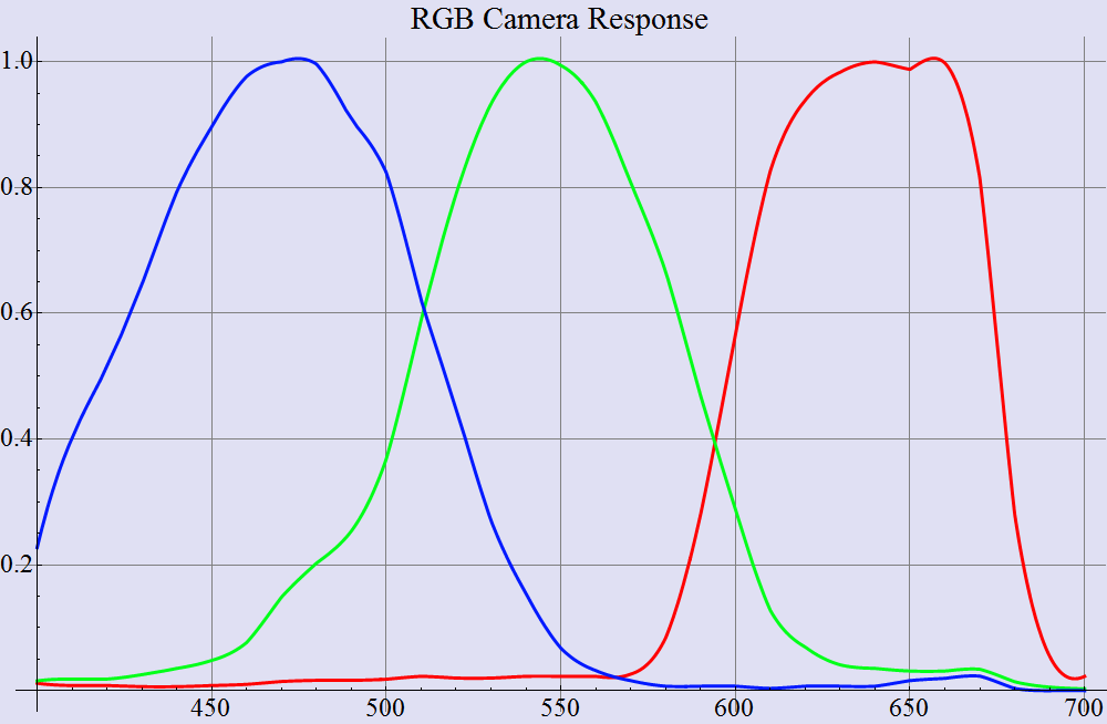
I submit exhibit A below, a graph that shows the spectral response of a typical RGB camera. (This one is not the response of my G10 - it is from some other camera.)

Spectral response of one RGB camera

For comparison, I show a second graph, which is the spectral response of the human eye.

Spectral response of the human eye

There are some very distinct differences. The most obvious is that the red channel in the eye is shifted considerably to the left. There is an astonishing amount of overlap between the red and green channels. The green channel of the eye has been approximated closely by the camera, but the blue channel on the camera is much too broad.

(I should point out that real color scientists don't even call these "red, green, and blue". Because the response of the eye is sooooo unlike red, green, and blue, they are called "L", "M", and "S", for long, medium and short wavelength.)

The consequence of this difference is that an RGB camera - or any other RGB sensor - sees color in a fundamentally different way than our eyes do. They don't all have the same spectral response as that of the camera above, but none of them look much like the response of the human eye.

I never metamer I didn't like

The word "metamer" comes to mind. Metamer, by the way, is the password for all meetings of the American Confabulation of Color Eggheads Lacking Social Skills. Memorize that word, and you can get into any meetings. You'll thank me later.

Two objects are metamers of one another if their colors match under one light, but not under another. Metamerism is a constant issue in the print industry since color matches of CMYK inks to real world objects will almost always be metameric. Print will never match the color of real objects. The fancy underthings in the Victoria's Secret catalog are guaranteed to look different when my wife models them at home.

The following pictures might well help to make metamerism as confusing as possible. I have pasted a GATF/RHEM indicator on a part of a CMYK test target. The first image below is similar to what I see when I view this in the incandescent light in my dining room. The RHEM patch that has the words "IGHT NOT" in it is a bit darker than its friend to the right, and the two patches above are almost kinda the same color.

Now we start getting confusing. The camera didn't snap this picture under incandescent light. This picture was illuminated with natural daylight.

Photographed under daylight

Ok, maybe that's not confusing yet. But let's move the studio into my kitchen where I have halogen lights. Note that the whole image has shifted redder, but the relationships among the colors are similar to the daylight picture.

Or are they?  Take a look at the RHEM patch and compare it with the CMYK patch directly above it. Previously, they were kind of the same hue. No longer. And the other two patches (RHEM and the one above it) have gotten closer in color.

Photographed under halogen light

Alright... still not real confusing. Let's try under some other light source. This one will blow your mind.

Next, I photographed that same thing under the fluorescent light in my laundry room. The striking thing is that the stripes on the RHEM patch are completely gone as far as the camera can tell. This is in contrast to what my eyes see. My eyes tell me that the stripes in the RHEM patch have reversed. To my eye, the darker stripes are now lighter than the others.

Big point here - for color transform software to work, it has to take the measurements from the adjacent RHEM patches below (which are nearly identical) and map them to CIELAB values that are very different.

Photographed under one set of fluorescent bulbs

Finally, I pulled out a white LED bulb, and tried again. Here again, the stripes are gone as far as the camera is concerned, but I can see the stripes. If I compare the image under the white LED versus under the fluorescent, it can be seen that the white LEDs bring out the purple when compared against the previous. The RHEM patch looks above is almost brown in comparison.

Photographed under white LED lighting

In summary, the camera does not see colors the same way that we do. 

I spoke in rather black and white terms as the very beginning, saying that getting CIELAB out of RGB just plain won't work. Maybe I am just being pedantic?  Maybe I am just bellyaching cuz it gets lonely in my ivory tower? 

Lemme just say this... You know the photo shoot where they took the picture of the Victoria's Secret model? That wasn't done in my ivory tower, and it wasn't done with my Canon G10. The real photographers would laugh at my little camera. Their camera cost about twice my annual salary. And guess what? Every single photo from the photo shoot went into Photoshop for a human to perform color correction because their expensive camera doesn't see color the same way as the eye. 

Quantifying the issue

In a 1997 paper, I used the spectral response of a real RGB camera, and the spectra of a zillion different real world objects to perform a test of a color transform, RGB to CIELAB. I calibrated the transform using one set of spectra of printed CMYK colors. As can be seen, if I used a 9X3 matrix transform, I could get color errors of between 1.0 ΔE and 2.0 ΔE when I transformed other CMYK sets. This is not quite as good as some purveyors of RGB transforms claim, but it's still usable for some applications.


But this was all done with CMYK printing ink on glossy paper. What happens if we use that same transform to go from RGB to CIELAB for something other than printing ink? Table 2 shows that all heck breaks loose. If I try to transform RGB values from the MacBeth color checker, a set of patches from the Munsell color atlas, a collection of Pantone inks, or a set of crayons, the average color error is now up around 7.0 ΔE. I don't think this is usable for any application.
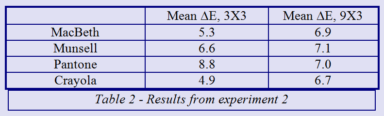

Ok, that's lousy, but hold onto your hats sports fans!  I tried this same 9X3 transform on a hypothetical set of LEDS, simulating what the camera would see when pointed at those LEDs one at a time, and I used the magic transform to compute the CIELAB values. The worst of the color errors was kinda big. Well, quite big, actually. Hmmm... maybe even "large". Or, perhaps more accurately, one might call the color error ginormously humongomegahorribligigantiferous. 161 ΔE. That not 1.61. That one hundred and sixty one delta E of color error introduced by using this marvelous color transform. This is called over-fitting your data.

I don't know if this has been surpassed in the past 17 years since I wrote the paper, but at the time, this was the largest color error ever reported in a technical paper.

Conclusion

I have focused on just one aspect of getting a color measurement right, that of having the proper spectral response. Don't start with RGB.

But if you still fancy building an RGB color sensor or writing an iPhone app, let me forewarn you. There are numerous other challenges. Enough to keep me blogging for pretty much the rest of the year. There's measurement geometry (lighting angle, measurement angle, aperture size- viewing and illuminating), stability of photometric zero and illumination, quantum noise floor, fluorescence, backing material -- these topics all come to mind. Once you move beyond the notion that RGB will work for you, then you gotta get these under control.

TANSTAFL - There Ain't No Such Thing As a Free Lunch. If it were easy to build an accurate color measurement device with a web cam, then the expensive spectrophotometers from XRite, and Konica-Minotla, and Techkon, and DataColor and Barbieri would all be obsolete. 

Further reading

Seymour, John, Why do color transforms work?, Proc. SPIE Vol. 3018, p. 156-164, 1997
Seymour, John, Capabilities and limitations of color measurement with an RGB Camera, PIA/GATF Color Management Conference, 2008
Seymour, John, Color measurement with an RGB camera, TAGA Proceedings 2009
Seymour, John, Color measurement on a flexo press with an RGB camera, Flexo Magazine, Feb. 2009


Thursday, September 27, 2012

Why does my cyan have the blues? (addendum)

I was asked a question about my previous blog about why the hue of ink sometimes changes when the ink film is increased.

I had a lovely plot (see below) that showed that showed that Beer's law doesn't do all that bad of a job at predicting the ink trajectory (and the hook) of a magenta ink. The plot shows how close the match is in a*b*. Erik pointed out that I didn't show what is going on with L*. It could be that Beer's law works well in a*b*, but really messes up when it comes to L*.

The magenta hook, real and estimated

So, I had a look at this same data from a few other perspectives. Here is what the data looks like in the L*a* plane.

And here it is on the L*b* plane.

My conclusion is that it doesn't do so bad. Thanks Erik, for keeping me honest. Naturally, if it hadn't worked out I would have suppressed the results.

Wednesday, September 26, 2012

Why does my cyan have the blues?

When I started in the print industry as an apprentice to Gutenberg, I noticed that the folks in the press room called the inks red, yellow, and blue. This confused me. Everything I had read in color theory books said that cyan, magenta, and yellow were the subtractive primaries. These were the primaries that you use to make a wide range of colors with pigments and filters. Pigments and filters work by subtracting certain wavelengths of light. On the other hand, red, green, and blue were the additive primaries, and these were used to make all the colors when you are mixing light, as in a TV or computer monitor.

Polaroid snapshot of me working at my first job
Why were those silly printers using some of the additive and some of the subtractive primaries? Didn’t they realize that this reduced their gamut? That was the theory, anyway[1].
Just a naming issue?
Anyone who knows me, or who loves me[2] can attest to the fact that I am a firm believer that ignorance is the main explanation for every cultural and scientific phenomenon. In this case, my previous blog about counting colors provides a clue as to the sort of ignorance that might explain why magenta is so curiously called red.
The eleven people who read my previous blog learned that there are only eleven basic one-word color names in our active vocabulary. Neither cyan nor magenta made that list[3]. Clearly the folks on press were calling the inks “red” and “blue” because they have no other words to describe the colors.
Cyan ink is blue, and magenta is red
In my normal incisive way, it took me a few years to realize that the pressmen were not quite as ignorant as I thought they were. I guess I spent too much time running for buckets of halftone dots to actually put my head in a bucket of ink. When I finally did put my head in a bucket of ink (as part of a hazing[4] experiment) I could see that cyan ink is blue, and that magenta ink is red when you look at them in a bucket.
Cyan and magenta inks are blue and red in the can
Cyan and magenta inks are cyan and magenta on paper
So, this confusion is obviously beyond my original explanation. Just like when a fellow accidently calls his wife by the name of a former girlfriend, you can bet there is something deeper going on.
Beer’s law revisited
In yet another very popular[5] blog of mine, I provided a charming explanation of Beer’s law. This blog post is a prerequisite for the following exciting discussion.
Let’s just say that we have a perfect magenta ink. A perfect magenta ink will reflect all the red light and all the blue light that hits it. As for the green light, a light shade of magenta might reflect about 10% of the green. A rich shade of magenta will reflect about 1%.
Now we bring in Beer’s law. Let’s say we start with that light magenta and add another layer of the same ink. Beer’s law would predict that the reflectance would multiply. Since perfect magenta reflects 100% of red and blue light, Beer’s law predicts that the double layer of magenta will reflect 100% of the red and blue light. Beer’s law would further predict that the green light would reflect at only 10% X 10%, which is 1%. A double layer of light magenta becomes a rich magenta.
Key point here: for this perfect magenta ink, the hue is still that of magenta. It still reflects most of the red and blue light, and absorbs most of the green light.
Let’s just say that we now switch over to a magenta that is less pure. Let’s just say that for some inexplicable reason, the publishers of Schlock magazine are unwilling to spend $100,000 per gallon for their ink. The bargain ink they decide to use does not reflect quite as much blue light as we would hope; maybe it only reflects 40% of the blue light when we put a thin film down, and maybe 10% of the green light. Let’s say that the red light is still reflected at 100%.[6]
What happens when we double the amount of ink on the paper?  Beer’s law takes over, and we see that blue light is reflected at 40% X 40% = 16%.  Green light? The reflectance goes from 10% down to 1%. Red light stays at 100%. The table below summarizes the Beer’s law estimation.

Blue
Green
Red
Thin layer
40%
10%
100%
Thick layer
16%
1%
100%
From this table, it would seem that the thick layer of magenta is a lot closer to red. The plot below shows the actual spectra of two magenta patches, one at a larger ink film thickness than the other. The plot leads one to the same impression – that a thick layer of magenta is closer to red in hue than a thin layer.
Spectrum of a magenta ink, normal thickness and thick
The tentative conclusion is that magenta turns red when it is thick because it is impure, or more accurately, because there are several different reflectance levels in the spectrum. When Beer’s law kicks in, the areas of the spectrum where the reflectance is “mid-level” (i.e. 40% reflectance) are grossly effected by the ink film thickness.
The plots below are the spectra of cyan and yellow inks. If the previous rule applies, then we would expect that cyan ink will have an appreciable change in hue as it gets thicker. From the plot of cyan ink, we see that the reflectance values between 500 nm and 600 nm are “intermediate”, somewhere between the highest value and the darkest value. This is the green range. As cyan ink gets thicker, we would expect the amount of green light reflected to drop.
Thus, based on Seymour’s rule of ink hue shift, a quick look at the plot below would suggest that thick cyan ink will be blue, just like thick magenta ink will be red. Yellow ink has very little in the way of intermediate values. It basically has either 75% reflectance or 3%. From that, you would guess that yellow ink will not change in hue. Note that a bucket of yellow ink does indeed look yellow.
Plots of cyan and yellow ink
But spectra can be a bit misleading when trying to discern color. I don’t know many people who can look at a spectrum and tell what the color is. So, I offer a little computational experiment to further validate Seymour’s rule of ink hue shift.
First, I will show the results. Then I will explain how I got them. The chart below shows the a*b* values of a set of ten magenta patches with increasing ink film thickness. These values are the ten blue diamonds in the plot. There is clearly a strong hook. The first five are pretty much along a line without much hue shift. The sixth one goes around the bend, and the last four are changing a lot more in hue than they are in chroma.
The magenta hook, real and estimated

For the other views of this data, I have published an addendum to this blog post.
The magenta colored line in the plot is a prediction of what I call the “ink trajectory”. This is the set of all L*a*b* values that an ink will go though as you change the ink film thickness. To compute this estimated trajectory, I started with the spectrum of the sixth patch and that of the paper. (You will note that the magenta line goes right through that point.) I loaded these spectra into a spreadsheet, and used Beer’s law to estimate the spectrum over a range of ink film thickness. You will note that the estimated trajectory comes reasonable close to predicting actual measured values, and definitely predicts the hook.
For those who want more detail, I have a little more description below. This is excerpted from a paper I presented at TAGA in 2008.
This pretty well settles it in my mind. Magenta ink on paper is magenta. Magenta ink in a bucket is red. I have explained this with some simple ciphering with Beer’s law. This led me to define Seymour’s rule of ink hue shift, which allows you to tell (just by looking at a spectrum), whether an ink will have an appreciable hook.
I then showed some really, really impressive results that show that, armed with just the spectrum of your paper and that of your ink on that paper, you can determine the magenta hook. This is clearly a triumph of modern science.
I have come a long way since I was ransacking the printing plant to find those elusive halftone dots!
Caveats
This is where I admit to some of the lies in the previous section.
First off, Beer’s law is only an approximation. It makes the simplistic assumption that a photon will either pass right through the ink, or get absorbed. It does not make allowances for photons that reflect directly from the surface, or for photons that bounce around a bit in the ink and maybe come out of the ink without ever having visited the paper.
Despite those simplifications is does fairly well. For the standard process inks. I do not have data to see whether it works for Pantone inks. If anyone has a cup of data to spare
One limitation that I glossed over is that it does not do well at predicting the reflectance of a double layer of ink. Us folks in the know like to say that ink is “sub-additive”, which means that Beer’s law does not do well at predicting the reflectance of a double layer of ink. It will, however, give you a spectrum that is attainable, however. Just not at that particular ink film thickness.
Well, that was kind of a lie as well. There are limitations, especially when you get up to the very high densities. You will note that my hook graph fits the data pretty decently, but it would not be nearly so good if I tried to predict the lightest density from the darkest, or the other way around.
There is one more lie, or one more pair of lies actually, but they are subtle. I demonstrated two ways of deciding whether the spectra of magenta showed a hue change. The first way was kind of hand-wavy. “Look at the spectra and see that it looks a lot like red. Ignore the little bump behind the curtain at 450 nm.”
Well, this argument may fly for someone who has not spent thousands of hours looking at spectra. But, if you have devoted a lifetime to deciphering spectra, you would know that sometimes the stuff happening down at the dark end is important. That little bump at 450 nm might just have a big effect on the color.
In this case, it didn’t. Converting to CIELAB demonstrated that the magenta is definitely turning red.
Or did it turn red? This is where the lie gets very subtle. We are trained from childhood to believe that colors with the same CIELAB hue angle are actually the same hue. But I have stubbornly disagreed with this all along. My first grade teacher almost flunked me over this point. I was glad to come upon a paper by Nathan Moroney where he made an off-hand comment that agreed with me.
The issue has to do with the fact that the CIELAB formula performs a nonlinear function on the XYZ values, which are a linear combination of the actual sensors in the eye, but which probably don’t actually exist in the eye or the brain. But that is grist for another blog.


[1] Yogi Berra said “In theory there is no difference between theory and practice. In practice there is.”
[2] I am still baffled as to why there are so few people who both know me and love me. Why is there no intersection between these two sets?
[3] Both words came into our language relatively late. Magenta became a word shortly are 1859, and cyan became a word in 1879. You wouldn’t expect them to become common words that quickly, would you? After all, look how long it took “internet”, “email”, and “perifarbe”  to become common words.
[4] “Hazing” of course is some sort of print defect for gravure printing. Nothing to do at all with the old guys picking on the newbie.
[5] Popular? So far, seven people have read the Beer’s law blog post. Well, I should clarify. Seven people stumbled upon the blog post. It is perhaps optimistic of me to expect that all seven of them took the time to actually read the blog rather than just look at the really cool pictures.
[6] Standard process magenta ink is not all that perfect, and there is a ”magenta” ink that is a bit closer to perfect: I am exaggerating just a tiny bit about the price of the alternative. I have not checked the price of Pantone Rhodamine just lately, but I think I can hook you up with a guy who can get you a gallon for something less than $80K a gallon. Unless of course, you are looking for ink jet ink.