The wonderful thing about standards is that there are so many to choose from. Today's rant on the topic is aimed at the various ways to calculate CIELAB values. You may have thought that a CIELAB is a CIELAB is a CIELAB, but there are at least eleventy-two different ways to combine the "illuminant" and the "observer", each giving you somewhat different values for L*, a*, and b*.
This may seem dumb. After all, an object has a single color and that's it, right? (And by the way, that color is whatever my wife says it is. She just told me to find her peachy-pink scarf. Hilarity ensued.) But it's not as simple as that. The color of an object is subtly dependent on two things: the light that is shining on it, and, yes, it does depend on size.

Nine different delicious ways to prepare SeaLab
Illumination
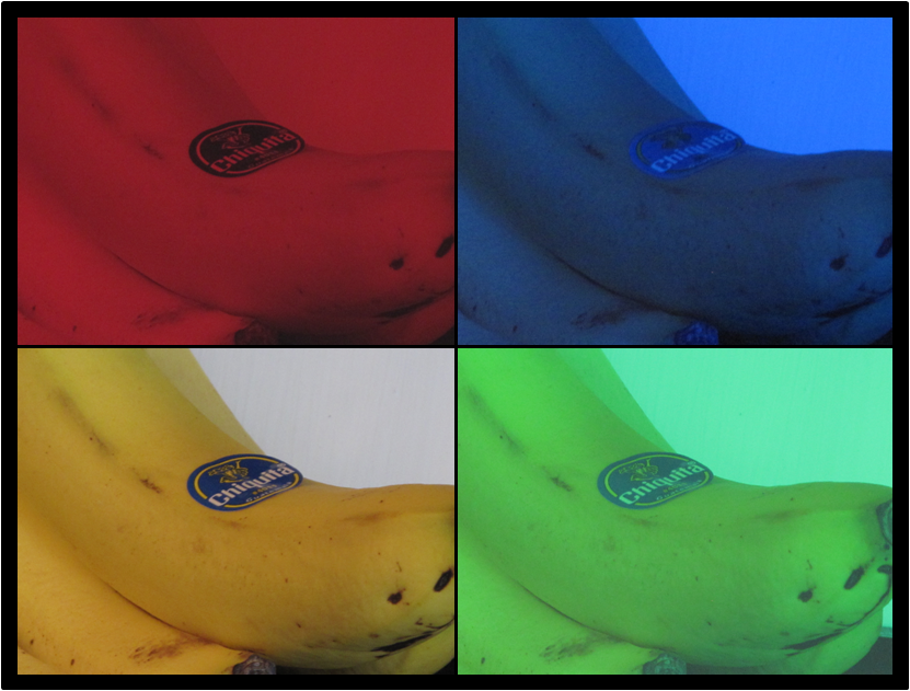
When I ask a simple question like "what color is a banana?" the answer is obvious to any five-year old. It's yellow. Under normal conditions, the banana will retain this color, but put on deep red sunglasses (or equivalently, look at the banana under red light), and the banana looks red. Put on blue sunglasses and the banana suddenly looks like the kind of banana that my wife would expect me to eat.

The depraved idea that an object has a specific color independent of the illumination is built right into our language. One should really ask "what color does the banana appear under a such-and-such lighting?" The reason we think of an object having a color apart from the effect of the light shining on it is that the eye and brain have conspired to make us believe in color constancy.
How is this trick accomplished? First, the eye and brain together do a remarkably good job of auto-ranging. If I am reading a magazine as I walk from indoors to outdoors, I may blink a few times, but it never occurs to me that the intensity of light hitting my eye just changed by many orders of magnitude.
Colorful lighting can enhance the look of food
The depraved idea that an object has a specific color independent of the illumination is built right into our language. One should really ask "what color does the banana appear under a such-and-such lighting?" The reason we think of an object having a color apart from the effect of the light shining on it is that the eye and brain have conspired to make us believe in color constancy.
How is this trick accomplished? First, the eye and brain together do a remarkably good job of auto-ranging. If I am reading a magazine as I walk from indoors to outdoors, I may blink a few times, but it never occurs to me that the intensity of light hitting my eye just changed by many orders of magnitude.
This auto-ranging is performed separately for each set of cones in the eye, which is an important little detail needed to preserve color constancy. When I go from warm incandescent light to cool fluorescent light, the relative amount of light at the blue end changes by almost a factor of ten. Do you notice that? Huh? And why didn't you notice it? Auto-ranging, my friend.
Here's an example of the conspiracy which has become famously known as the "Jennifer Aniston has way different RGB values for her skin tone from picture to picture" effect. Someone wrote a blog post about the color of her forehead. Something about how the eye/brain tries to get us to not see the glaring difference in color. The blog post went viral, so now everyone is talking about the "Jennifer Aniston has way different RGB values for her skin tone from picture to picture" effect.

The reason that these pictures of my heartthrob all appear "normal", is a devious trick in the brain that goes beyond the auto-ranging feature. Somehow or other, the lower levels of the brain have this concept of white point. Everything that we perceive is not thought of in absolute terms, but rather, in relative terms to some color that we have decided is "white". The brain somehow has established a different white point for each of the six gorgeous pictures.
Here is another cute trick to illustrate this devious trick. Go to your recycle bin and pull out a newspaper, or some similar paper. Look at it for a while, against a dark background. What color do you perceive the paper to be? I am guessing that you see white.
Now, unbeknowst to your eye and brain, set a piece of printer paper or a glossy magazine next to the newspaper. As quick as you can say "John the Math guy is a genius", the newspaper will take on a dingy tone. A new white point! That lower visual system is a tricky little critter, I tell you!
So, part of the process of computing a CIELAB value is to factor in the illumination in kinda the same way as the eye.
Object size
This is totally non-obvious, but objects change color as their size changes. Or, to be more specific, objects change color depending on the angular size of the object. Well, actually, to be even more specific, the spectral response of the eye depends upon the position on the retina. The area of the retina that collects light from within 2 degrees of "dead on" has one spectral response. Once you are talking about objects extending to 10 degrees, the spectral response changes slightly.
How big is 2 degrees and 10 degrees? At arm's length, 2 degrees is about the size of your thumb, and 10 degrees is about the width of your fist.

Going from spectrum to CIELAB
Now, on to explain how the computation of CIELAB values are computed in order to take into account all these crazy effects.

Rule of thumb: If you can smell his breath,
the beautiful stripes are likely to be subtending an arc of at least 10 degrees
the beautiful stripes are likely to be subtending an arc of at least 10 degrees
Going from spectrum to CIELAB
Now, on to explain how the computation of CIELAB values are computed in order to take into account all these crazy effects.
The
first step is to measure the spectrum with the spectrophotometer. This is just reflectance as a function of wavelength -- what
percentage of 570 nm (yellow-green) light will reflect from the sample? This by itself has nothing to do with the light source; nothing to do with either the
light source of the spectro or the light source that has been specified
for the CIELAB values.
One possible confusion... The spectrum of the sample is not D50 or D65 or F11 or illuminant A. It has been sanitized to remove all traces of the illumination. When you flip the switch on your spectro to make it report D75 instead of F3, you don't change the light that hits the sample.
Once you have the spectrum, the next step is to apply the spectral curve of the light source... D65 for example. The purpose of this is to simulate how much light at each wavelength is available to reflect. For example, if your light source is incandescent (illuminant A), then the amount of light at the blue end is much smaller than at the red end. The spectral curve for illuminant A will dampen down the blue end. The calculation that goes on inside the spectro accomplishes this by applying one of the standard illuminants from CIE 15, ASTM 308, or ISO 13655.

The third step is to apply one of the sets of curves that approximate the spectral response of human eye. These are the tristimulus functions. This will reduce that spectrum of 15 or 31 or 36 numbers down to three (X, Y, and Z) which represent the responses of the three cones in the eye. Here, we have two choices: the 2 degree (thumb-sized or smaller) or the 10 degree observer (fist-sized or bigger).
(For the persnickety reader, I should admit something. The XYZ curves are not actually the spectral response of the three cones. Those responses are called LMS. It's pretty simple arithmetic to go between the two, but the exact values of the constants weren't known back in 1931 when the 2 degree observer became a standard.)
Once you have the spectrum, the next step is to apply the spectral curve of the light source... D65 for example. The purpose of this is to simulate how much light at each wavelength is available to reflect. For example, if your light source is incandescent (illuminant A), then the amount of light at the blue end is much smaller than at the red end. The spectral curve for illuminant A will dampen down the blue end. The calculation that goes on inside the spectro accomplishes this by applying one of the standard illuminants from CIE 15, ASTM 308, or ISO 13655.

This monarch is blissfully unaware of all the math that goes into color
The third step is to apply one of the sets of curves that approximate the spectral response of human eye. These are the tristimulus functions. This will reduce that spectrum of 15 or 31 or 36 numbers down to three (X, Y, and Z) which represent the responses of the three cones in the eye. Here, we have two choices: the 2 degree (thumb-sized or smaller) or the 10 degree observer (fist-sized or bigger).
(For the persnickety reader, I should admit something. The XYZ curves are not actually the spectral response of the three cones. Those responses are called LMS. It's pretty simple arithmetic to go between the two, but the exact values of the constants weren't known back in 1931 when the 2 degree observer became a standard.)
At
this point, we have approximated the signal that travels along the
optic nerve to the brain. The next step is to approximate the math that
the lower level of the brain does. We translate the XYZ values into
L*a*b* values to get this.
Well, sorta. There is some further math that the brain does. At the
cognitive level, we don't think in terms of a* and b*, but rather in
terms of chroma and hue. So, to get numbers that intuitively make
sense, we convert from L*a*b* to LC*h. (This conversion can go either way
- they represent the same information.)
Usage notes
So, we got us a couple of plethoras full of combinations of ways to multiply stuff together to convert the spectrum of a sample to a color value. How is a color metrologist to decide which delightful combination to choose?

Here is a list of the illuminants that are mentioned in ISO 15-4:2004. The silly four digit numbers like 2856 and 6800, are called correlated color temperature. A smaller number refers to a warmer (redder) color, a higher number refers to a cooler temperature (bluer). The silly two digit numbers are abbreviations of the four digit numbers; D65 actually means D 6500 K.
Illuminant A - 2856 K, kinda looks like an incandescent light bulb.
Illuminant B - 4900 K, deprecated, which means "not recommended anymore".
Illuminant C - 6800 K, kinda like daylight, but in the shade.
Illuminants - daylight simulations D50, D55, D65, D76.
Illuminants FL1, FL2, ... FL6 - standard fluorescent lights.
Illuminants FL7, FL8, and FL9 - broad band fluorescent lights.
Illuminants FL10, FL11, FL12 - narrow band fluorescent lights.
I am not an arithmetician, but I count 18 different illuminants.
There are two "observers", the 2 degree and the 10 degree, that have been defined. That brings us to a total of 36 combinations.
There is a general recommendation from color scientists to use D65 for computing CIELAB values, but the choice is industry specific. The graphic arts community (of which I am a card carrying member) has chosen D50 to be its standard illuminant. Why? Maybe D50 was taken as a compromise between theoretical daylight (D65) and theoretical living room light (A). Personally, I think the D50 lobby bribed someone on the standards committee, but I can't prove anything.
Similarly, the standard in the graphic arts for the XYZ function is the 2 degree observer. Why? Areas of constant color in the Victoria's Secret catalog are usually pretty small. Well, unless the colors are banners and background, in which case, who cares about the color?
So, if you are doing printing, then the ISO Technical Committee 130 has decided on D50/2 (simulation of the color under D50 lighting, with a colored area being about the size of your thumb).
But what about packaging printing?
Imagine that Jamal is standing in front of that big screen TV box at Best Buy. He is making that spur of the moment decision about spending three month's salary on that TV that's going to make him not care whether the Packers win. The color of that box darn well better look good. And the colors probably subtend an arc greater than 2 degrees. Oh... and the lighting in the store? Probably not D50.

So, a good case could be made that the color of this package should be computed with the 10 degree observer and probably with one of the F illuminants. Ideally, it would be computed with the F illuminant that is in the store. This is what contracts are for. If I was Mr. Sony, I would specify that Big Screen Package Printing use the 10 degree observer for their color computation.
But, yet again...
When it comes down to it, it generally doesn't make a huge difference if you specify D50/2 or D65/10. It's a much bigger deal to make sure that everyone has agreed on which combination is to be used.
So, we got us a couple of plethoras full of combinations of ways to multiply stuff together to convert the spectrum of a sample to a color value. How is a color metrologist to decide which delightful combination to choose?

Steve Carrel demonstrates the proper usage of CIE standard illuminants
Here is a list of the illuminants that are mentioned in ISO 15-4:2004. The silly four digit numbers like 2856 and 6800, are called correlated color temperature. A smaller number refers to a warmer (redder) color, a higher number refers to a cooler temperature (bluer). The silly two digit numbers are abbreviations of the four digit numbers; D65 actually means D 6500 K.
Illuminant A - 2856 K, kinda looks like an incandescent light bulb.
Illuminant B - 4900 K, deprecated, which means "not recommended anymore".
Illuminant C - 6800 K, kinda like daylight, but in the shade.
Illuminants - daylight simulations D50, D55, D65, D76.
Illuminants FL1, FL2, ... FL6 - standard fluorescent lights.
Illuminants FL7, FL8, and FL9 - broad band fluorescent lights.
Illuminants FL10, FL11, FL12 - narrow band fluorescent lights.
I am not an arithmetician, but I count 18 different illuminants.
There are two "observers", the 2 degree and the 10 degree, that have been defined. That brings us to a total of 36 combinations.
There is a general recommendation from color scientists to use D65 for computing CIELAB values, but the choice is industry specific. The graphic arts community (of which I am a card carrying member) has chosen D50 to be its standard illuminant. Why? Maybe D50 was taken as a compromise between theoretical daylight (D65) and theoretical living room light (A). Personally, I think the D50 lobby bribed someone on the standards committee, but I can't prove anything.
Similarly, the standard in the graphic arts for the XYZ function is the 2 degree observer. Why? Areas of constant color in the Victoria's Secret catalog are usually pretty small. Well, unless the colors are banners and background, in which case, who cares about the color?
So, if you are doing printing, then the ISO Technical Committee 130 has decided on D50/2 (simulation of the color under D50 lighting, with a colored area being about the size of your thumb).
But what about packaging printing?
Imagine that Jamal is standing in front of that big screen TV box at Best Buy. He is making that spur of the moment decision about spending three month's salary on that TV that's going to make him not care whether the Packers win. The color of that box darn well better look good. And the colors probably subtend an arc greater than 2 degrees. Oh... and the lighting in the store? Probably not D50.

But, yet again...
When it comes down to it, it generally doesn't make a huge difference if you specify D50/2 or D65/10. It's a much bigger deal to make sure that everyone has agreed on which combination is to be used.
A reader pointed me to an article that gives a more complete explanation of why the print industry decided to compromise and use D50:
ReplyDelete"Why the printing industry is not using d65?"
http://mxchg.fogra.org/products-en/download/Extra18web.pdf
Thank you, Dan, for pointing me to the article, and thank you Andy, for writing it!
Thanks for the link on D50 vs. D65. As a hobbyist photographer, I use D50 lamps from Walmart or the home improvement store in desklamps to look at my prints. When the camera club puts them in the D65 (more or less) lightbox for competition, they get what they get.
ReplyDeleteAs a side note, illuminating the whole room at home with D50 (or especially D65) at the low levels attainable does not appear neutral at all - noticeably cold and blue even after minutes of adaptation. I noticed the same effect when participating in the subjective testing for HDTV back in the early 90s. This effect seems to disappear when the light levels are raised closer to natural daylight levels.
sir, what is the value of 0.008865 in xyz to Lab? Please.
ReplyDeleteThis is kind of a long story... but I will try to simplify.
DeleteSteven's law suggests that all our senses are nonlinear, and follow a power law. Many researchers tried to fit linearity data for vision with a function like x^k, where k is the nonlinearity constant.
These didn't work well. They found they needed to subtract some number to get things to fit better. Around 1955, Ladd and Pinney published a paper suggest that cube root is a good approximation, with some number subtracted. Several researchers duplicated that cube-root function.
But there is a problem that this would give you a negative number for really really dark stuff. In 1976, Pauli solved this by creating a linear segment near the bottom -- so the cube root is used above ~0.008865, and a straight line going to zero below that point.
The transition point was chosen so that the slope of the line matches that of the cube toot of that point.