
Friday, June 28, 2013
Wednesday, June 26, 2013
The color of a bunch of dots, part 2
In the color of a bunch of dots, part 1, I focused on one simple equation for the prediction of the reflectance of a halftone, the Murray-Davies equation. This equation is reasonable and readily understood, but it does not do such a good job at predicting what happens when ink meets paper. The Murray-Davies equation does such a poor job of predicting reflectance that the prediction error has become one of the most common standard process control parameters for printing.

That comment is important enough to repeat. Please read this slowly, carefully articulating every word: The Murray-Davies equation does such a poor job of predicting reflectance that the prediction error has become one of the most common standard process control parameters for printing. It is called "dot gain" by old pressmen, and "tone value increase" or "TVI" by the intellectual elite. Feel free to decide which group you belong to and use the appropriate phrase.

Dot gain in the headlines
That comment is important enough to repeat. Please read this slowly, carefully articulating every word: The Murray-Davies equation does such a poor job of predicting reflectance that the prediction error has become one of the most common standard process control parameters for printing. It is called "dot gain" by old pressmen, and "tone value increase" or "TVI" by the intellectual elite. Feel free to decide which group you belong to and use the appropriate phrase.
Of course, we knew one source of error in the Murray-Davies approximation. Halftone dots are bigger in real life than they were in the image file. Ink squishes out between the plate and the blanket and then again when it transfers from blanket to paper, so the dots on the paper are bigger [1]. To be fair to those using the Murray-Davies equation to compute TVI, the degree to which the dots spread is a valid control parameter indicative of how dots squish out.
But, to be fair to people who make brash, negative comments about the Murray-Davies equation (and then have the gall to repeat them in italics), how much the dots squish is only part of the prediction error.
Optical dot gain
The Murray-Davies equation was published in 1936. It was known at least by 1943 that it did not work well for halftone dots on paper. I quote from Yule: "Experimental results do not agree exactly with the theoretical relationships except for screen negatives and positives with sharp dots."
Enter John A.C. Yule and W. J. Neilsen. They presented a paper at the 1951 TAGA conference [2] entitled "The Penetration of Light into Paper and Its Effect on Halftone Reproduction", where they described another reason for the discrepancy. [3]

Yul Brynner, Leslie Nielsen, and Dodd Gayne
(from The King and I in the Cockpit) [4]
(from The King and I in the Cockpit) [4]
The Murray-Davies formula makes the assumption that light either hits a halftone dot or paper. Furthermore - and this is the critical part - that the dots of ink don't effect the color of the paper. Yule and Neilsen point out that this is just not the case. Anyone who says otherwise is itching for a fight.
The diagram below shows the Yule-Neilsen effect. When we look at a halftone, some of the light follows path #1. It passes through the ink once, reflects from inside the paper, and then exits for us to behold its marvelous hue. The ink acts like a filter, so two passes make it a richer color.
Some of the light, however, passes through the ink once and then scatters within the paper. This hapless light then exits from between halftone dots. Since it has only passed through the filter (the ink) once, it will not take on quite as rich a hue.

Dramatization of the Yule-Neilsen effect
The next diagram illustrates what the result looks like. The paper between halftone dots takes on a richer hue as a result. The magnitude of the effect depends on a few factors. First, obviously upon the amount that the paper scatters light. This is related to the opacity of the paper. A paper that is translucent will tend to scatter light further, enhancing the Yule-Neilsen effect.
Second, and perhaps not so obvious, is the screen ruling. If the dots are closer together, the light doesn't have to scatter as far to infuse the whole area between halftone dots.

Equally dramatic demonstration of the effect of the Yule-Neilsen effect
These gentlemen, Mr. Yule and Mr. Neilsen, were pretty sharp guys. They knew some math. The graph below shows the equation that they came up with to model this effect. From this equation, it was now possible to predict the reflectance (or density as in the graph) of a halftone from the dot area on the paper and the densities of the paper and solid.

The celebrated Yule-Neilsen equation as it originally appeared
The equation above is written in terms of density and not reflectance. This makes it a bit hard to relate to the Murray-Davies equation. Here is the equation written in a way that makes the correspondence obvious.
Yule-Neilsen equation
Comparing this back to the Murray-Davies equation, we see that the only difference is that in the Yule-Neilsen equation, all the reflectance values are raised to the power of 1/n. The Murray-Davies equation is a special case of the Yule-Neilsen equation with n = 1.
Murray-Davies equation
The appropriate value for "n" depends on the translucency of the paper. One researcher (Pearson) said that it should be between 1.4 and 1.8. Another set of researchers (Qian et al.) had it at 1.3 for their substrate.
Now it gets complicated
This thing that has become known as "tone value increase" thus is comprised of two parts:
1) The dots on the paper are richer in color than expected because the dots squish out to cover more paper. This is known as physical dot gain.
2) The light spreads between the dots to make the paper take on a tint of the color. In doing so, they also make the color of a halftone richer than expected. This is known as optical dot gain.
That was the easy part. Now for the complicated part.
Optical dot gain is not as easy to measure as physical dot gain. You need to take a picture of the dots, and assign each pixel to either dot or paper. This isn't all that hard, but it can't be done with a standard spectrophotometer. A second instrument is used, called a planimeter. For "hard" dots - dots that have crisp, well defined edges, the assignment of each pixel isn't that hard. You simply set a threshold gray value somewhere around half way between "paper" and "dot". But for softer dots, the measurement you get depends a lot on how the threshold is chosen.
So, basically, no one in a production environment ever measures physical dot gain. The two types of dot gain get rolled into one. The combination of the two, TVI has become the process control parameter of choice. Any difference between the tone value in the file and the tone value on the paper is undifferentiated.
But researchers generally use the Yule-Neilsen equation to model the relationship between CMYK tone values and reflectance. I have a short list of such papers below [5]. The Holy Grail for these folks is to find a formula that will allow them to compute the whole shooting match. CMYK tone values, along with some press parameters, go into the magic black box. CIELAB values come out.
The Yule-Neilsen equation (and the n value that go with it) are kind of a one-way street. It can be used in prepress to predict what a halftone will look like, but you can't use it in the press room to verify that the print is correct.
So, for the time being we are stuck with the Murray-Davies equation. Maybe that's not so bad? I will address this issue in the next post in this series. Maybe the current way of measuring halftones is not the panacea that we think it is.
-------------------------------------
[1] I am taking a very web-offset-centric view of this. The same principles apply to other types of printing.
[2] TAGA (Technical Association of the Graphic Arts) has been running an annual conference since the ten commandments were inscribed via a lithographic process without the help of Yule Brynner. The 2014 call for papers is out. Submissions dues by July 19th, 2013.
[3] I missed this conference and hence the landmark paper, but I don't quite recall why.
[4] Seriously for the moment. Yule is the print scientist. Yul is the actor who my wife has a crush on. Someday I will shave my head to compete. Neilsen is another print scientist.The actor's last name is spelled "Nielsen". My wife does not have a crush on him, but regardless, I will someday grow my hair white.
The insidious misspelling of Neilsen's name is so pervasive that Google's patent search returns 11,400 results searching on "Yule Nielsen factor" and only 88 on the correct spelling. This just ticks me off.

Scan from the 1951 TAGA Journal, showing correct spelling
[5] Here is a list (incomplete) of papers where the Yule-Neilsen formula is featured as a way to predict the color of a halftone.
Pearson, M. (1980). N-value for general conditions. In TAGA Proceedings, (pp. 415–425).
Viggiano, J. A. S. (1985). The color of halftone tints. In TAGA Proceedings, (pp. 647–663).
Pope, W. (1989). A practical approach to N-value. In TAGA Proceedings, (pp. 142–151).
Rolleston, R., & Balasubramanian, R. (1993). Accuracy of various types of Neugebauer model. In IS&T and SID’s Color Imaging Conference: Transforms and Transportability of Color, (pp. 32–37).
Arney, J. S., Arney, C. D., & Engeldrum, P. G. (1996). Modeling the yule-nielsen halftone effect. Journal of Imaging Science and Technology, 40(3), 233–238.
Hersch, R. D., & Crt, F. (2005). Improving the Yule-Nielsen modified spectral Neugebauer model by dot surface coverages depending on the ink superposition conditions. In IS&T Electronic Imaging Symposium, Conf. Imaging X: Processing, Hardcopy and Applications, SPIE, vol. 5667, (pp. 434–445).
Gooran, S., Namedanian, M., & Hedman, H. (2009). A new approach to calculate colour values of halftone prints. In IARAGAI.
Rossier, R., & Hersch, R. D. (2010). Ink-dependent n-factors for the Yule-Nielsen modified spectral Neugebauer model. In CGIV – Fifth European Conference on Colour in Graphics, Imaging, and MCS/10 Vision 12th International Symposium on Multispectral Colour Science.
Qian, Yiming, Nawar Mahfooth, and Mathew Kyan, (2013) Improving the Yule-Nielsen modified spectral Neugebauer model using Genetic Algorithms, 45th Annual Conference of the International Circle
Wednesday, June 19, 2013
The color of a bunch of dots, part 1
First off, most printing today is done with dots. Halftone dots. Oh, you knew that already? Just in case you didn't, have a look at magazine with a magnifying glass. You'll see that highlight areas are made of tiny dots, and shadows are made of dots that are so big they run all together.

Scan from a catalog showing halftoning
A formula to predict the reflectance of a halftone
Way back in 1936, a fellow by the name of A. Murray of Eastman Kodak [1] was pondering the measurement of halftones. Murray sought out his friend, E.R. Davies [2] to ask if there were a simple formula. Davies gave him such a good enough answer that Murray decided to publish the results. Naturally, by Stigler's law, the resulting equation isn't known as the Davies equation, but rather, as the Murray-Davies equation.

Contrary to popular belief, the Murray-Davies formula
was not developed by Bill Murray and Geena Davis
was not developed by Bill Murray and Geena Davis
Suppose that you have an area that is halftone dots that cover 20% of the area, something like the area below. Of the light shining on this area, 20% will hit ink, and the remaining 80% will hit paper. If there are 100 photons playing this game, 20 will hit the ink. Suppose further that the ink will reflect 5% of the light that hits it. That means that, of the initial 100 photons in the game, only 1 will reflect back from the ink, since 5% of 20 is 1.
Now, let's look at the fate of the other 80 photons. Suppose that the paper has a reflectance of 80%. That means that 80% of those 80 photons (64) will reflect. All told, 1 + 64 = 65 of the original 100 photons will reflect.

The pattern on my jammy bottoms
Did that all make sense? If so, then congratulations! You understand the Murray-Davies equation. If the various R's in this equation stand for the reflectance of the various things, and A stands for the dot Area, then this simple formula will give an approximation for the reflectance of the halftone:
The celebrated Murray-Davies equation
You may have seen an uglier version of this equation, one involving logarithms or 10 raised to some power. Trust me. IT's all the same equation. People put that kind of complication in just to make themselves sound smart. Sometimes they are actually smart. Especially when I do it. But the point is, the simple equation above is the basic Murray-Davies equation.
Trouble in Paradise
It didn't take long to see that the formula does not do a fabulous job of estimating the reflectance of a halftone. And it didn't take long to find an explanation. If one compares the size of the dots on the plate with the size of the dots on the paper, it is obvious that the dots get bigger when you print. There is dot gain. And if the dots are bigger, then one would expect the reflectance to go up as well.
Clearly if one would like midtones to be the right color, dot gain must be measured and ultimately controlled. The Murray-Davies equation provides a way to measure the dot gain. First, you solve the Murray-Davies equation for the area term, A. This revision of the Murray-Davies equation (shown below) answers the question "How big must the dots be in order to get a certain reflectance?"

You measure the reflectance of the paper, the solid, and the halftone, plug them into the equation below, and you have an indirect measurement of the size of the dots. The difference between this indirectly measured dot area and the area on the printing plate (or the area requested in the digital file) is called the dot gain.
Aside from changing the name from "dot gain" to "tone value increase", this basic formula has survived to this day as a control metric. The image below is a screenshot from the most recent (unpublished, as yet) version of the main ISO standard for printing, ISO 12647-2. The horizontal axis is the tone value (dot area) going from 0% (paper) to 100% (solid ink). The vertical axis is the expected amount of increase in tone value for each of five different types of printing. For printing type A, a 50% tone value in the image file is supposed to print like a 66% halftone.

One of the jobs of the printer is to maintain the press so that these are the tone value increases that are seen on a daily basis. If the press is printing differently (maybe the 50% tone value measures as a 64% rather than a 66%) a look up table (known as a plate curve) is introduced between the digital file and the plate manufacture so that the combined system has the proper tone value increase. As a result, a contact proof can be printed or displayed on a calibrated monitor that accurately predicts what the press will print.
So, it would appear that all is well with the world. The printer has a tool to monitor the way that halftones are printed, and can digitally adjust this to a value that ISO has prescribed. By keeping this constant, the printed product will always be the correct color.
Or so it would appear. Stay tuned for the next installment, where I show that this simplistic view of tone value increase is lacking, particularly when we go beyond the borders of conventional web offset printing with CMYK inks.
--------------------------------------
[1] Almost no one knows this guy's first name. It is ironic that his last name has gone down in the history of printing without a first name. Note to the historians: When you put my name down in the history books, please make sure my first name is there. And if you have enough space, I wouldn't mind having my middle name, "the Math Guy" included. I said, "almost no one" because I have found exactly one person, Dr. J. A. S. Viggiano, who has preserved the first name: Alexander. Alexander has that first name on at least 22 patents.
[2] Guess what? I don't know this guy's first name.
Wednesday, June 12, 2013
A few maps of the US
I don't know what to make of this. But it has to do with Tom Jones, political leanings, and coleslaw. Three infographic maps of the USA wandered through my browser in the past few weeks. As I recalled, they bore a striking resemblance to each other, so I decided to blog about them.
I will start out by talking about regional dialects. A grad statistics student at NC State recently sent ripples through the twittersphere with some cools maps showing dialectic differences between areas of the USA. He looked at regional data on pronunciation and word usage questions like whether that white stuff on your bagel is called "CREAM cheese" or "cream CHEESE", and how to pronounce the "i" in miracle.
The important question that I want to focus on is the preponderance of people who hold the mistaken belief that it is somehow appropriate to refer to coleslaw as "slaw". In the map below, the regions shaded with a reddish-orange indicate where the use of "the slaw word" is acceptable in mixed company. The areas where you just don't say that are light blue.
The important question that I want to focus on is the preponderance of people who hold the mistaken belief that it is somehow appropriate to refer to coleslaw as "slaw". In the map below, the regions shaded with a reddish-orange indicate where the use of "the slaw word" is acceptable in mixed company. The areas where you just don't say that are light blue.

Reddish-orange means that the word slaw can be used in place of coleslaw
Important stuff indeed if you are on a road trip and get a hankering for coleslaw!
This next infographic map of the presidential election results showed up in a sidebar in a news article that I was reading. I know... election results? This is old news, but, there is a striking resemblance between this image and the slaw image. Except for a slightly different choice of colors.

State by state presidential results
The following states are reddish in both maps: Texas, Louisiana, Arkansas, Mississippi, Alabama, Georgia, South Carolina, North Carolina, Tennessee, Kentucky, West Virginia, Indiana, Missouri, Kansas, and Oklahoma (15 states). The following states are bluish in both maps: New Mexico, Colorado, California, Nevada, Oregon, Washington, Minnesota, Wisconsin, Iowa, Michigan, Pennsylvania, New York, Maryland, Delaware, New Jersey, Connecticut, Rhode Island, Massachusetts, Vermont, New Hampshire, and Maine (21 states).
So, unless I counted wrong, 36 of the 48 contiguous states are colored similarly in these two maps. I figger the odds for this happening at random to be around 0.07% [1].
There is some very practical advice here. Let's say that, while travelling the US, you were in a bar and wondering whether to bring up the topic of immigration reform. Now, if you didn't happen to know what part of the country you were in, you could easily get a handle on the political leaning by just asking for an order of slaw. If the waitress looks at you funny, then you are pretty safe espousing a liberal viewpoint [2].
Hey, that was fun! How about another infographic of the US that caught my attention this last week? Below, we see a graph of the number of Welsh people per 10,000, on a county by county basis. I am sure most of you were wondering when I would come around to talking about the Welsh [3]!

Number of Welsh people per 10,000
My opinion here (with no math to support it) is that if you squint your eyes just right, this looks a lot like the other two maps. Well, maybe more like the election map than the slaw map. That is, if you ignore what's going on in Wisconsin. And who cares about them anyway?
So, here again, is the practical advice. It is abundantly clear that eating slaw instead of coleslaw will help rein in the rampant Welsh immigration into this country. Please do your civic duty.
----------------------------------
[1] This is a quick estimate. I assumed that the choices in both cases were 50-50. It would be preferable to start with the raw data, and do correlation on actual percentages, rather than the binarized red/blue. It would also not be such a bad idea to look at data county by county, if this were available for the coleslaw data. I did not take the time to do that, but hey, come on! Cut me some slack. I write this blog every week!
[2] If you try this helpful trick and get beat up, I will gladly refund the money you paid me to read this blog.
[3] Useful bit of trivia: Tom Jones was Welsh. Another useful bit of trivia: "Jones himself has admitted that during his Lothario period he slept with up to 250 women a year."
Wednesday, June 5, 2013
Math Guys say the darndest things!
I recently went through my posts on Facebook, and found several that were perhaps a bit silly. Decided for yourself...
I thought I was going to have a great dream last night, but I slept through it.
I thought I was going to have a great dream last night, but I slept through it.
I am alleged in my own time.
I am developing a search engine for Jewish food called Koogle.
Before buying an iPad, I would recommend adding another
bathroom.
I am developing a search engine for Jewish food called Koogle.
 |
| Koogle the search engine |
There was a bug in the bathroom this morning with a hundred
legs: a centi peed in the toilet.
I decided not to take the job in the shipping department of
the basket company. I don't think I could deal with all the basket cases.
Is it washful thinking for me to plan to get laundry done
today?
I spent all last night dreaming about insomnia. :(
Beauty products don't work on my wife. Can't improve on
perfection.
I'm looking for an Android app where I can download a
Starbucks to drink in bed.
I am soooooooooo looking forward to National No Underwear day
on Saturday! I have been looking through my closet for just the right pair to
not wear. So hard to decide.
Today's invention - a device that holds your e-book to your
chest so that you can read while jogging. I will call it the kindle-ah-bra.
I am hoping to find a way to slip the word
"excrementitiously" into casual conversation.
I think they should replace the "Forward" button in email programs with a button that says "I'm not going to bother to do any fact checking
or research or even critical thinking, but I fully support the hatred expressed
in this email".
My condition has been upgraded to "feeling like
poop". I am soooo much better today.
Ignorance is bliss, but awareness of ignorance is not.
I just realized that those fake dog turds are really dog
sham poo!
I don't want to sound like a skeptic, but I don't think Buzz ever actually got to infinity, let alone beyond it.
I'd give my manhood for another X chromosome.
A joke walks into the bar and the bartender says, "I don't get it?"
I don't want to sound like a skeptic, but I don't think Buzz ever actually got to infinity, let alone beyond it.
I'd give my manhood for another X chromosome.
A joke walks into the bar and the bartender says, "I don't get it?"
Wednesday, May 29, 2013
What? Are you tone deaf???
I would guess that all of us who are musically inclined have had the unpleasant experience of singing (or trying to sing) next to someone who just could not get the notes. I'm not talking about the people who can't quite reach up to an E or an F and wind up just a bit flat. I'm talking about the folks who just can't sing the right notes even when the pitch is well within their range. These people are tone deaf.
Florence Foster Jenkins was one such lady with a tin ear. She was a lady of society in the early 1900's who aspired to be an opera star. And she had the funds to back her own performances. A bad combination. She appeared once at Carnegie Hall, and sold out the venue with people wishing to participate in the ridicule.
Jenkins was apparently completely unaware of her total inability to sing on pitch. She thought that people who ridiculed were just jealous. In the play Souvenir, there is a scene where her lifetime pianist is mortified that she was going to listen to a recording that had been made of her. He relented, and she heard her voice for the first time. She was thrilled.
What causes this? How can people not know?
Where hearing takes place
Hearing takes place deep in the ear. People talk about the ear drum, and the hammer and anvil and stirrup and I dunno, the spurs and the staple gun. All those things are great to have in one's inner ear, but the actual sensing of sound comes in that snail-like thing called the cochlea.

The cochlea is a long tube, filled with hairs. It just happens to be twisted around into the shape of a snail shell, but that's not a functional feature. It just conserves space. If you were to stretch the cochlea out and slice it open, it would look exactly like the diagram below. Absolutely identical. Sound travels from the left to the right. The left side of the picture is near where the sound enters, and the right side is where the tube ends.


Jenkins was apparently completely unaware of her total inability to sing on pitch. She thought that people who ridiculed were just jealous. In the play Souvenir, there is a scene where her lifetime pianist is mortified that she was going to listen to a recording that had been made of her. He relented, and she heard her voice for the first time. She was thrilled.
What causes this? How can people not know?
Where hearing takes place
Hearing takes place deep in the ear. People talk about the ear drum, and the hammer and anvil and stirrup and I dunno, the spurs and the staple gun. All those things are great to have in one's inner ear, but the actual sensing of sound comes in that snail-like thing called the cochlea.

Something inside your ear, and something that would be gross to have in your ear
The cochlea is a long tube, filled with hairs. It just happens to be twisted around into the shape of a snail shell, but that's not a functional feature. It just conserves space. If you were to stretch the cochlea out and slice it open, it would look exactly like the diagram below. Absolutely identical. Sound travels from the left to the right. The left side of the picture is near where the sound enters, and the right side is where the tube ends.

Actual photomicrograph of the inside of the cochlea
Ok. I lied. This is not a perfect representation. It is a conceptual drawing.
But anyway. Each of the hairs has its own resonant frequency due to its size and stiffness. When a specific frequency of sound enters the cochlea, it will set certain of the hairs to vibrating like a bunch of little tuning forks. The vibration is converted to nerve impulses and transmitted to the brain. The louder the sound at that frequency, the more the corresponding hair vibrates, and the stronger the signal passed to the brain. Thus, the cochlea is performing frequency analysis on the incoming sound wave.
This next image is another conceptual drawing, illustrating the mapping between frequency and position along the tube. The opening of the cochlea is sensitive to sound around 16 kHz, which is the upper limit of our hearing. The hairs that are one quarter of a trip around the spiral are sensitive to sound one octave below this, that is 8 kHz. Each subsequent quarter trip around the spiral represents another octave drop, or halving of the frequency.
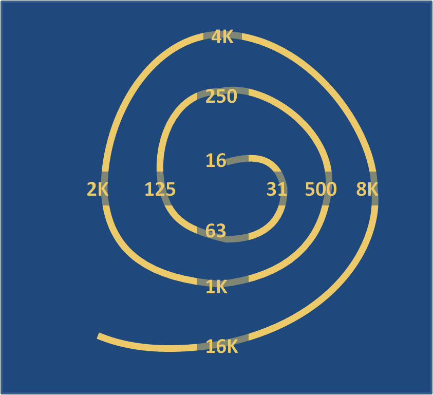
Where the frequencies hit the hairs in the cochlea
This continues over the entire span of human hearing, or about ten octaves - a factor of 1,024 in frequency. Each octave turn around the spiral has at least 12 discrete steps, since we are able to readily distinguish 12 half steps in a musical. Our frequency resolution is not likely to be more than a factor of five more than this, however, since a half-step feels fairly small.
I should point out that an octave is not necessarily one quarter spin around the spiral. That's just my guess. The salient point is that the individual frequency receptors are spaced out logarithmically.
Maybe the hairs are not working?
If someone is tone deaf, then perhaps the cochlea is not functioning according to spec? This is conceivable... but I'm going to argue that it's not likely.
Here's my argument: if a person can tell the difference between "oooooo" and "ahhhhhh", then the basic hardware must be working.
I sang an oooooo into the microphone on my laptop and then did a little frequency analysis. The graph below shows the amount of energy at each of the frequencies from 0 Hz to 1.4 kHz. For the "oooooo", there are two spikes: one at the fundamental frequency of about 140 Hz, and the other at one octave above that, at about 280 Hz. The second frequency is called the first harmonic. Almost everything (vocal chords included) vibrates in a complected way that includes multiple frequencies that are multiples of a fundamental frequency [1].

Oooooooooo
The diagram below shows roughly which hairs in the cochlea will be stimulated by the "oooooo" sound.

Hairs that respond to an "oooooo"
I also recorded and analyzed an "ahhhhh" sound. The frequency breakdown is shown in the next graph. The difference is startling. The ahhhhh has the fundamental frequency, and the first harmonic, but it also has an appreciable amount of energy in the third through ninth harmonics [2].

Ahhhhhhhhh
Here is my argument again. If a human ear is capable of differentiating between the oooooo and ahhhhh at a fireworks display, as well as eeeeee, and oh, and also mmmmmm, and nnnnnn, and ellllll... then it is likely that a lot of the mechanism in the cochlea is intact. The fault must lie somewhere in the brain. The part of the brain that decodes sound for the purpose of speech must be getting everything it needs, but the part of the brain that interprets sound as music must be broken somehow.
What do the real scientists say?
A recent article in the Journal of Neuroscience remarkably provides support for my back of the napkin analysis. The folks who wrote this paper had a look at the "arcuate fasciculus" portion of the brain. The AF is a pathway that connects the part of the brain that controls our perceiving of sound with the part of the brain that controls the production of sound. There are two such pathways. People who are tone deaf lack one of these connections. The other connection, presumably, is responsible for distinguishing between ooooos and ahhhhhs.
This answers the question of what causes tone deafness. It's not a lack of training, or a problem in the ear itself, but an anomaly in the brain.
Thanks to Rachel for getting me thinking about this question!
-------------
[1] Softly blowing across a pop bottle gives a fairly clean tone that has just the fundamental frequency. If you were to simultaneously blow across two bottles, tuned one octave apart, the result would sound similar to an oooooo.
[2] This is equivalent to blowing pop bottles tuned to C, the C that is the next octave up, the G above that, the C that is two octaves above that, the E, G and B flat of that octave, the C that is three octaves up, and the D above that.
Subscribe to:
Posts (Atom)