Wednesday, November 20, 2013

What difference does it make? (part 2)

Let's see... where did I leave off in part 1?  Our hero, Albert Munsell left us with a posthumous challenge. He developed this wonderful color space -- a way of organizing crayons [1] -- which has for some strange reason become known as the Munsell Color System. This is one of the oddest things I have ever seen in science history, by the way. One of the basic rules in the history of science is that you never name something after the person who invented it!


The wonderful Munsell Color Space had this wonderful trait that it is "perceptually linear". Well at least mostly. The thing is, there was a lot of effort put into making sure that pairs of colors that are adjacent kinda felt like they were the same distance apart as any other pair of adjacent colors.

But, the Munsell color space is not measurable, that is, I can't just put a color meter on an object and have it tell me the position of that color in Munsell units. So, they invented CIELAB -- but it did not quite have that perceptual linearity that Munsell had bragging rights to. If you took a one unit step in any direction from a given point in CIELAB space (that is, from one color), it probably wouldn't look to be the same size as a one unit step away from some other color. Also, a step in one direction (like in the direction of higher chroma) may not look to be the same size as a step in another direction (like in the direction of a slightly different hue).

So, what's a color scientists to do!?!?!

Taming of the ΔE

As I write this, I am sitting in a hotel in Hong Kong, sipping on a Coke that I bought for the alarming sum of 32 dollars (Hong Kong dollars, mind you). My wife is currently back home. For the sake of the discussion, let's say that she is in a bar in Wisconsin, listening to reggae music [2]. Also for the sake of the discussion, let's say she is also drinking a Coke, for which she paid four dollars. And let's say that my buddy Dave, who lives in Sweden, is drinking a Coke that he paid three euros for. And let's say that my buddy, Steve, in England is also drinking a Coke that he got for 2.50 pounds. While the absolute numbers are different, for each of us, the perceived cost is about the same. All of us are getting equally ripped off for drinking carbonated sugar water. 

Such it is with the adjustment that has been done to color differences. I don't mean that we are getting ripped off when we order a color difference margarita, but that there is a local exchange rate that is used to convert between actual numbers and perceived cost.

Let me 'splain a bit more about the details of that local exchange rate.

Enter CMC

CIELAB came along with a method for determining the distance between two colors. It is called ΔE. Technically I should say that it was called ΔE. Now, it's called ΔEab to distinguish it from its antecessors, which we will enumerate shorthly. ΔEab is computed in the normal Pythagorean way with all those hypotenuses and square roots and all that. It's just the distance that you would measure with a tape measure, as if the colors were all laid out in a physical model of color space. Don't let anyone tell you it's more complicated than that. A ΔEab is defined as one step in any direction, and was originally intended to refer to one "just noticeable difference".

The error in ΔEab assessment of color difference can be generally characterized by saying that higher the chroma (richer color) the larger the overestimation of a color difference. R. McDonald noticed this in 1974, and proposed a fairly simple method to correct ΔE values. I don't know this for sure, but I believe McDonald worked for J P Coates Thread Company [3]. This work all lead to ΔEJCP79.

In Old McDonald's formula, the differences in L*, a*, and b* are first converted into ΔL, ΔC, and ΔH. These represent the difference in lightness, in chroma, and in hue. I show below ΔC in green, and ΔH in red.


This is where my Hong Kong dollar analogy comes in. These three differences are then scaled, each according to the position of the colors in CIELAB space. The scaling is shown below. I didn't bother to show how to compute SL, SC, and SH, mainly because I'm lazy. 

The ΔEJCP79 Color Difference Formula

This formula was from 1979. But that gosh darn McDonald kept working on this formula. He, along with Clarke and Rigg, published a modification in 1984. This modified version was standardized in 1986 by the Colour Measurement Committee of the Society of Dyers and Colourists. They named it after their own group: ΔECMC.

The formula embodied a few general ideas that are summarized in the artist's conception shown below. First, the collection of all colors that are viewed as being "too close to tell the difference between" are described by an ellipsoid in CIELAB. Second, those ellipsoids get more elongated as you move away from a neutral gray color. Third, all the ellipses are tilted about the neutral axis, that is, they point to a* = b* = 0.

Artists conception of CMC just noticeably difference ellipses

This color difference formula has been successful. According to a recent poll by IDEAlliance, ΔECMC is currently the most commonly used color difference formula in the print industry, with 45% of the respondents saying this was the formula they used to specify color tolerances.

The menu gets longer

The CMC formula was updated in 1987 by Luo and Rigg and called the BFD color difference formula. Don't ask what me what BFD stands for, cuz I don't know. But it's probably not what you are thinking. For some reason, BFD never took off. Maybe because people thought it was not a Big Friggen Deal?


Then came ΔE94, which was accepted as a trial standard by CIE in 1994. This color difference formula is a simpler version of the CMC formula with similar performance. The CIE, by the way, is a standards organization which fits under the ISO standards umbrella. The name stands for International Commission on Illumination. For those of you who noticed that "Illumination" does not start with the letter "E", note that the committee goes under the French name Commission Internationale de l'Eclairage.

Dong-Ho Kim wrote his PhD dissertation in 1997 on yet another color difference formula. Excuse me... I meant colour difference formula, since his work was done at the University of Leeds in England. The formula was known as LCD for Leeds Colour Difference.

Like BFD, Dr. Kim's formula never got taken to the prom. Perhaps he didn't have a good publicist? Or perhaps his work was overshadowed by the work of the ISO committee TC 1-47, which published CIE 142-2001. This document introduced ΔE00 which is also known by the euphonious name "CIEDE2000".

The CIE was a bit circumspect about this formula. The document describes a recommendation, and not a standard. "A period of use, testing, and reporting by the user community will precede a determination on whether to make the new method a standard."

Now, I don't want to say the formula for ΔE00 is ugly, but let's face it. When it was born, the doctor slapped it's mother. This formula gives Stephen King nightmares. Seriously, the formula is complicated enough that I have had two different people send me spreadsheets to debug. There is an oft referenced paper that provides a data set for testing implementations of the formula.

From the standpoint of an applied mathematician, I honestly worry about all the fitted parameters. To understand why this is a concern, have a look at my blog post on when regression goes bad. Still, the standards group in the printing industry, TC 130 (which I happen to be a member of) recently ratified this as the color difference formula of choice.

Remember how ΔECMC gave us ellipses for just noticeable difference, and that the ellipses all pointed toward the neutral point? CIEDE2000 gives us quasi-ellipses which sometimes don't quite point to neutral.

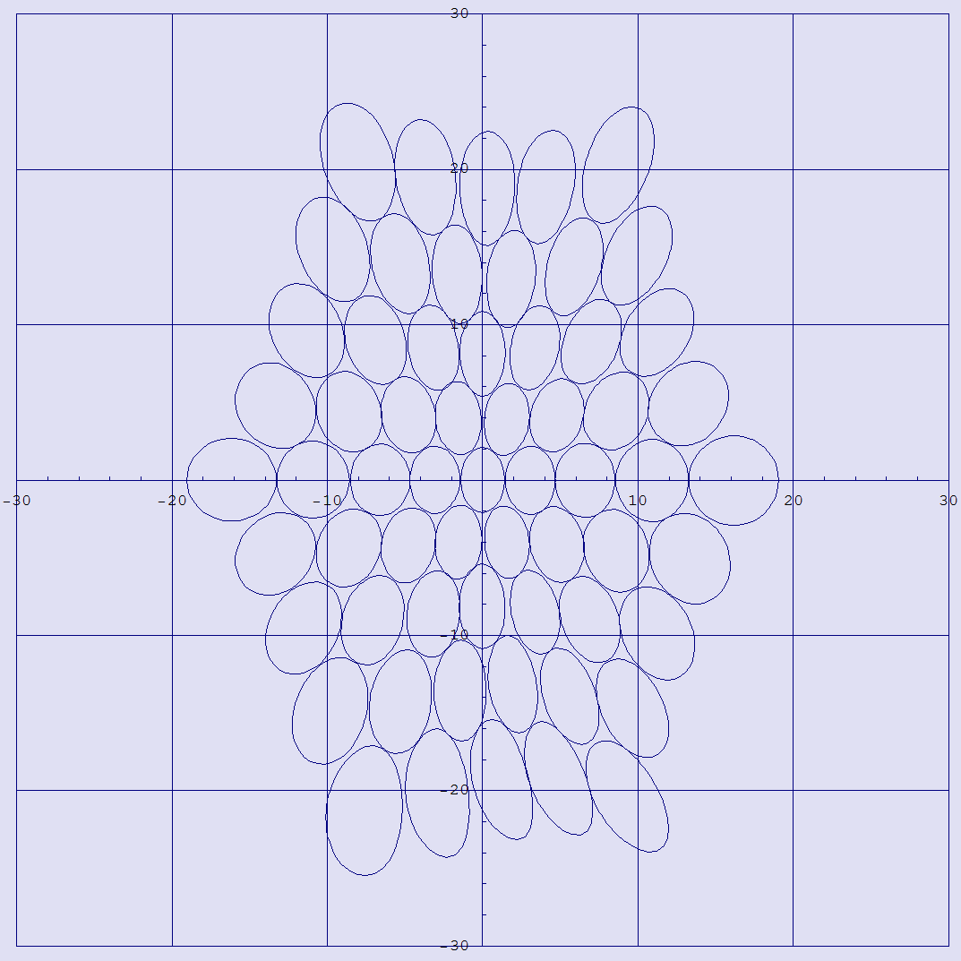
Quasi ellipses, shown in a*b*, all of which have radius of 2 ΔE00

To recap, we have ΔEabΔEJCP79ΔECMC, ΔEBFDΔE94, LCD, and ΔE00. Seven color difference formulas, arranged in chronological order, with every other one catching some users along the way. (I am guessing that the next ΔE formula won't be shopping for a prom dress any time soon!) Which one is best? Generally speaking, the last formula, despite it's distinct lack of pulchritude and parsimony, agrees better with psycho-physical testing. The CIE has gone from it's original stance of "suggested formula" to "standard formula".

What about a uniform color space?

Remember my analogy about Hong Kong dollars? Wouldn't it be nice if we had once single currency that applied to colors everywhere in color space? If we could somehow warp color space so as to match human perception, life would be so much easier. Or so I think.

One problem that would go away is the so called "which color do I use to define my ellipse" problem. I glossed over this problem when I introduced ΔECMC, but consider this: with ΔECMC, the color difference between color one and color two is generally not the same as the color difference between color two and color one. In this formula, the first color is always used to "calibrate the ruler" for measuring color difference. ΔE00 solved this problem by defining an imaginary color midway between the two colors you are comparing.

Another fall of the "which color do I use to define my ellipse" problem is that ΔE00 has a warranty of 5. It is not recommended for color differences greater than that.

Really, what we want is not a way to distort ΔL*, Δa*, and Δb* values for any particular color, but rather a way to distort the whole color space so that the whole Pythagorean thing works. Apparently, I am not the only person who had that thought. Here are some folks who have entered the sweepstakes for the best uniform color space:

Labmg (Colli, Gremmo, and Moniga, 1989)
ATD (Guth, 1994)
DCI-95 (Rohner and Rich, 1995)
LLAB (Luo, Lo, and Kuo, 1995)
??? (Tremeau and Laget, 1995)
CIECAM97 (CIE standard, 1997)
RLAB (Fairchild, 1998)
IPT (Ebner and Fairchild, 1998)
L*’a*’b*’ (Thomsen, 1999)
DIN99 (DIN standard 6176, 2000)
CIECAM02 (CIE standard, 2002)
QTD (Granger, 2008)
LEaEb(Berns, 2008)
LAB2000 (Lissner and Urban, 2010)

Wow. I think this just goes to show ya. People want this uniform color space, but it's not a simple task to come up with one. One can only hope that some dashing young math guy will one day come up with a simple equation that gives us a uniform color space. Just think of the fame and fortune that this guy will receive!

---------------------------
[1] Interesting point of history here: Munsell developed a set of crayons. The rights to these crayons were purchased by Binney and Smith in 1926 to augment their Crayola line of crayons. I assume that most of my readers have heard of these.

[2] For those who are not familiar with Wisconsin, this is one of the few states where there are more bars than churches. The majority of these bars will be featuring a reggae band. I may not have this exactly correct, but someone once told me that their brother heard that Wisconsin is known as the reggae capitol of the Midwest.

[3] A thread company? Really? It may seem odd that this guy is doing color science, but consider the importance of color when looking at thread, especially when it comes to accepting a batch of thread as being the correct color. This work all lead to JCP79.

Wednesday, November 6, 2013

What difference does it make? (part 1)

I want to talk about the difference between two colors, but I need to lay some background first. This background is useful for understanding how we got ourselves into such a nice mess.

Albert Munsell, jealously guarding this cool little color toy
from two envious kids [1]

For the purposes of this blog post, I am going to say that Color Science (with capital letters) began with the work of Albert Munsell just after the turn of the last century. I call him the Father of Color Science, and I think I can get away with affixing that moniker to him because:

1. If he were alive today, he would be 155 years old, and there is still a book of his available: The Munsell Book of Color. The 2010 edition is available for the low, low cost of $994.75.

2. The Rochester Institute of Technology has a building named after him, "The Munsell Color Science Laboratory".

3. He has his own friggen' website: http://munsell.com/. At 155 years old? Complete with a blog! Although I suspect that some of his more recent blog posts were by ghost writers.

I have blogged about the Munsell color space before, in a marvelous post entitled Organizing Your Crayons. That incredible blog post gave a superficial understanding of value, hue, and chroma. That task of organizing crayons was already a pretty cool thing to be known for. But I neglected one of the really big things that he did: perceptual linearity. The colors in Munsell space are organized so as to be equally spaced according to the eye. 

The world's most attractive color space supermodel,
clearly enjoying her experience with the Munsell Color Space

This was a monumental undertaking, and the undertaker was none other than Albert Munsell. Painstakingly, he mixed colors in all combinations, at each step trying to find mixtures exactly half way between two colors. His ultimate goal was to organize colors in a way that is visually uniform. The result was the best-selling book "Atlas of the Munsell Color System", first published in 1915.

Four pages from the Color Atlas

Our messed up perception

I'm gonna ponder a bit about our perception of difference. Imagine getting a raise from $10 per hour to $10.50 per hour. Not a bad raise, right? 5%? Compare that to getting "that same raise" -- of $0.50 per hour -- if you are making $50 per hour. That's only a 1% raise. The skinflints! This example shows that our perception of salary and money is not linear. We think in terms of percentage of change. A mathematician (or an engineer who remembered her math) would say that our perception of the size of a raise is logarithmic. 

Our perception of loudness is also logarithmic, so we measure sound pressure in a nonlinear scale, decibels. Each step of ten in decibels represents a factor of ten in energy. Each step of one decibel is about a 26% increase. Our perception of musical pitch is also logarithmic, so we "measure" pitch in a logarithmic scale that we call musical notation. Each key on the piano is roughly 5.9% higher in pitch than the one just to the left of it. (Want some more math about the frequency of notes on a piano?)

The brightness of stars and the intensity of earthquakes are also measured on a logarithmic scale. The general rule that all of our perceptions are logarithmic is known as the Weber-Fechner law. The law is named after Weber and Fechner, by the way.

The same law applies more or less to our perception of color. Let's say that we give someone a pile of little tiles with different shades of gray, and ask them to find the gray tile that is half way between pure black (0% reflectance) and pure white (100% reflectance). What would the reflectance of the mid-gray be? You would think that it might be pretty close to 50%, but not so. The preferred choice is somewhere around 20%.

Nonlinearity in the chromaticity diagram

Now I'm going to take back what I said about Munsell being the father of science. Lord Kelvin (AKA James Thompson) said this about science: "When you can measure what you are speaking about, and express it in numbers, you know something about it, when you cannot express it in numbers, your knowledge is of a meager and unsatisfactory kind; it may be the beginning of knowledge, but you have scarcely in your thoughts advanced to the stage of science."

Munsell provided us with a fancy book with lots of pretty colors. He gave us a three dimensional ordering system that allowed us to uniquely specify every color in the world. I guess you could say that his three attributes are the expression in numbers of color, but I could argue either way about whether he truly provided us with a way to measure color. 

The genesis of the color measurement work came in the late 1920's and early 1930's. W. D. Wright and J. Guild (whose first names are doomed to be lost in the annals of history) performed experiments to measure the spectral response of the human eye. The culmination of that work resulted in "the standard observer" functions that were standardized in 1931. Applying this standard to spectrometer data, we arrive at the beloved X, Y, and Z tristimulus values that define the color that the human eye sees.

This was all well and good, and everyone was justifiably excited. But when the champagne had gone flat and the helium balloons lost their buoyancy, they realized that the tristimulus values were just not intuitive. The numbers did not readily relate to our intuitive understanding of hue, value, and chroma. 

The diagram below shows one early attempt at relating these numbers to something intuitive. The x axis is the x tristimulus value, and the y axis is the y tristimulus value. The brightly colored overlay shows a rough mapping of these numbers into our perception of colors.

The chromaticity diagram, showing the MacAdam ellipses

Another deficiency of the chromaticity diagram is illustrated by the "MacAdam" ellipses on the chart in the above diagram. These ellipses represent the range of tristimulus values that we would perceive as being the same color [3]. Anything within those ellipses looks the same.

Munsell provided us with a color space that had this wonderful property of perceptual linearity. Beyond just being cool, this property is of practical importance. While it is important that we can say "if two objects have the same XYZ values, then they are the same color", it is even more important to be able to specify how close to the same XYZ values that they need to be in order for us to perceive them to be the same color. And even more important still is the idea of being able to quantify when a measured color is acceptably close to a target color.

Attempts to rectify the situation

The challenge was taken up by many researchers. The goal was basically this: to find a mathematical transform to convert XYZ tristimulus values into a color space that looked like the Munsell color space. Richard Hunter, in his book The Measurement of Appearance provides a handy summary of the work that went into this effort between 1931 and 1976. I recommend printing this image off and tacking it to the wall in your office. I am sure that you will find yourself frequently referring to it.

A family tree of color spaces
(Stolen with neither malice or remorse from Hunter's book)

As you will see, the culmination of this work came in 1976, with the standardization of the color space called L*a*b*. This is a natural point for Hunter to end his color tree, since this book was published in 1975. How he came to know that L*a*b* would become a standard the year after his book was published is a mystery to me. He must have had some inside information.

L*a*b*, AKA CIELAB [4], did a good job of capturing the essence of the layout of the Munsell color space. The L* value correlates moderately well with Munsell's "value" axis. The a* and b* values can be translated quite easily into analogs of Munsell's hue and chroma. A mathematician (or an engineer who remembered her math) would be immediately reminded here of the arctangent function. 

L*a*b* also came along with a reasonably simple way to express the difference between two colors. If you lay out two colors on a three dimensional grid, you can use a tape measure to determine the distance between two colors. A mathematician (or an engineer who remembered her math) would recognize the Pythagorean theorem in this. 

The L*a*b* values are scaled so that one step in any direction corresponds to a "just noticeable difference" in color. This step is referred to as a ΔE (read as delta E). Unfortunately, a ΔE does not do a great job at predicting color difference. For example, a step of 5.0 ΔE in the direction of making yellow a more saturated color is just barely noticeable. A step of 0.5 ΔE in any direction around a neutral gray is noticeable.

As another example of the disparity between ΔE and our actual perception of color difference, one brilliant researcher devoted an entire blog post to counting the number of discernible colors. An entire blog post! Can you imagine that?!?!? When counted in L*a*b* space, there were something over 2 million. But the real number is somewhere closer to only 346 thousand.

What was needed is a more accurate way of expressing color difference. That's the topic of the next part in this series.

-----------------------------------------
[1] I need to be fair here. Albert Munsell was a brilliant man who devoted his life to understanding color, and to teaching kids about color. 

[2] At least that's the way they look on my monitor. Like most computer monitors, mine is not calibrated, so I can't really be sure what the ramps will look like on your monitor!

[3] Technically, the ellipses are drawn at ten times that threshold of just noticeable difference.

[4] These are the only correct names for this color space. They are routinely called Lab or CIELab or even LAB. These are all incorrect and naughty. Note that Hunter invented Lab, so it is just plain wrong to call CIELAB by this name. Wrong. 


Wednesday, October 30, 2013

Tolerances for spot colors

There is a little bit of a hole in the most recent version of the ISO spec for flexo printing[1]. I will explain the hole, discuss my analysis, and provide a patch for this hole, but first a bit of background.

There is a family of standards called ISO 12647, which all cover printing. In particular, they provide some target color values, along with acceptance tolerances around those colors. In almost all case, those tolerances are in terms of ΔE, with the newer revisions of the standards shifting from ΔEab to ΔE00.

Part 6 of this standard is devoted to standards for flexographic printing. Flexo printing is used on such a wide variety of substrates that it is often not possible to nail a particular color. As a result, tolerances based on a ΔE-type color difference are not possible. One has to be content with getting the correct hue.

ISO 12747-6:2012 states target hue angles for C, M, and Y, and provides a ±6o tolerance. Spot colors are also given a tolerance in terms of hue angle, but it’s ±8o. Black, however, does not have a hue angle tolerance. This makes a great deal of sense, since black is neutral. The hue angle is undefined.


Tolerances from ISO 12647-6

But, “black” is not the only black. My Pantone book lists six shades of black. Presumably, the target a* and b* values for these inks are also 0, so the hue angle is undefined. This is the question that led to the realization of the hole in the standard: “how can analysis software decide if the ink name ‘midnight’ or ‘inkwell’ is equivalent to black?”[2]

Worse yet, what if the target for a spot color is not quite exactly neutral, but near neutral? If the chroma[3] of a spot color is small, then a tolerance of 8o might be impossibly tight. For example, in my Pantone book, the ink “Warm gray 5” has an L*a*b* value of {69.61, 2.58, 1.00}. Let’s say the hue of this ink is rotated by 8° to {69.61, 2.70, 1.63} so as to be at the very edge of acceptance in terms of hue. The color difference is a meager 0.38 ΔE00. Holding a printer to a 8° tolerance is pretty tight.

For highly saturated colors, a tolerance of a specified number of degrees around a target hue is perfectly reasonable. But as a color gets closer to a near neutral, it would be preferable to shift over to a ΔE00 tolerance. At what chroma value do you need to shift between a ΔE00 tolerance to a hue angle tolerance?

First naïve approach

I call this the naïve approach, because I am going to make a mistake. It turns out that the mistake is not huge, and it gives some intuitive understanding, so I will leave it in on this first pass. Watch for the mistake.

The figure below shows two colors r1 and r2, in the a*b* plane. Both have a chroma of c, but are separated by 8o. If r1 is the target hue, then r2 is at the edge of the 12647-6 tolerance window.

The arc length between the two colors is fairly trivial to compute. I could use the normal trig stuff, but since the arc is so small, I will just estimate the ΔE (which I a straight-line distance) with the arc length.


Thus, if we assume a tolerance of 1.5 ΔE, the crossover is close to a chroma of 10. Below that point, a hue tolerance is overly restrictive.

Second, not so naïve approach

Did anyone catch the mistake I made? Yes, you in the back? Ahhhh… the old accidentally used ΔEab instead of ΔE00 mistake! The formula for ΔE00 is just a tiny bit more complicated than the formula for ΔEab.[4]  So, I need a slightly less naïve way to look at this problem.

Suppose I picked a color at random, and then rotated it by 8° - that is to say, shifted the hue by 8° without changing L* or the chroma, C*ab. What is the color difference (in ΔE00) between the original color and the hue-shifted color? Then let’s say you computed that for a whole big bunch of colors just to see how it all played out. You would expect that, the larger the chroma, the larger the color difference, right?
Well, I just happened to have a large collection of colors (11,488 of them to be exact) just laying around from a blog of mine on counting colors. Below is a plot of the color difference caused by an 8° hue shift as a function of chroma.
Color difference caused by an 8° hue shift
Is this cool?

To answer the rhetorical question, yes, it is cool. But the data is a bit sparse down there in the lower left-hand corner around 1.5 ΔE00 where we are looking for our answer. This is not a surprise, since my color database only includes colors on a grid with spacing of 5.

So, I took a little different approach. For my next plot, I looked at points in color space with a chroma of 10. (This is the estimate we came up with by analyzing ΔEab.) These are all shades of gray, essentially, with a moderate amount of a color cast to them. I looked at how much color difference there was for each of them when they shifted in hue by 8°. The plot below shows this color change as a function of original hue angle.

The color difference caused by an 8° change in hue, as a function of hue angle

We see that the amount of color change oscillates between 1 and 2 ΔE00, so the average must be somewhere around 1.5 ΔE00. The true average is 1.45 ΔE00. Going back to Table 4 from ISO 12647-6, this is really close to the variation tolerance for spot colors.

For an ink with a target chroma of 10, a tolerance of 8° is roughly equivalent to a tolerance of 1.5 ΔE00.[5] Based on that, I have a simple recommendation for spot colors: If the target chroma is less than 10, then the appropriate tolerance is 1.5 ΔE00. For target chroma of 10 or greater, then the hue angle tolerance of 8° should be used.

Just in case someone wants to repeat this analysis for angles other than 8° or color differences other than 1.5 ΔE00, I provide the useful nomograph below. The t-shirt version should be out just in time for Christmas.

Nomograph for determining the crossover chroma
for various combinations of color difference tolerance and hue tolerance

The red line on the nomograph shows the determination of the crossover chroma between tolerances of 1.5 ΔE00 and 8° of hue. The graph shows a crossover at C* = 10.5. Just between friends, let’s call it 10.


[1] I am not blaming any of the diligent folks on TC 130 who reviewed this document. I was one of them!
[2] Thanks to Bruce Bachmann and Mike Sisco for this realization.
[3] I am using the word “chroma” to mean C*ab, which is defined as 

[4] Well, to be fair, the formula for ΔE00 is just a tiny bit more complicated than the formula to get a balanced budget.
[5] One caveat: I have made the assumption that the only change in color is in hue angle.

Wednesday, October 23, 2013

Color Picker Pen

(An update to this blog post can be found at "Scribble Pen".)

As John the Math Guy, people are always asking me stuff. Often the questions are like "When are you gonna get off that darn computer and fix that leaky faucet?" Or "Why are you so ugly?" These, of course, aren't really question at all, but every once in a while I get a real question. Today, the question was "how does this gizmo work?"

The gizmo in question is called the Color Picker Pen, designed by Jinsu Park. Lemme tell you, it's pretty cool.

You start by holding one end of the pen up to an object and clicking the color scan button. A color sensor measures the color of that object. In the picture below, the pen has picked up the green of the leaf, and note that the color display (along the side of the pen) has changed to indicate green.

Grab a color

So far, this is a cute little gadget. But now the real fun begins. This is a pen, right? The really cool thing is that you can now use the pen to write with whatever color you just scanned. Kind of like the Photoshop eyedropper tool, only it works in the real world rather than in the cyber world within Photoshop. (You know, where all models are a size zero, and don't have pimples or cellulite?)

Draw with that color

Wow!

But I was asked to explain how it works. The answer is simple. It doesn't. Don't get me wrong. It's a great concept, a cool idea, but, at least as shown in the diagrams, it seriously won't work. And, it was never advertised as a real product. Actually, you can find a lot of websites by googling "color picker pen", and many of them refer to this as a "concept", an idea that has not been turned into a real product. 

Internal organs of the Color Picker Pen


The sensor

The sensor for this pen is plausible. There is a color sensor available from MAZeT that would fit the bill. This is a true XYZ sensor, which means that it is a bit better than an RGB sensor in terms of color fidelity. (An RGB sensor will see some colors distorted.)  The sensor itself is shown above... certainly small enough for the color picker pen. Below the sensor is a prototype board. At the right side of the board, you will see a USB connector, so that gives you an idea of the size of the board. If you remove the USB related components on the board - which would not  be needed - you might be able to fit the board into the end of a fat pen.

MAZeT sensor and prototyping board

Of course, a few things might be missing. If I were designing this, I would likely try to add a white LED because I wouldn't trust ambient light, which can vary in intensity by many orders of magnitude. And especially since the user would generally want to push this thing right up against the leaf, effectively shielding the leaf from any ambient light. But this LED might make the whole thing too large, since it would be necessary to shield the sensor from the LED.

There is still one thing that is bothering me about the sensor, though. Below I show a closeup of the sensor end of the pen. Anything funny about it? Think now. What color is the end? It's a dark gray?!?!?  Why would an optical designer put sunglasses over a color sensor? It's pretty dark. Just taking a wild guess, I would say that it reduces the light to the sensor by a factor of 10. Not a good thing.

Close up of the sensor end of the Color Picker Pen

So far, it sounds like this could perhaps be built, but that it is unlikely that the pictures represent a real design.

The display

The Color Picker Pen offers a nice feedback feature: the pen will light up to tell you what color ink is measured / loaded. Is this feasible?  I borrowed a pen that belongs to my wife to show that, yes, such an animal exists. Those of you who know my wife, I would appreciate if you didn't mention that I borrowed her pen. I told her I was going to be fixing that leaky faucet.

Pen for writing love letters in the dark

This pen has a battery and a blue LED. Clicking the switch on the top will turn the light on or off. This could easily be done with a tricolor LED so that a wide range of colors can be produced along the side of the pen.

The battery in my wife's pen reminded me of something else that is needed. In my palpable excitement over this pen, I forgot all about the need for a battery! I didn't see a place for one, or a way to replace it, but let's just say that could be done. Since there is no evident way to replace a battery, it is sounding more like this is a concept design, and not a real product or prototype.

The other electronics

Of course, maybe there needs to be a microprocessor as well? Ok... I guess we can make some space for that. Maybe it would fit? I dunno.

The inks

Now we come to the fun part. The ink. Once again, I have taken a close up of the internal organs shot. Quite clearly, it shows a red, a green, and a blue ink cartridge. That's where the color scientist in me immediately says "nope, not a real product".

Close up of the ink

Why do I say that? Well.... Lemme ask you a question. What color inks are used in your home printer? Red, green, and blue? Nope. Sorry. They are cyan, magenta, and yellow. Below you see the four printing inks from my home printer. Cyan, magenta, yellow, and black. No red, no green, and no blue.

The inks for my printer

Perhaps I just have a cheap printer, you say? Well, that's true, but let's consider the other end of the spectrum. I put my latest Boston Proper sales flyer on my scanner, and collected this image. Note, especially in the white of her alluring eye, that there are no red, green, or blue dots. The dots are cyan, magenta, and yellow. The printing press that this was printed on cost a little more than my home printer - I dunno the exact figure, but I am putting it around $10 million. They don't use RGB inks. 


The choice of CMY (with the addition of black) over RGB is a fascinating story. I will get around to telling it sometime soon. For the time being, let me say this. If you mix red and green ink, you get a dark and dirty brown, almost black. If you mix red and blue ink, you get a very dark blue, almost black. If you mix green and blue, you get another really dark color. So, mixing RGB inks, you can make red, green, blue, and three lovely shades of black.

Let's change up the inks. If you mix cyan, magenta, and yellow, on the other hand, you can get a whole bunch more colors. Cyan and magenta ink mix to make a purplish blue. Cyan and yellow make green. Magenta and yellow make an orangeish red. If you mix all three inks, you get a dark brown, almost black.

So, my assessment of the Color Picker Pen is that no one ever built one. If they had, they would have realized that red, green, and blue don't make for a very wide collection of colors. They would have then called John the Math guy to help them figure it out and I would have recommended cyan, magenta, and yellow. Since I never received such a call, I have to assume that the Color Picker Pen was never built.

So, why are color cameras RGB? And why is a computer display and a TV RGB? Questions, questions! I will leave them for another blog!

Wednesday, September 25, 2013

A YouTube tour through Brazil

As they say in Monty Python land, "and now for something completely different." Enough of this silly math and color science stuff, ok? How about something fun for a change?

My wife and I got a Brazilian earworm the other day [1]. An earworm is one of those catchy tunes that gets stuck in your head. Since my wife and I are both susceptible to earworms, and both like to sing, and spend a lot of time together, we generally spend weeks re-infecting each other with earworms. The only way to get rid of an earworm in our household is to introduce another.

The earworm was the song "Brazil".

Here is a version of the song which I would call quintessential. And I say that not as a real expert, but as a guy who likes the song, and who once had a collection of over twenty eight track tapes, so I consider myself an expert musicologist. The music in this video is hot, the tempo is fast, and its got lots of instrumental things going on. You know, like a piano and stuff. Maybe strings and those things that you shake to make shikka-shikka sounds.


This version was from the movie The Eddy Duchin Story, which was about a band leader from the 30's and 40's. I forget the band leader's name, but the movie is his story. You can buy the soundtrack of the movie from Amazon.

This is not the original version of the song, of course. That would have been back in 1939, when it was written one stormy night by Ary Barrosa. The first recording of it was by Francisco Alves, which I have painstakingly cut and pasted from YouTube below. Comparing this to the version from the Eddy Duchin movie, you will note two things. First, it's slower - still a reasonable tempo, but not frenetic. The second thing is that there are words! The cool thing is that the words are in Portuguese, which (in my opinion) is an absolutely gorgeous, sensual language. I am sure if I knew how to speak Portuguese, I would have better luck with the women, if I were single. And, of course, if I chose to use that secret weapon.


As lovely as this version is (in it's tinny kind of 1939 recording quality way, and with its 1939 kind of vocal stylings), the version that put Brazil on the map [2] was an animated version by Disney. Donald Duck is in the cartoon, but the singer is a parrot by the name of Joe Carioca [3], as sung by the real life human Jose Oliveria.

Donald and Joe

Here is the YouTube video. I recommend watching it from one end to the other. The idea of animating the painting of the scenes with a paintbrush was truly inspired. The inspiration actually comes from the full title of the song, "Aqualera do Brasil", which means "Watercolor of Brazil". Barrosa came up with the name when he looked at a watercolor painting by that name.


There are 2^n (cos (zillion) + exp (umpti-leven/2)) versions of this song on YouTube. I listened to quite a few, but I must admit, my research was not exhaustive. Still, here are some that stuck out in my mind.

I start off with one of the absolute worst versions, as performed by the Ray Conniff Singers. Sorry, Ray, this version just leaves me flat. They slowed it down and turned it into a 1970's fashion statement. I am the singer on the far left, by the way. I still have the bow tie, but my barber left town.


Contrast this against the Lawrence Welk version from 1959. Now, I grew up being indoctrinated in the belief that Lawrence Welk was totally unhip "Gramma music". If you were indoctrinated the same way, this clip might change your mind. Electric guitar, muted horns playing a crisp staccato, joined by flutes and clarinets... all at an electrifying tempo. And what would a Lawrence Welk song be without the accordion of Myron Floren? Seriously, this rocks.


Just to be clear about my own tastes, the song doesn't have to be performed fast to make me long for the sandy beach and skimpy bikinis of Rio. Here is a version from old Blue Eyes that pops my cork. Note that he never bothered with the Portuguese lyrics [4]. I guess he figgered he was sexy enough already.


And here is another laid back version that I can't help dooby-do-wopping along to.


Finally, I provide a version by the Slovenian vocal group Perpetuum Jazzile. (See if you can find me in the second row.) I can't watch this video without wondering what kind of volume discount [5] they get on the Shure SM58 mics. And the volume discount on Prozac.


----------------------------------
[1] I know what you are thinking. Not that kind of Brazilian! An earworm, silly.

[2] "Put Brazil on the map" Isn't that a cute little pun?

[3] This last name sounded to me a lot like "karaoke", so I had to dig around a bit. Is there any connection? Well, of course not. "Carioca" is a Brazilian word referring to people from Rio de Janeiro. The word "karaoke" is a Japanese word meaning, literally "empty orchestra". No connection other than the serendipitity of two words sounding similar and relating to singing.

[4] Here are the English lyrics that Sinatra sings:

Brazil, where hearts were entertaining June
We stood beneath an amber moon
And softly murmured someday soon
We kissed and clung together

Then, tomorrow was another day
Morning found me miles away
With still a million things to say
Now, when twilight dims the sky above
Recalling thrills of our love
There's one thing I'm certain of
Return I will to old Brazil

(instrumental)

Then, tomorrow was another day
Morning found me miles away
With still a million things to say
Now, when twilight dims the sky above
Recalling thrills of our love
There's one thing that I'm certain of
Return I will to old Brazil
That old Brazil
Man, it's old in Brazil
Brazil, Brazil

[5] "Volume discount" - another incredibly subtle pun.

Thursday, September 12, 2013

How many colors are there - the definitive answer

Here is the quick summary: There are 346,005 discernible colors.

I published a rather popular blog post in October 2012 that posed the slightly whimsical question "How many color are in your rainbow?"  I looked at the question in a number of ways and came up with answers anywhere from 3 to 16,777,216. The intent of the post was to collect some interesting facts into one coherent and entertaining post.

But, I sort of sidestepped the implied question: How many discernible colors are there?  I intend in this post to answer the question a bit more scientifically. Well... quite a bit more scientifically. For this blog post, I used a Monte Carlo technique to determine the volume of CIELAB space, and then modified this volume according to DE00 to account for the nonlinearity of CIELAB. And the number 346,005 plopped out.

General idea

I started by generating zillions of random spectra [1]. Now, I'm not gonna say that I generated every spectra possible. I'm sure I missed a few that were hiding down there in the shadows. But I did look at a whole bunch of them. Half a billion, to be exact.

I converted each spectra into L*a*b* values using D50 illumination and the 2° observer. The resulting L*a*b* values were tabulated into boxes in a three-dimensional array, with each box indicating whether the corresponding region in CIELAB space contained a viable L*a*b* value.  

Next, I counted up the number of boxes checked to establish the volume of CIELAB space. According to my experiment, the volume is just short of 2.2 million. This number fits in reasonably well with two papers cited by Gary Field in my addendum blog post:

Research on the number of colors issue usually starts with reference to the Dorothy Nickerson and Sidney Newhall paper of 1943 (JOSA, pp. 419-422). They conclude that there are about 7,500,000 surface colors at "supraliminal" viewing conditions, and 1,875,000 colors when viewing conditions approximate those used for color matching work.

Mike Pointer and Geoff Attridge concluded that there were about 2,280,000 discernible colors in their 1998 CR&A article (pp. 52-54). 

Thus, my number (2.176 million) corroborates the previous results from Nickerson and Newhall (1.875 million), and from Pointer and Attridge (2.280 million).

But we're not done yet. As we know, CIELAB is just not all that uniform. In particular, two saturated yellow colors might be 5 units apart (according to DEab) but might still be perceived by a human as just barely different. Thus, this figure is an overestimate of the number of colors that are actually discernible. Since I have all (or nearly all) the physically realizable colors in boxes, I can compute the volume of each box using DE00. Adding the DE00 volumes of each of the boxes will provide an estimate of the true number of colors, corrected for visual linearity.

Based on this correction, the number of discernible colors is 346,005. I won't attempt to name them in this blog post. That will come in a future post.

Now for some details on how the calculation was done...

Generating spectra

All the spectra were "physically realizable reluctance spectra", which is to say, the reflectance values were all between 0 and 100%. I created spectra from 380 nm to 730 nm, in 10 nm increments. All the spectra I generated were somewhat "smooth", in that they were piece-wise linear functions. I show one example below.


The spectra above is comprised of nine segments. I generated 125 million of these nine-segment spectra, along with the same number of spectra with eight segments, the same number with seven segments, and the same number with six. Thus, there were 500 million spectra en toto.

Initially, I used reflectance values that were uniformly distributed between 0 and 100%. This proved a bit slow to converge (slow to fill the area), since a lot of spectra were generated at the light end where our sensitivity to color difference is rather weak. For this final work, I used random numbers distributed according to the cube root distribution. 

Caveat - This Monte Carlo analysis necessarily will produce only a subset of all possible spectra. First, discontinuous spectra were left out. Second, the fact that "only" half a billion spectra were analyzed leaves open the possibility that some are missed. This would tend to cause my estimate to be a bit low.

I also tried generating purely random spectra, with no correlation between wavelengths. Initially this was slow to converge - perhaps that might have worked out in the long run if I would have just had the patience.

Tallying the number of unique colors

A three dimensional array was created, representing L* values from 0 to 100, a* values from -150 to + 150, and b* values from -150 to +150. All three dimensions were quantized in steps of 5, resulting in 21 X 61 X 61 boxes. Thus, there was a single cube, for example, in CIELAB space representing all colors in the range 20 < L* < 25, -40 < a* < -35, and 80 < b* < 85.

Each of the spectra were converted to CIELAB values using the D50 light source and the 2° observer. The CIELAB values were then converted to a position in the three dimensional array, and the location was marked to indicate that there was at least one viable CIELAB value within the box.

If anyone is interested, I can send you a list of the centers of all the boxes, representing all valid CIELAB colors. Send me an email at john@johnthemathguy.com. If anyone is really interested, I can provide a set of very colorful charts like the one below, that summarize all this data. If enough people are really interested, I will post those to my website for all to marvel at.

Viable a*b* values in the range 55 < L* < 60
(each square represents a 5 X 5 box in a*b*)

Caveat - This discretization causes a bit of an error. It will cause an over-estimation of the number of colors. Why? Let's say that a certain box is at the edge of color space, straddling the line between viable CIELAB values and silly-lab values. If zillions of spectra are tested, then this box will eventually get a tally, despite the fact that only half of its volume should have been counted.

Converting to a count of discernible colors

Now for the novel part, the conversion to DE00. In the previous analysis, the tacit assumption was made that each of those 5 X 5 X 5 boxes had a volume of 125. To be completely correct, the volume of each cube is 125 ΔEab3, cubic delta E units. I guess maybe that's not an assumption, that is pretty much just geometry. The assumption comes in when this is interpreted as meaning that each box contains 125 discernible colors. Those who have subscribed to the Color Science Times Newspaper for the last 30 years know that this might not be exactly the case.

So, I computed the volume using a color difference formula that is closer to human visual perception, ΔE00. Theoretically, we could just compute the volume of a box by determining the color difference from top to bottom, from side to side, and from other side to other side. These three numbers would be multiplied together to get the volume of discernible colors in that box. This is reasonable, but it falls just outside of the spec for this color difference. Due to nonlinearity, the warranty on ΔE00 expires at 4. Beyond that point, it may not give reasonable results.

Just to make sure this didn't introduce an error, I divided the cube into eight cubes, each with sides of 2.5 ΔEab, and added these up. Now we are within the warranty.

346,005. I'm going to use this for all my computer passwords. Just to make sure I remember it.

---------------------

[1] I am talking here in the first person, like I actually generated all the spectra myself. I didn't really. I have better things to do. Like drink beer. I had my assistant Dell Studio generate the spectra. He didn't seem to mind, although he did seem to take his time about it.