Tuesday, May 27, 2014

Get out the pitchforks!!

Get out the pitchforks! It's time to storm the castle at the US Patent Office and at the headquarters of Amazon! The USPTO just granted a patent for something that we have been doing for years.

Or so the article in techdirt would have you believe. According to the title of the techdirt article, Amazon now owns the right to "photography against a white background". Gosh darn it to heck! We have been doing that for years!  How can the patent office be such stupid-heads to allow such a patent to be granted?!?!? Tim Cushing (the author of the article) starts out on the offensive:

The US Patent and Trademark Office is frequently maligned for its baffling/terrible decisions... and rightfully so.

And he ends the column on a similar tone:

Chalk up another loss in the USPTO's column and a baffling, oblique "win" for Amazon's IP legal team, which now "owns" an obvious method.

Relax. Douse the torches, put away your pitchforks. There is no issue here. The simple explanation is that the folks at techdirt (and many of the folks who commented on the article) don't understand patents.

Disclaimer

I am not a patent lawyer, and I don't even play one on TV. And while I have a whole mess of patents, I can't give legal advice - only illegal advice. And I will write that illegal advice on an illegal pad, if you like. If you have a concern about this patent, or any other patent, talk to a patent attorney. Don't take the advice of a fellow who blogs on the internet under a phony name like "John the Math Guy".

Speaking of my patents though, they are soon to be released in a series of YouTube videos. Great stuff, by the way. Enacted by some of the best patent actors in the business.

Dramatic reading of US patent #8,437,041

The (white) background

Amazon has requirements for the product images that you see on their site. One of the big things is that the images aren't allowed to have anything distracting in the background. You may not have noticed this, but almost all images of products on Amazon have a white background.


I'm sure the execs at Amazon had long debates about what color the background should be. I can picture one CFO arguing adamantly for "lilac", with the CTO holding out for "puce". Guys are like that. Somehow they managed to agree on white.

What is a patent?

Before I go off on an illegal tirade, I should say about what a patent is. A patent is a fence around a piece of intellectual property. The boundaries of that fence are written in the claims of the patent. I'm guessing that none of the people who were up in arms on the techdirt webpage actually bothered to read the claims, but really, that's all that is important.


What about all that other stuff in the patent? There is usually stuff like an abstract, a background, a summary, and a description section. The patent has to have disclosure like this. Why are they there? A patent is essentially a contract with the government. In exchange for the exclusive right to make use of the invention, the patent office requires that the inventor describe the invention is enough detail so that someone could go build it without undo experimentation.

So, before you get all lathered up about how the patent office is a bunch of bozos, or about how Amazon is in the extortion business, read the darn claims.

The first claim 

I am only going to look at the first claim in this blog. (I'll admit it. I'm lazy. If you want an analysis of the the rest of the claims, find another math guy color scientist edutainment blogger who has more time on his hands.)

Here are some highlights from the first claim, and some workarounds. Important point: the rules say that in order to infringe on a certain claim, you need to do everything that's listed in the claim. Every single item. If you leave out only one thing, then you won't infringe. Another important point: You really should look at all the claims. You may have managed to escape infringement of claim 1, but claim 7 might get you. If a real patent attorney were doing this and getting paid embarrassing amounts of money, he/she would look at all of the claims.

One of the requirements of the first claim is that you must use a cyclorama as the background. That's great! How can I infringe if I don't even know what a cyclorama is? Just kidding... this illustrates one good reason for the rest of the patent to exist. It can be used to define what a cyclorama is. In this case, it does. A cyclorama is defined as "a curve, concave background". So, if I want to get around infringing on this claim, all I need to do is have a flat or convex background. Nothing else, and I am good to go.

This is not a cyclorama

By the way - this illustrates one of the things that I have enjoyed about writing patents. I think the word cyclorama existed before this patent, but the inventor is allowed to be his own lexicographer, which is to say, the inventor is free to invent words so long as they are defined in the patent, and may redefine standard words, so long as the new definition is not repugnant to the normal definition. This is how the words "vromanoid", and "disadumbration" entered into common usage.

The claim also says that the cyclorama must be white. Make yours light grey, and you won't infringe.

The first claim requires that you have a light source that is perpendicular to the face of the cyclorama. Ok, so put your light source at 10 degrees off from perpendicular.

Another requirement in the claim is that the camera and the light source must be in a line along this perpendicular. Now, I'm not a photographer (or patent attorney), but I think it might generally be a good idea to not have the light source directly in line with the camera. Anyway, change the angles around a bit, and you're good to go.

The camera in the claim has some pretty limiting characteristics. It must have an 85 mm lens, be set up for ISO 320 speed, and have the aperture set to 5.6. The claim says "about 5.6" and "about 320", so I don't know exactly what you could get away with. As a math guy, I would think that 8 or 4 is not "about 5.6". And again, I don't know if a zoom lens which is capable of zooming to 85 mm is cobered in the claim. Certainly not if the zoom lens is not set to 85 mm.

By the way, my patent attorneys have always told me to avoid fuzzy words like "about". If this were one of my patents, it would read something like "with an f number of at least 4, but no greater than 8".

Infringement of the first claim further requires that there must be an elevated platform on that line that is perpendicular or something like that. (Funny... The claim actually never says that there must be anything to take pictures of, but presumably the platform is where you would place the purse or the boot that someone is trying to sell on Amazon. I guess you actually don't need to have product on the platform in order to infringe. Come to think of it, it looks like you don't actually have to take a picture to infringe. I have no idea what that means in terms of the patent.)

How to get around this part of the claim? Maybe I'm being dumb here, but maybe you could put the boot you are photographing on the floor? Or dangle it from the ceiling with fishing line?

Setting up the next product shoot for Lands End

The claim then goes on to require a total of four lights that are pointed at the background. There is a required position and orientation for each. If you leave out one of the four lights, or put one of the lights somewhere other than what is stated, or point it in a different direction, then you're are in the clear.

One thing to note. The claim says there must be four lights shining on the background. Adding a fifth light to the mix doesn't help you get around the claim. Adding stuff to the mix doesn't get you around a claim unless the claim says something like "no more than".


The claim goes on to say that the top of the elevated surface looks like the background. Hmmm... I'm not sure how to design around that one, since Amazon requires that the silhouette of their images be white. Darn! If only someone had invented green screen, or a retroreflective material that is whiter than white, or maybe had some way to illuminate the surface from below to make it whiter than white. Or if someone could figger out how to use PhotoShop to make a white background.

Finally, one last element to the first claim. The total intensity of the four light sources trained on the backdrop must be about 10/3 times the intensity of the main light. There's that pesky word "about" again. I dunno how you read that but I think that if they meant "about 3", then they would have said "about 3", rather than the precise sounding 10/3. So, I don't think that 3 is about 10/3. I dunno... maybe someone else might disagree. I'm thinking a ratio of 3 might be ok, but what do I know?

Note also that the word intensity in the claim refers to the intensity of the light, and not the intensity of the light that hits the surface of the backdrop. You could turn the four lights way up, so as to get a 20/3 ratio, and then shutter them back to 10/3. Or, You could put in fifty lights of equal intensity to get those 10 shares of light. The claim calls for the total intensity of four lights to be in that ratio.


Ohhhh!  So many ways to design around this claim!!  Getting around this claim is as easy as falling off the surface of an elevated platform positioned between the image capture position and the background in the longitudinal axis.

I read this claim, and I tried to imagine trying to set up a studio in an attempt to willfully infringe on it. If I tried, I guarantee you that I would mess it up. There are just too many requirements for a simple guy like me. I would set the shutter speed in order to infringe and then accidentally change it later. Maybe I would wind up moving one of the four lights? Or I would forget to turn one on?

Is a workaround legal?

The reader may be wincing at all this talk about workarounds. Maybe it sounds a bit slimy? Like maybe any of these workarounds would infringe on the intent of the claim and get someone angry? Lemme repeat what I said before... a claim in a patent is like the fence between my property and the neighbor's property. Am I trespassing if I walk right up to the fence line?

Addendum

Once again, this blog is not to be construed as legal advice. A real patent attorney would say stuff like "a claim must be read as broadly as possible without reading on prior art". A real patent attorney would suggest looking at the file wrapper to see if there is any further clarification in the prosecution history. But, I don't even know what those words mean.

This blog, on the other hand, should be construed as an attempt to get people to put away their pitchforks and stop paying attention to rabble-rousers who are trying to get people excited over nothing.  

Wednesday, May 21, 2014

Getting the most color for your ink, part 2

In the first part of this series, I made the point that mushy dots are efficient dots. The logic is pretty simple. Higher dot gains means more color for the same tone value. I went on to give some lame explanation, and gave a link to a TAGA paper that went way above my head.

I don't know if anyone believed me in that post, but I will press on with yet another absurd statement related to ink mileage. Gloss is good for ink mileage. First, I will explain why this is, and then I will suggest some avenues for research to take advantage of this little appreciated fact. 

The smoother the surface, the better the ink mileage

It was almost two years ago that I posted a blog called Flat Paint is Not Flat. I am pleased to say that over 1,000 people viewed this post, and it would appear that there have been somewhere around 7 people who actually read at least some part of it.

The blog made the point that glossy surfaces make an object appear richer in color. I dramatized the point with a photo like the one below. This photo shows the effect of clear lacquer on black ink on copy paper. The arrow on the right shows the untreated ink. The arrow on the left shows the richer black that you get with the lacquer.

Effect of a coat of clear lacquer on copy paper

What's going on? Why is the left leg of the K slightly gray, whereas the right leg is a full black?

The answer is surface reflection. If you want to sound like a color scientist like me, you call it specular reflection. (And I do want to sound like a color scientist.) About 3% to 5% of the light that hits the surface of the ink will bounce directly off the surface of the ink. Sadly, the interaction will be such a brief fling that the light will leave without even a memory of the tryst. (If you want to sound like a color scientist, you might state that a little differently. You would say something dry and unromantic like "the specular reflection is spectrally non-selective.")

If you hold a glossy catalog at a shallow angle to the light, all you will see is the specular reflection. Note in the photo below that the color of the incoming light and the color of the reflected light are the same.

If you want to sound like a color scientist, you must pretend to get excited
when the "Victoria Secret for Optical Engineers" catalog arrives

If you try this with a newspaper, you may come to the conclusion that there is hardly any specular reflection from uncoated stock. That's not the case, though. The specular reflection behaves like a billiard ball bouncing from the rails of a billiard table. Equal angles and all that. If the surface is smooth, like the Victoria's Secret catalog, then all that specular light from a single light source will reflect at the same angle. 

We called it pool where I grew up
We weren't pretentious

(We are coming to the key point here, so I started a new paragraph.) If the surface is rough, like the uncoated stock of a newspaper, then the specular light will bounce around at all angles. And we will see it. We won't notice it, because it is diffuse, but we will see it nonetheless. It's like adding 4% white light on top of the specular reflection of the actual ink on paper. We don't see that specular reflection on a glossy stock because we involuntarily tilt the VS catalog so that it doesn't interfere with seeing all the sexy plano-convex lenses.

Remember that K in the above picture? The two images below were taken of the same printed sheet with the camera and sheet in the same position. The image on the left was with the illumination coming in at the billiard ball angle to the camera. The area that was lacquered is apparent. The image on the right was taken with the light oriented to minimize the specular reflection. The same amount of light is reflected - it just reflects differently.

Getting a little free ink by getting lacquered up

Practical application

What good is theory if you don't have any practical application? The practical application is this: The smoother the surface, the better the ink mileage. The million dollar question is what you can do to get a smoother surface? I have no idea which of these are cost effective. This is more like a group brain storming session with one person in the group. I invite any interested party to join me.

1. Use a smoother stock.

Well, duh! This is, of course, a balance in cost between paper cost and ink usage. One point to make is that it's not all about "holdout". People generally think that the poor ink mileage with newsprint is because the ink seeps into the paper and pigment hides behind paper fibers. That's certainly part of the explanation, but I think the larger effect is specular reflection. 

2. Add a lacquer overneath the inks. 

I know this is often done, but usually it is added to increase rub resistance. It also improves gloss, and hence improves ink mileage. Coating with silicone is done to allow one magazine to slip against the one below it, but it also increases gloss.

3. Apply MgF to the surface.

Ok, this is a little tongue in cheek, but maybe there is something there? In optics, magnesium fluoride is used as an anti-reflective coating. It is optically softer than glass (it has a lower index of refraction). Like a ball bounces better on concrete than on water, MgF will reduce the surface reflectance of glass from 5% down to 1%. This is actually a different effect that the dictum of "make it smoother". I don't know if there is something like MgF that is practical.

4. Dry the ink slower, and at a lower temperature.

In commercial web offset, it's all about running the press faster. Less press time means more impressions per hour and more income per hour. But, think about what the poor ink has to go through to make 3,000 FPM happen. Ink is about one-third oil, and the oven evaporates this oil. I don't have any data on this, but it sure seems to me that such quick evaporation has to disrupt any sort of smooth surface. 

Maybe bringing the dryer temperature down to "just right" will increase ink mileage? Maybe running the press just a tad slower will increase ink mileage all around? Or maybe not. Unfortunately, conventional ink keys keep us from accurately measuring  ink mileage. The proliferation of digital inking systems might make this sort of research possible in the future.

5. Use EB or UV curing.

If you buy into the idea that the evaporation of oil from the ink disrupts a surface that would otherwise be smooth, how about using an ink that doesn't have a carrier that needs to be evaporated? In electron beam ink curing, a stream of high energy electrons is used to polymerize the ink. There is nothing that evaporates, so in addition to the drop in VOCs, the surface should be inherently smoother. The same reasoning goes for ultraviolet cured ink. Both inks are more expensive than traditional inks, but maybe the economics can be tilted if you figure in the potential ink savings from needing less pigment.

6. Ink polishing.

Uncoated stock is run through a calendaring process to make the surface smoother. These are chrome rolls that run at a different speed than the paper so as to compress the paper. I wonder whether it's possible to use a similar technique to polish the surface of the ink without smearing? 

7. Use more resin? 

I have seen that some inks are naturally glossier than others. I don't know why. Maybe it's the ratio of varnish in the ink? Maybe something else. Another thing I don't know is whether ink chemists think "let's increase the gloss" when they think about improving ink mileage.


Any other suggestions? Can any of these suggestions be turned into anything practical? I know it's unusual for me, but with this blog, I am going to actually admit to ignorance rather than pretend to know everything.

Saturday, May 10, 2014

Getting the most color for your ink, part 1

So, my wife says to me the other day, "Hey Math Guy, you should do a blog about ink mileage - you know, making the most efficient use of pigments." I love it when she calls me Math Guy. It's so much more intimate than John the Math Guy. "Surely you've thunk some thoughts that no one ever thought to thunk before." I don't love it quite as much when she calls me Surely.

But she does have a point. I do have a few thoughts. I have been waiting for an opportunity like this to share them with an eagerly waiting world.

Dot gain is your enemy

I remember years ago hearing a competitive pride in the press room when it came to printing sharp dots. Mushy dots were a sign of a sloppy pressman. Really good pressmen, running on really good presses would produce sharp, crisp dots. Really good pressman would make Felix dots. All pressmen wanted to be Felix. All presses wanted to be Felix presses. All printing inks wanted to be Felix inks. All fountain solutions wanted to be Felix solutions.

Felix halftone dots versus Oscar halftone dots

And so it was the goal to make crisp, Felix dots, and press crews worked at reducing dot gain.When a press crew managed to bring the dot gain down by one point, there would be huge bonuses and wild parties and groupies everywhere. Many of you remember those days. Mick Jagger would show up, and the roll tender would get a call to be on the Carson show. You get it. The whole magilla.

Then those darn pre-press guys started getting involved. Stick-in-the-muds, every one of them. They complained about needing to run a different plate curve for every job. The pre-press folks didn't buy into the whole press room machismo thing. They didn't want to be on late night TV. They just wanted consistency.

And so it came to be that the printing pundits made the rounds, popping in on the Tonight Show and getting little blurbs on the bottom of page 17 of the tabloids. The message went from "Dot gain and Communism are the enemy" to a more subtle one. "Dot gain, just like Kim Kardashian, is inevitable. We can't get rid of either one of them. All we can do is try to control them."

In light of all of this, what I am about to say is heresy. When it comes to ink mileage, dot gain is your friend. Yes, it needs to be controlled and kept consistent, but more is better.

Kim Kardashian proudly displaying high dot gain

Why is there dot gain?

A point to consider: stochastic printing (FM screening) has high dot gain. That means you need to adjust the plates curves to make it print like conventional printing. Get it yet? You need to bring down the 50% when you're printing stochastic. Have you caught my point yet? You need to put less ink on the paper when you are making a halftone. Less ink for the same amount of color.

I think that the fact that stochastic screening requires a different plate curve is common knowledge, but I'm not sure that everyone has connected the halftone dots. Stochastic printing requires less ink. High dot gain means less ink.

But... maybe the "less ink" part is not obvious. Maybe I need to expound on a question that has baffled philosophers of printing science for decades. Why is there dot gain?

Every Phy-Ed major knows why there's air - to fill up volleyballs!

I know of three explanations for why halftone dots come out fuller than one would expect: more ink, more diffusion, and more squish. The physics is probably correct behind all of them, but it is likely that one or two of them are the major factors. 

More ink

The simplest explanation is that the plate simply delivers more ink. The more ink, the more dot gain. As it was explained to me by Herr Gutenberg, it all had to do with ink/water balance. When you put a little more water on the plate, it will crowd out the ink in at the edges of the dot, and there will be less dot gain. If there is a bit less water, the ink will have the upper hand at the edge of the dot, and the dot will grow.

Based on this, the model is this: more dot gain -> more ink -> more color. Simple enough.

This all makes sense, but I have tracked press runs while adjusting water up and down within reasonable limits. I saw a lot of change in dot gain over hours of press time, but little of it was correlated with the amount of water. I don't think that the "ink/water balance at the edge of the dot" theory is the big explanation for dot gain. 

More diffusion

In 1936, Yule and Neilsen came up with the idea that there are two parts to dot gain: physical and optical. They said that the dot on the paper is indeed larger than the dot on the plate, but that there was a second effect. The paper between the dots takes on some of the color of the ink because of light diffusing into the paper.

I won;t go into much detail explaining it here. You can look at my previous blog post for that. I just want to say here that the Yule-Neilsen effect gives you a little extra color for free. That apparent tinting between the dots acts like more ink, more ink that you get for free.

More squish

Noffke and Seymour came up with a little different explanation in 2012 - dot squish. (Some of you may recognize the name Seymour. He has this blog?) A pristine silo of ink is first deposited on the printing plate, and then that nasty old press comes along and presses it flat. Note that there is no change in the volume of each dot, just it's shape. 

Halftone dot transmogrification under imply pressure

But what of the color? Does squishing the dots change the richness of the color? Well, yes. I go into more detail in the blog on the Noffke-Seymour effect, and Pat and I went into excruciatingly painful detail in the TAGA paper. 

(By the way, the call for papers for the 2015 conference is out. The conference is set for gorgeous downtown Albuquerque, March 22 through 25. Email me if you have any questions, or want to discuss an idea. john@johnthemathguy.com)

Does this get you more halftone for your money? Let me motivate the idea a little bit by considering the extreme. Let's take that silo to the extreme. Keep the silo the same volume, but picture it becoming more of a needle - a very tall spire of ink that has a very, very tiny footprint on the paper. Being very tall, the microdensity of that ink is very high. The color at the top of that spire is very rich. But it covers an infinitesimal amount of paper, so the overall reflectance is pretty much the same as the paper. 

That tall narrow spire is the very least efficient use of ink. It is the cleanest, crispest dot possible, but it is absolutely lousy when it comes to ink mileage.

Dot gain is your friend

The first of the three explanation for the cause of dot gain predicts that dot gain is "cost neutral". You put in more ink, and you get just that much more color. The other two explanations predict that dot gain is like getting a little extra pigment in your halftone for free. My own observations are that the first explanation of dot gain is not the major effect.

So, my conclusion is that dot gain is your friend. According to the Yule-Neilsen model, whatever it is on press that causes more spread of light into the paper, like higher line screen or stochastic printing (or perhaps some reformulation of the paper?) can reduce the cost to print a halftone of a given color. 

According to the Noffke-Seymour model, whatever it is on press that causes the halftone dots to spread out more, like decreasing viscosity or increasing pressure, can reduce the cost to print a halftone of a given color. 

Moral of the story -- An efficient halftone dot is a happy halftone dot

Wednesday, May 7, 2014

Pythagoras' law of harmony

Once upon a time, there were four little factoids rolling around in John's brain. Being in such a tiny and empty space, they were bound to eventually bump into each other. And when they did, it was cause for celebration, what with the whole being greater than the sum of the parts and all that.

Factoid #1, Pythagoras' law of harmony

Pythagoras stated a simple law to explain why certain notes sound harmonious: the ratios of their frequencies are in simple integer ratio. He didn't quite put it in those words, but that's the modern description. Two notes that are a major third apart sound good because the ratio of their frequencies are 5 to 4. For those who don't remember, I expounded on this law of harmony in a previous blog post about tuning pianos.


This has always been a little confusing for me. Not much, but a little. Why is the ear so incredibly sensitive to these ratios?  If you play a note, any decent singer can sing a note twice or three or four times as high to within a few per cent. Can you judge weight that well? How accurately can you estimate three inches after being shown one inch?

Factoid #2, Tuned cilia in the cochlea

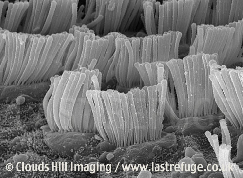
We sense notes because of little hairs in our ears. I am not talking about those unkempt hairs that totally gross my wife out... I mean little, itty-bitty hairs that are deep in the ear and well beyond where any self-respecting Q-tip should ever go, inside the cochlea. 

Cochlea Cells, Cochlear Cilia
Way cool SEM image of cilia from Clouds Hill Imaging www.lastrefuge.co.uk

Those cilia dance to the music, but they wiggle around only when they happen on a frequency that they are tuned to. Each cilia is connected to a nerve, and what we sense as a tone is the reaction to that cilia dance. For those who don't remember, I expounded on the inner working of the ear in a blog post about being tone deaf.

Based on this, it again seems odd to me that we should be so darn precise in our assessment of an octave. Are the cilia really tuned that precisely?


Factoid #3 - Tartini tones

It is painful to admit, but at one time I did sing in a barbershop chorus. In fact, I actually organized a quartet while in high school. That's me, sporting the Fu Manchu in the picture from our yearbook of the Thundertones. Our high school mascot was the Thunderbird, hence the name. But, the name was also a play on the word "undertone". Barbershoppers are always talking about overtones, which were notes that are heard which are way above anything that anyone is actually singing. Undertones are just the opposite. 

From right to left, Denny, Kenny, Johnnie and Chip, AKA The Thundertones

Roger was the director of a barbershop chorus that I was in. A chorus, by the way, is a whole bunch of guys singing barbershop together. Roger came to rehearsal one night all excited to play with undertones. He had the chorus sing a set of very specific notes, each part with a specific volume. The result was that a magic note appeared, a note which no one was singing. The note was somewhere deep and dark in the basement where only the bassest of the basses have ever visited. We're talking Johnnie Cash, Tennessee Ernie Ford, and Lurch.

This phenomena of creating low notes from higher ones was discovered by a violinist by the name of Giuseppe Tartini, so they go by the name of Tartini tones. They can be used in the design of pipe organs as well. A combination of a 16 foot pipe and a 10 foot 8 inch pipe can be made to sound like a 32 foot pipe, thus saving a lot of space and expense. These pipes are called helper ranks.

For those of you having trouble hearing them, you might want to try liberal application of libations. This will bring out the Martini tones.

I have seen this in audio processing as well. I recorded a tone, and edited the waveform to remove the fundamental frequency (using fast Fourier transforms). When I played back the filtered waveform, it sounded like the fundamental frequency was still there.

So... what gives with that? I thought the ear was designed to pull out frequencies?!?!? How does my ear get fooled?

Factoid #4 - Overtones and vibration modes

Sympathetic vibration and overtones can be used to explain the stupid piano tricks that I once blogged about. In the example below, middle C is silently held down so that the wire is free to vibrate. The F below this is plunked and then let up to silence this note. The note that is sustained is the C above middle C.

One of many stupid piano tricks that illustrate overtones and vibration modes

What's happening is that the F note generates a series of overtones. It likes to vibrate at F below middle C, but also at twice the frequency (F above middle C), and also at three times the frequency (C above middle C). 

Meanwhile, the middle C wire doesn't like to vibrate at F below middle C, nor at F above middle C. But, C above middle C is in it's overtones series. So, when the plunked note is let up, the middle C wire continues to sound the C above middle C. 

Here are the two basic rules to remember: 1. Things that vibrate easily at one frequency tend to like to vibrate easily at twice that frequency, and three times that frequency, and four times, etc. 2. In order for resonance to happen, the sender must send out wavelengths that the receiver likes.

A sudden insight

As I said, these four factoids happen to collide in my brain one day. I think Factoid #4 is the explanation of the conundrums that I had with the first three factoids.

Let's just say a middle C just happens to crawl into my cochlea. All by itself. Normally, it will come in with an entourage of overtones, but let's just say this tone was produced by lightly blowing on a soda bottle. Pure middle C.

Now, if you didn't think about it for too long, you would expect that only one set of cilia would vibrate. I mean, that's kinda the design goal, isn't it? Each cilia is supposed to be some kind of tuning fork sensor for middle C or the B flat two octaves below middle C, or whatever. Right?

But remember the first rule of overtones and vibration modes. A single frequency will likely get several sets of cilia going. Middle C will activate the middle C cilia, but the cilia tuned for an octave below will also set to vibrating. Clearly they won't vibrate really strongly, or we would always hear that lower octave. But, if you get enough of the overtones going, and you will hear that Tartini tone. That explains factoid #3.

Factoid #2 is explained by noting that two notes that are exactly an octave apart will stimulate the same sets of cilia. The brain doesn't have to try to map each cilia to a frequency and then calibrate each one accurately. The two notes sound very similar because they activate some of the same cilia.

How about factoid #1?  The answer is pretty much the same. Because simple ratios fit in well with the overtone series, and sets of cilia are inextricably linked through the overtone series, notes with simple ratios sound good together. They stimulate the same sets of cilia.

I don't know about you, but I'm feeling pretty good about this. I'm gonna treat myself to the Midwest Vocal Express concert. Best barbershop music in the Milwaukee area. The concert is Saturday, May 10, with shows at 2:00 PM and 7:30 PM, at the Nathan Hale Auditorium, 11601 W Lincoln Ave., West Allis, Wisconsin.

Wednesday, April 23, 2014

TAGA 2014 in review

When I started in the printing industry, we didn't have all those fancy colors for ink. All we had was white. Decorative packaging was white, but that was ok cuz all we had to sell was rocks. Books were printed with white ink, which, at the time, was good enough. No one knew how to read. Hadn't been invented yet.

And then someone had to go and invent white paper. We were screwed and we knew it. Our response? There were, of course, the white paper deniers who eventually invented red ink. Those of us who survived the great "white ink is dead" upheaval innovated, and this, is how black ink was invented.

White ink is dead? Now what are we gonna do!?!?

As I recall, we were burning the midnight oil trying to find innovations that would eclipse the disruptive technology of white paper. Some were working on creating whiter ink. Some worked on ways to package rocks that didn't require packaging. By the way, I don't think anyone ever made money on that one. They found it hard to sell a packaging material that wasn't there.

But someone had their midnight oil burning mechanism sitting too close to the window. The next morning, that same someone noticed a big smudge of serendipity on the window. "Eureka! We have discovered black ink! Let's go buy a million lanterns and a million windows so we can go into production!"

You know the rest of the story. Gutenberg and all that. But what you probably didn't know that TAGA -- the Technical Association of the Graphic Arts -- was there the whole way, providing a forum for the technical leaders of the time to discuss the future of printing, the thixotropic properties of carbon black, and modern techniques of rock packaging. 

At the time, black ink was a solution looking for a problem to solve. Very few people know this, but it was at TAGA that the people who were working to find the most efficient mean for putting black ink on paper met the people who were looking for a way to record the spoken word. TAGA provided the spark that created the written word.
The 2014 TAGA conference was a continuation of this ancient tradition. Here are some highlights. I make no apologies for all the cool stuff that I missed because I was hung over.

Daniel Dejan of Sappi Paper gave one of the keynotes. Brain scans done of people reading tablets and people reading physical paper are actually different. People are more likely to read a book linearly, and read a tablet with "skim/click/jump around". Studies have shown that people tend to trust stuff committed to paper more than stuff on the web, and also have better retention for stuff on paper. (Please print this blog post out before reading.) These are reasons to utilize print.

How can you target advertising for all these avenues?
(from Dejan's talk)

Ian Hole of Esko gave another key note. There have been some way cool packaging concepts recently. Bombay Sapphire gin used an electroluminescent ink to make the bottle light up in blue. Absolut vodka used a blue thermochroic ink to indicate the vodka was chilled to the proper temperature. Coke has successfully marketed cans with absolutely no words on the can. Smart wine corks can track the temperatures that a bottle has gone through. Smart packaging of medicines can record when a patient is actually taking a medicine. Pringles delivered their potato chip tubes with the logo “these are not tennis balls”. Where? At Wimbledon.

Show stopper from Ian Hole's presentation

Tim Claypole of Swansea University gave yet another of the keynotes. 98% of printed electronics is done with screen printing. Flexo is another technology that could work, but solvents are an issue. The only application of printed electronics that has been successful (from a business standpoint) to date is the printing of blood glucose sensors. This has been very successful. One university group created a 3D printer for chocolates. Look to the Korean Olympics for applications of large area printed displays.

As if three keynotes were not enough, Paul Cousineau and Mark Bohan collaborated to give the fourth keynote. The most important thing I learned is that wide format printing on shrink wrap is being used to make customized coffins.

A brilliant scientist with a huge ego gave a talk about intra-instrument agreement between spectrophotometers. His message is that standardizing one spectro to match another is a tricky business. Due to actual physical differences in the spectros, standardization can make inter-instrument agreement worse. Look for this self-important dude to give a blog summary of the paper soon.

Tony Stanton (Carnegie Mellon) looked at color uniformity of various types of presses. Variability for ink jet: 0.2 ΔE00, for litho: 0.5 ΔE00, for electrophotographic: 1.0 ΔE00.

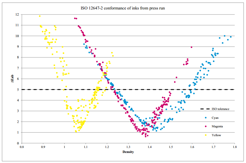
Soren Jensen (Danish School of Media and Journalism) spoke on an approach to meet the color targets of ISO 12647-2. This standard has target L*a*b* values for CMY solids and tolerances that they must be within. It also has target values for the RGB overprints, but does not have tolerances for these. Soren worked out a means for determining the densities that are a) within tolerance for CMY, and b) that minimize the overall error in hitting the RGB targets. He's my buddy cuz he used Beer's law.

Perifarbe plots from Soren's presentation

Bruce Leigh-Myers (RIT) looked at inter-instrument agreement of M1 spectros measuring paper with fluorescent whitening agents. One instrument in his corral was way different.

Ragy Isaac (Goss) gave a tutorial on statistical methods, driving home the point that you shouldn't make important decisions without doing a little bit of statistics. His talk involved paper helicopters.

Xiaoyin Rong (Cal Poly) discussed screen printing of electronics. Cell phone touch screens are a potential application for printed electronics. To do this, you want a tiny silver grid laid down on glass. The trace width should be around 2 µm. Current limitations are about 30 µm for gravure and flexo, and 40 µm for screen printing. She looked at using a solid mesh screen as opposed to a woven wire screen. She is still working on this.

Gary Field (Cal Poly) investigated the difference between printing in the order KCMY versus CMYK. Previous studies would run in one order, bring the press down and swap plates, and then run again. The reliability of this sort of test is questionable. Was the change due to changing conditions on the press, or due to the change in the print order? He got around this limitation by running on a five color press with K in the first and last positions. The conclusion is that CMYK produces a bigger gamut. The Dmax is higher, the print is glossier, and the four color solid is closer to neutral.

Martin Habekost (Ryerson University) looked at the print quality (resolution) that is produced by various RIP software. Surprisingly (or maybe not) all RIPS are not created equal. Some RIPs produce plates that result in higher resolution on the printed page.

Doug Bousfield (University of Maine) looked at the tack force that ink applies to paper. One of his comments was that a tack force meter might not be really measuring what we think it’s measuring. Heresy. Pure heresy.

Michael Carlisle (ArjoWiggins creative papers) spoke on the development of a special paper for electronic printing. They typically print on plastic substrates, but this needs to be laminated to paper. This special paper is especially smooth, which is what is needed to make those 5 micron traces.

Really cool SEM images from Michael's presentation

Sasha Pekarovicova (Western Michigan University) talked about the use of soybean oil to take the ink out of recycled paper. Bet you didn't stop to think about where the ink goes when you put the newspaper into the recycle bin!

Joerg Daehnhardt (Heidelberg) spoke about fanout on extra-wide sheet-fed presses. The cause is different from the fanout that we all know and love on web presses, but the results are the same. It is caused by the grippers pulling laterally, and uneven inking putting strange elasticity on the paper. They use a system of cameras to determine the misregister and actually stretch the plate to compensate.

Don Duncan (Wikoff Color) gave a talk on migration of icky stuff from the printing process into the stuff inside the packaging. This is a hot political issue and Nestlé’s and Mueslix have found it can be a big source of bad PR. Nestlé’s developed a list of naughty chemicals that they don’t want to be used in the print process. The Swiss government rubber stamped this, and this list is on its way to becoming an EU ruling. The list is perhaps a bit stringent, maybe even draconian. It is also a bit of an issue since Nestlé’s requires that fluorescent inks be used on the packaging of certain candies, and all fluorescent pigments are on Nestlé’s list of forbidden chemicals.

Mandy Wu (Appalachian State University) chronicled a project at her university for the students to offer commercial printing to businesses in the community. They made a point of using green technology.

Thomas Klein (Esko) gave a very informative presentation about high definition flexo plates. The normal flexo plate has flat topped cells. This causes problems with highlights, since you can’t reliably print below a 12% dot, and also with solids because the solids get mottled. You can deal with the solids by creating a cell that has microcells. This evens out the laydown and gives a big boost in density. At the highlight end, the issue is dealt with by making cells that are rounded at the top.

Nir Mosenson (HP) spoke on an electrophotographic printer, in particular how they managed to scale up their original system to one twice as wide. He provided a very clear description of how this sort of printer works. One thing I found interesting was the use of a rotating set of mirrors mounted together as a hexagonal prism being used to guide the laser beam to charge the cylinder.

Kirk Szymanski (Ricoh) described the process by which one assures that a toner-based printer is made consistent in color. Inline measurement of color is important. Even for a printer like this with very quick startup (comapred with web offset) there is a small warm-up time. Typically 7 to 10 sheets are required to provide stable printing. The lasers need to be linearized across the sheet. There are inherent differences in color between web offset (and ISO 12647-2) that must be calibrated. Density is a good start, but tweaking must be done in CIELAB.

Stephen Lapin (PCT Electron Beam) compared electron beam (EB) curing to conventional ink drying. In heatset web offset, the ink is “dried” by flashing off the oils through the use of heat. In UV cured flexo, a photoinitiator is added to the ink. This photoinitiator is a good absorber of UV, so it readily captures the energy from the UV lights. EB curing relies on the fact that all matter will absorb energy from an electron beam. The higher the specific gravity (I hate to say “density”), the more absorption of the energy. EB curing uses a special ink that polymerizes when the energy is absorbed; there are no oils to flash off.

Tim Claypole (Swansea) presented a service that they have started. Newspaper printers will contract with Swansea to rate them. The printer prints a test target, which is measured and graded at Swansea. This service differs from other software packages in that it is an independent evaluation, and in that it compares one printer against another.

Sasha Pekarovicova (Western Michigan University) gave a talk about their experiences in creating a  printed electronics capacitor where pthallocyanine ink (commonly called cyan) is used as the dielectric. The pinholing effect was problematic. (If I understand the issue correctly, this limits the breakdown voltage of the capacitor.)

Bruce Leigh-Myers (RIT) described a G7 calibration that was done on a gravure press by his colleague Bob Chung. Typically, a G7 calibration takes a few iterations to dial the press in. On gravure, this is very costly, since it costs and arm and a leg and two tickets to Disneyland to engrave the cylinders. The idea is to do the first press run virtually. The first run is performed by attaching a gravure ICC profile to the P2P target file and reading the values out of the digital image. Simple enough, and it did work. Only one set of cylinders needed to be engraved.

Udi Arieli (EFI) gave an enlightening talk (with many cute videos) about his theory of global optimization. This is the idea that a printing process should not be thought of as strictly a printing process in order to make for efficiency. Concentrating on optimizing just one process unit can hurt the efficiency of another. I have known Udi for years, but had never heard him speak until this conference. I had no idea he was such a smart guy.

I know I missed some good talks, but I was either hung over (as I said), forgot my pen, was signing autographs for a student, or the topic was way over my head. For lack of time, I have omitted reviews of all the student's journals - which I thought were fabulous this year!

Oh... I almost forgot one thing. I am now the VP of papers. That means - talk to me if you want a spot in next year's conference.

Wednesday, April 16, 2014

Stupid piano tricks

Your grandparents may have told you tales of a musical instrument called a "piano". This crude instrument had keys on it, much like today's pianos, but it lacked the ability to produce its own drum track, the ability to sound like a horn section, and could not (in most cases) play itself. How quaint! And if you had one of these old relics, you needed to hire someone every year or so to come to your house and tune the darn thing. I can't see why anyone would want one, really.

Some of the best piano players of all time -
Ray Charles, Elton John, Jerry Lee Lewis, Vladimir Horowitz, Bugs Bunny,
Victor Borge, Doctor John, Fats Waller, 
Linus Van Pelt, Liberace, and Dawg

But just in case you do have one, you could try a little experiment that I just tried on one of the two pianos in my house. Very slowly press down on middle C. If you are careful, you can get the key all the way down without the hammer touching the string, that is, you can do it silently. The cool thing is that while you hold the key down, the damper will be released from the string so that it is free to vibrate.

Now comes the truly amazing part. While you are holding down middle C, sharply strike the C below middle C. Let it up right away so that the damper clamps down again on that string. The piano will still be echoing the sound, but in an odd way. You will hear the sound of middle C, and not the sound of the note that was hit. On most pianos you will hear a lot of tinny vibrations from all over the piano, but the loudest will probably be middle C. If you let up on middle C, you will see that the middle C string was indeed vibrating.

First experiment in sympathetic vibrations

What we have discovered is called sympathetic vibration. (Sympathetic vibrations have nothing to do with the Beach Boy's Good Vibrations, in case you were wondering.) The middle C string has "sympathy" for the vibration of the lower C. Air and that big piece of cast iron that the strings are attached to both carry the vibration from one piano wire to the other and set that second wire to vibrating. 

So far we have learned that sympathetic vibrations cause middle C to play middle C. But that's a bit odd. It makes sense that if it's going to vibrate, it will vibrate at middle C. After all, that's how it was was designed to vibrate. But why does it vibrate at all? Can a piano wire vibrate sympathetically to any other note, or are there some rules to it?

Vibration modes of a piano wire

We can answer that by looking at how a piano wire (or guitar string, or vocal chord, or a column of air in an organ pipe) can vibrate. In the drawing below, we see one mode of vibration. The whole string flexes up and down as a whole. This is the fundamental tone; the vibration is at about 262 Hz (vibrations per second) for the middle C piano wire. 

Fundamental vibration of piano wire

But that's not the only mode of vibration for the middle C wire on the piano. It can also vibrate in the funny shape shown below where one half of the wire is flexing up and the other half down. This is called the first overtone, and it is at twice the frequency, or about 524 Hz. If we heard this all by itself, we would hear this as the C above middle C.

First harmonic vibration of piano wire

Is that it? Hardly! Piano wires (or practically anything else) are capable of all kinds of vibrations. Below we see the second harmonic vibration of the piano wire. If a middle C piano wire is set to vibrate in this mode, the frequency would be around 3 X 262 Hz, or about 786 Hz. If we heard this vibration all by itself, we would hear the G which is one and one-half octaves above middle C.

Second harmonic vibration of piano wire

Why does middle C sound when the lower C is played?

Back to the original question. When a piano wire vibrates, it normally vibrates in a collection of all the vibration modes. When middle C is played, there will generally be vibrations of 262 Hz, 524 Hz, 786 Hz, 1048 Hz, 1310 Hz, and so on. Our ear and brain conspire to hear a single note and not the complex chord.

So... for the purpose of this discussion, it is important that when the C below middle C is played, it vibrates not only at its fundamental of 131 Hz, but also at the first harmonic of 262 Hz. That first harmonic is what sets middle C to vibrating.

The rule of sympathy is thus pretty simple. A string will vibrate sympathetically to the frequency that it was tuned for.

But it gets a tiny bit more complicated

Let's go back to the piano and repeat the experiment, only this time we will plunk a different note. We will hold down middle C so that this wire is free to vibrate, but will plunk the F below. When the F is released we will hear a C, but this time the C is the C above middle C. One octave higher. 

Second experiment in sympathetic vibrations

Confused? It doesn't follow our first guess at the rule for sympathetic vibrations. 

But it shouldn't be all that confusing, provided you consider that the F below middle C has it's overtone series, and middle C has it's overtone series. From a previous blog post on tuning a piano, the avid JMG blog reader will recall that F, being a fifth below middle C, will have a frequency that is 2/3rds that of middle C, or about 175 Hz. That is the fundamental frequency for this wire, but it will also vibrate at 2 X 175 Hz (the F above middle C) and at 3 X 175 Hz (the C above middle C).

In other words, in the second experiment, the middle C did not vibrate at middle C because the F didn't provide that frequency in its overtone series. But the C above middle C (which the middle C wire likes to vibrate at) is a frequency that the F is more than happy to provide.

And another example

Here is another example that should help solidify the concept. While the note held down is middle C as before, the note plunked down in the third experiment is G below middle C.  From experimenting on my own piano, I found the following results.

Third experiment in sympathetic vibrations

This can be explained by a similar analysis, as organized in the following table. The first column shows all the frequencies that are made available by the G that is plunked. The second column shows all the frequencies at which the middle C wire would like to vibrate. As can be seen, the lowest frequency provided by the G that the C will respond to is 786 Hz, the second G above middle C. Hence, that's what we hear.

G
C
196.5 Hz (fund)


262 Hz (fund)
393 Hz (1st)


524 Hz (1st)
589.5 Hz (2nd)

786 Hz (3rd)
786 Hz (2nd)

Summary

Things like piano wires naturally vibrate at a number of different frequencies. Sympathetic vibration occurs when one vibrating object has some loose connection to another object. The sympathetic vibration that is induced in this way depends on finding a match between those frequencies that are available and those frequencies that the second object has an affinity for.